Voting period is over. Please don't add any new votes.Voting period ends on 5 May 2016 at 09:48:13 (UTC)
Visit the nomination page to add or modify image notes.
Featured picture candidates/File:2015 Swaledale from Kisdon Hill.jpgCommons:Featured picture candidates/File:2015 Swaledale from Kisdon Hill.jpg
Comment I hesitated long if I should nominate this one but finally decided to get your opinions about it. Beyond a very fine view into Swaledale, it also conveys the contrasting Yorkshire Dales scenery formed by the green pastures below and the more brownish moorlands on the hills. Took some effort to avoid overexposure in the clouds which, of course, shone brightly in the backlight. --Kreuzschnabel09:48, 26 April 2016 (UTC)[reply]
I already cropped some of the foreground off. Found it best this way to maintain a U-shaped darker frame around the sunlit curved valley. --Kreuzschnabel17:12, 26 April 2016 (UTC)[reply]
Voting period is over. Please don't add any new votes.Voting period ends on 1 May 2016 at 11:27:36 (UTC)
Visit the nomination page to add or modify image notes.
Featured picture candidates/File:Falcon 9 first stage at LZ-1(two).jpgCommons:Featured picture candidates/File:Falcon 9 first stage at LZ-1(two).jpg
Comment - I would really rather support the original crop, as I feel that it's a more harmonious composition with the greater area of trees and the additional light right at the right margin. As a viewer, I don't find that the "rule of thirds" makes any sense to me. Maybe it's useful to some people as one general guideline, but I definitely don't like people emphasizing it over concrete considerations related specifically to a particular composition. Would you consider reverting? -- Ikan Kekek (talk) 17:59, 22 April 2016 (UTC)[reply]
Strong support This is a very well-done image. I have uploaded a version that a) isn't tilted like the previous two, and b) keeps the original crop, except for a slight crop on the right to remove the distracting light in the bottom right. Cropping by the rule of thirds here leads to left-right inconsistencies, due to the wide lens used, so along with the "keep information where possible" guideline, it's best avoided. Revert it if you have a better reason. Thanks -- Thennicke (talk) 07:59, 23 April 2016 (UTC)[reply]
Oppose Fine colors, but rocket is leaning to left side (probably some PD), flare is problem and tight crop above. --Mile (talk) 07:40, 24 April 2016 (UTC)[reply]
Info I checked EXIF, so its FF cam, i see resolution is some 7-8 MPx on 24 Mpx sensor (croped so much or downsized ?). I use 16 MPx and i think all are at least some 9-10 MPx at least. Copy-paste for lens review: Distortion is quite a prominent factor for this lens...but the lens produces some of the widest distortion results we've seen. For FF camera i expect more, nice colors wont be enough. --Mile (talk) 09:47, 24 April 2016 (UTC)[reply]
Voting period is over. Please don't add any new votes.Voting period ends on 5 May 2016 at 06:00:54 (UTC)
Visit the nomination page to add or modify image notes.
Info Spherical panorama of a flowering magnolia. The picture was taken from underneath the tree. I think it's an unusual view of an interesting subject and therefore could be special enough for FP. Please do me the favour and look at it in the panellum viewer before voting. All by me -- Code (talk) 06:00, 26 April 2016 (UTC)[reply]
Voting period is over. Please don't add any new votes.Voting period ends on 5 May 2016 at 06:45:51 (UTC)
Visit the nomination page to add or modify image notes.
Featured picture candidates/File:Saint Kitts - Brimstone Hill Fortress 04.JPGCommons:Featured picture candidates/File:Saint Kitts - Brimstone Hill Fortress 04.JPG
Support - Not obviously spectacular - it looks like a private house, not a fortress - but, perhaps ironically, a very peaceful picture. The area to the right of the fortress is a bit blurred at full size, but it looks fine at full-page size, and the picture would suffer if it were much more closely cropped on the right side (a bit closer might be fine). -- Ikan Kekek (talk) 07:30, 26 April 2016 (UTC)[reply]
Voting period is over. Please don't add any new votes.Voting period ends on 5 May 2016 at 08:57:01 (UTC)
Visit the nomination page to add or modify image notes.
Featured picture candidates/File:Santa Maria dell'Orto (Rome) - Ceiling.jpgCommons:Featured picture candidates/File:Santa Maria dell'Orto (Rome) - Ceiling.jpg
Support - I'm not sure what others will say, but I love the decorations and the resplendent shafts of light, and I'm willing to accept the shadow at the bottom of the picture as a side effect of natural lighting. -- Ikan Kekek (talk) 09:19, 26 April 2016 (UTC)[reply]
Voting period is over. Please don't add any new votes.Voting period ends on 1 May 2016 at 07:34:00 (UTC)
Visit the nomination page to add or modify image notes.
Featured picture candidates/File:Steinbock 14962940265.jpgCommons:Featured picture candidates/File:Steinbock 14962940265.jpg
Support - This photo looks great at full-page size and it's a very nice portrait of the ibex in its natural environment and a very satisfying composition, so I'm willing to tolerate the unsharp areas in this macro photo. I also appreciate that the photographer explained what the bluish bokeh background is - the ice field of the glacier. At least in English. If someone wants to volunteer to translate that into German and/or Ukrainian (or any other language), that would be great. -- Ikan Kekek (talk) 08:15, 22 April 2016 (UTC)[reply]
Comment - When the subject is the only thing that's really in shadow, can't that itself be a kind of emphasis? I think that actually helps the subject stand out, in this case. -- Ikan Kekek (talk) 05:16, 24 April 2016 (UTC)[reply]
Voting period is over. Please don't add any new votes.Voting period ends on 1 May 2016 at 18:37:53 (UTC)
Visit the nomination page to add or modify image notes.
Featured picture candidates/File:Cathedral of Petrópolis, Brazil.jpgCommons:Featured picture candidates/File:Cathedral of Petrópolis, Brazil.jpg
Oppose Doesn't address any of the issues I raised in the previous nomination. All that seems to have happened is that the image has been cropped vertically, lightened a little, some reflections on the floor cloned-out, and the white parts of the walls and dark wood gone over with a very heavy NR brush. The rest of the image is still as noisy, the stained glass no clearer or sharper, and the colourspace still AdobeRGB. The crop is an improvement, but the interior really would benefit from multi-frame HDR to capture this dynamic range noislessly. -- Colin (talk) 19:14, 22 April 2016 (UTC)[reply]
I corrected noise specifically located on the roof shadow areas and some areas that seem noise is really cement texture, the reflection of the floor was corrected using cloning, stained glass no clearer or sharper and Overexposed because its not a HDR, I'm fixing right now AdobeRGB to RGB. I don't have a equipment (external shooter) to do HDR. Thanks for your comments. --The Photographer (talk) 19:31, 22 April 2016 (UTC)[reply]
Oppose - The standard of featured pictures of church interiors is extremely high, as witness User:Diliff's photos, but also several other people's work. The ceiling is unsharp in this picture. -- Ikan Kekek (talk) 08:08, 24 April 2016 (UTC)[reply]
Weak oppose per Ikan. I can forgive the noise and blown windows given that it's a long exposure, but the image should at least be sharp. Colin's suggestion for HDR might well be one of the few instances where that would be desirable for FP status. Daniel Case (talk) 22:14, 27 April 2016 (UTC)[reply]
Voting period is over. Please don't add any new votes.Voting period ends on 28 Apr 2016 at 22:46:14 (UTC)
Visit the nomination page to add or modify image notes.
Featured picture candidates/PlayaForteSaoMateo2-CaboFrio-Brasil-feb2016-1.jpgCommons:Featured picture candidates/PlayaForteSaoMateo2-CaboFrio-Brasil-feb2016-1.jpg
Edit summary maybe it's only my bad eyes + DEnglish, I meant "nothing else apart from the lower right rock is sharp". The crop is better, {{o}} disabled. –Be..anyone💩09:03, 20 April 2016 (UTC)[reply]
Thank you for nominating this image. Unfortunately, it does not fall within the Guidelines and is unlikely to succeed for the following reason: at this point it would be beyond unlikely that enough support !votes would emerge to offset all these opposes
Anyone other than the nominator who disagrees may override this template by changing {{FPX}} to {{FPX contested}} and adding a vote in support. Voting will then continue in the usual way. If not contested within 24 hours, this nomination may be closed.
Do you guys really think it will get 12 solid supports in the next few days. I think FPX is appropriate here as a nearly unanimous negative opinion. No need to keep piling on. -- Colin (talk) 11:04, 25 April 2016 (UTC)[reply]
I was unaware of that rule; I would like to see it linked. But Colin stated my reasoning for essentially mercy-killing this nom as well as I could. (and the diff Be..anyone linked to says nothing about this rule). Daniel Case (talk) 05:07, 26 April 2016 (UTC)[reply]
Ikan I don't like citing IAR since it can often be misused but yes, a wiki can afford to be flexible. We don't need rules for everything. Most nominators would have withdrawn by now, so this kind of "mercy killing" is fairly rare. -- Colin (talk) 07:39, 26 April 2016 (UTC)[reply]
I'm not going to fight this any further, because I see the sense in your position, but I'm surprised by unawareness of the rule on the part of regulars. It's right on this page, at "Featured picture candidate policy/General rules". Rule 9: Pictures tagged {{FPX}} may be removed from the list 24 hours after the tag was applied, provided there are no support votes other than that of the nominator. There really is no ambiguity there. -- Ikan Kekek (talk) 08:01, 26 April 2016 (UTC)[reply]
Thanks. But I think some flexibility was required here, due to the age of the nomination and the amount of opposes, again as Colin has said. Daniel Case (talk) 01:53, 27 April 2016 (UTC)[reply]
Ikan, I'm fully aware of the "rules". This isn't the first time this has been done, though. I seem to recall Jebulon doing it, and he's been around here forever. The point of IAR, is that regardless of what the rules say, is there actually a problem here? If not, why cause so much grief. Just let it be. -- Colin (talk) 07:02, 27 April 2016 (UTC)[reply]
The grief affects good faith nominations, abuses of FPX as referenced above, other known FPX abuses by among others you, and one case of vandalism by a 'crat. –Be..anyone💩02:00, 28 April 2016 (UTC)[reply]
Well I don't know what Be..anyone is smoking but the only "abuse" I see here is the pile-on of oppose votes. So much argument about "rules", which helps nobody. The "rules" aren't going to make this picture into an FP. The point of IAR is that if you find yourself arguing with fellow Commoners about following rules for the sake of following rules, you are not helping. -- Colin (talk) 08:30, 28 April 2016 (UTC)[reply]
Voting period is over. Please don't add any new votes.Voting period ends on 3 May 2016 at 13:35:12 (UTC)
Visit the nomination page to add or modify image notes.
Featured picture candidates/File:2016.04.21.-01-Mannheim Vogelstang--Vierfleck-Zartspinne-Weibchen.jpgCommons:Featured picture candidates/File:2016.04.21.-01-Mannheim Vogelstang--Vierfleck-Zartspinne-Weibchen.jpg
Voting period is over. Please don't add any new votes.Voting period ends on 6 May 2016 at 11:15:13 (UTC)
Visit the nomination page to add or modify image notes.
Featured picture candidates/File:Cathedral of Mount Mary, Old Goa.jpg/2Commons:Featured picture candidates/File:Cathedral of Mount Mary, Old Goa.jpg/2
Question What’s that terracing in the foreground, taking up 60 percent of the frame? For a picture of a church building, I’d like to see more of the building. --Kreuzschnabel14:25, 27 April 2016 (UTC)[reply]
First of all, thank you for your interest. To clarify, it's not a picture of just the church building, in that case I would have put up an image (or a close-up) of only the building itself. The intention here was to show the church in the context of its surroundings by using a low-angle composition and framing. This image presents the point-of-a view of a little kid who is standing on the base of the steps and looking up to take all the steps that lead up to the church. The church is located at an elevated level. The foreground is worn out steps covered with dry grass and leaves and convey the feeling of deserted and lonely surrounding of the church and they are very much integral part of the photo to establish the mood and lead the viewer to the church which is at the end of the steps. I hope this explains my idea as I captured it. -- Dey.sandip (talk) 08:26, 28 April 2016 (UTC)[reply]
Comment - I'm tempted to oppose, unless there's a good explanation of how unusual or important those terraces are. I give you credit for trying a non-traditional composition, which I think is a good thing to try, but I lean against this being a really good and featurable composition. -- Ikan Kekek (talk) 06:53, 28 April 2016 (UTC)[reply]
Voting period is over. Please don't add any new votes.Voting period ends on 6 May 2016 at 14:45:15 (UTC)
Visit the nomination page to add or modify image notes.
Featured picture candidates/File:I-DPCN at work 03 (4203528315).jpgCommons:Featured picture candidates/File:I-DPCN at work 03 (4203528315).jpg
Question - I have yet to understand why there's a dislike of centered compositions among photographers. If you'd like to take the time, please explain the general reasoning, as in this particular case, I can understand easily why you'd suggest a crop. -- Ikan Kekek (talk) 08:52, 2 May 2016 (UTC)[reply]
Voting period is over. Please don't add any new votes.Voting period ends on 6 May 2016 at 20:19:33 (UTC)
Visit the nomination page to add or modify image notes.
Comment - Also, to further explain, the reason I wanted this photo to be nominated is that it's an amazing sight, the strip of habitation and colorful mural in the middle of the desert. -- Ikan Kekek (talk) 06:58, 28 April 2016 (UTC)[reply]
Comment Not convinced yet, technically. Colours appear oversaturated (esp. the red house near center) with some overexposed areas to the left (not blown but washed-out), and there’s a bright seam along the horizon line suggesting that the sky is unnatural. --Kreuzschnabel09:55, 28 April 2016 (UTC)[reply]
Voting period is over. Please don't add any new votes.Voting period ends on 2 May 2016 at 18:53:13 (UTC)
Visit the nomination page to add or modify image notes.
Featured picture candidates/File:Mordechai Keidar.jpgCommons:Featured picture candidates/File:Mordechai Keidar.jpg
Oppose Too dark at bottom, and the book is too obviously a prop. I'd prefer a more natural/relaxed pose with more even light, and maybe more space. INeverCry02:13, 25 April 2016 (UTC)[reply]
Oppose - This is really somewhat of a gut-level oppose vote: I react differently to a laptop screen than to books on a shelf. I find the text on the TV segment on the laptop behind and to the right of the subject to be overly distracting and a little gimmicky, though I understand the reason for it, as described in the second sentence of the file description: "Became famous for being one of the few Arabic-speaking Israelis interviewed for Arabic satellite channels such as Al-Jazeera." But I don't see that sentence as necessitating a laptop picture of him appearing on Al-Jazeera with a particular message. If the laptop were cropped out, I'd give the photo another look and might support it. -- Ikan Kekek (talk) 06:30, 25 April 2016 (UTC)[reply]
Oppose I like the idea of this as an environmental portrait, but this is too much environment at the expense of the portrait; per Ikan, I find the computer screen unnecessary. Cropping it out would probably simplify the image wonderfully, although it would also make it much less environmental. Daniel Case (talk) 03:34, 28 April 2016 (UTC)[reply]
Voting period is over. Please don't add any new votes.Voting period ends on 3 May 2016 at 17:08:46 (UTC)
Visit the nomination page to add or modify image notes.
Featured picture candidates/File:Solitaire berk (Betula) in een prachtig landschap. Locatie, natuurgebied Delleboersterheide – Catspoele 03.jpgCommons:Featured picture candidates/File:Solitaire berk (Betula) in een prachtig landschap. Locatie, natuurgebied Delleboersterheide – Catspoele 03.jpg
Voting period is over. Please don't add any new votes.Voting period ends on 2 May 2016 at 18:57:53 (UTC)
Visit the nomination page to add or modify image notes.
Featured picture candidates/File:Thurston the Great Magician - Strobridge Litho. Co..jpgCommons:Featured picture candidates/File:Thurston the Great Magician - Strobridge Litho. Co..jpg
Voting period is over. Please don't add any new votes.Voting period ends on 2 May 2016 at 18:38:43 (UTC)
Visit the nomination page to add or modify image notes.
Featured picture candidates/File:William McIlvaine - The Chickahominy - Sumners Upper Bridge.jpgCommons:Featured picture candidates/File:William McIlvaine - The Chickahominy - Sumners Upper Bridge.jpg
Support - Nice and historically important, but please specify the medium in the file description. Is this a watercolor on paper? -- Ikan Kekek (talk) 22:25, 24 April 2016 (UTC)[reply]
Voting period is over. Please don't add any new votes.Voting period ends on 6 May 2016 at 11:02:05 (UTC)
Visit the nomination page to add or modify image notes.
Featured picture candidates/File:Узкоколейный тепловоз ТУ8-0427 с туристическим поездом на станции Гуамка..JPGCommons:Featured picture candidates/File:Узкоколейный тепловоз ТУ8-0427 с туристическим поездом на станции Гуамка..JPG
Oppose Hardly QI for me. Blown cloud, distracting background (car, railcar, houses, wires), busy composition. The object as such is nice but I see nothing special in this photographic rendering of it. --Kreuzschnabel14:22, 27 April 2016 (UTC)[reply]
Voting period is over. Please don't add any new votes.Voting period ends on 6 May 2016 at 06:12:13 (UTC)
Visit the nomination page to add or modify image notes.
Featured picture candidates/File:Mengshäuser Kuppe mit Kruspis.jpgCommons:Featured picture candidates/File:Mengshäuser Kuppe mit Kruspis.jpg
Support - I don't know whether this will be judged an FP or only a good QI, but this is the only way to find out. I think it's a beautiful landscape, and it reminds me of some of the landscapes my father painted in New England in the late 60s and early 70s. It's a composition with several distinct grounds, if you like, rather than just a foreground, middleground and background, and then a sky with dramatic clouds. Among other things, I really love the very green mown grass crops in the foreground. -- Ikan Kekek (talk) 06:12, 27 April 2016 (UTC)[reply]
Oppose from me, sorry. Certainly it is a nice scenery, but the image as such does not strike me outstanding nor even flawless (overexposed clouds). The ruined house on the lower right might have given an impressive subject :-) Foreground shows no mown grass but growing crops on a field, as does the middleground. Cropping, err, the crop out would give a better composition IMHO. Altogether nice but not exceptional. --Kreuzschnabel09:07, 27 April 2016 (UTC)[reply]
Oppose It feels like it could be part of a featured landscape photo. But it's not there all by itself. Plus there's a blown highlight on the cloud. Daniel Case (talk) 03:30, 2 May 2016 (UTC)[reply]
I withdraw my nomination - I like this photo a lot, but I understand perfectly why people aren't convinced to feature it. I've seen several photos since I nominated this one that really wow me. The standard of the best photos on this site is really high. With respect for both Jörg and the two people who posted reviews of this photo, I'd rather nominate another photo. -- Ikan Kekek (talk) 08:38, 2 May 2016 (UTC)[reply]
Voting period is over. Please don't add any new votes.Voting period ends on 8 May 2016 at 05:14:54 (UTC)
Visit the nomination page to add or modify image notes.
Support - What a cheerful, bright photo! The only thing short of perfection I see is perhaps just a touch of noise in the sky at full size, but I don't really care. The reflections on the water are gorgeous. -- Ikan Kekek (talk) 05:23, 29 April 2016 (UTC)[reply]
I was surprised by the size of the boat, I came with the prime 35mm lens, I applied a small perspective correction and this is the bigger size I can give. Christian Ferrer(talk)10:54, 29 April 2016 (UTC)[reply]
Support crystal clear picture of a piece of ugliness! This ship is a candidate for the hall of shame. But maybe just in my humble opinion. --Hubertl12:22, 29 April 2016 (UTC)[reply]
Comment It’s impressively sharp and rich in detail, yet the tight side crop does not appeal to me. So, it’s just a ship, no idea beyond the plain rendering (if only I could see the wide sea it’s going for! Oh, and I agree with Hubertl about its lack of beauty). Some pixelisation on the right side (look at the letters of the name), maybe due to your perspective correction. I rather tend to oppose in spite of the technical qualities and high resolution.
Support Outstanding capture of an ordinary subject. The dominance of the white and blue throughout the image makes for a strong motif. --King of♥♦♣ ♠ 23:17, 29 April 2016 (UTC)[reply]
Support Ideally, one would have liked to see some way of compensating for the necessarily short exposure that left the clouds a little darker than they would naturally be. But ... that's a quibble, and this picture easily clears the bar. Daniel Case (talk) 23:04, 2 May 2016 (UTC)[reply]
Voting period is over. Please don't add any new votes.Voting period ends on 7 May 2016 at 22:30:51 (UTC)
Visit the nomination page to add or modify image notes.
Featured picture candidates/Abbaye d'Hautecombe.JPGCommons:Featured picture candidates/Abbaye d'Hautecombe.JPG
Oppose - Pretty motif! But not sharp enough for me. I also don't love the crop on the right, as I'd like to see the rest of that building, but that's a side point. -- Ikan Kekek (talk) 22:52, 28 April 2016 (UTC)[reply]
Oppose Such glorious composition and colors! But so much unsharpness ... yet another regrettable example of how the best a DP/S can do is usually far from adequate here. Daniel Case (talk) 22:13, 2 May 2016 (UTC)[reply]
Voting period is over. Please don't add any new votes.Voting period ends on 3 May 2016 at 17:06:34 (UTC)
Visit the nomination page to add or modify image notes.
Featured picture candidates/File:2013.07.01-21-Wustrow-Neu Drosedow-Blaugruene Mosaikjungfer-Maennchen.jpgCommons:Featured picture candidates/File:2013.07.01-21-Wustrow-Neu Drosedow-Blaugruene Mosaikjungfer-Maennchen.jpg
Support - This seems like an especially good picture of its type to me. I like that the insect is centered, the body is very clear and pretty, and the wings are very clear and more in focus than in some other similar pictures that have been featured. -- Ikan Kekek (talk) 19:57, 24 April 2016 (UTC)[reply]
Oppose Well sharp and in focus but it emerges not enough from background, mainly because of the branch at left. I wonder if the purple color on the tail is natural or some sort of CAs (purple fringe). Christian Ferrer(talk)17:05, 27 April 2016 (UTC)[reply]
Comment Please consider that insects don't have real colours. The colour arises from light refraction in its skin (or what ever the name is). --Hockei (talk) 19:06, 28 April 2016 (UTC)[reply]
Voting period is over. Please don't add any new votes.Voting period ends on 4 May 2016 at 19:50:05 (UTC)
Visit the nomination page to add or modify image notes.
Featured picture candidates/File:Basel - Roche-Turm mit Stadtansicht bei Abenddämmerung.jpgCommons:Featured picture candidates/File:Basel - Roche-Turm mit Stadtansicht bei Abenddämmerung.jpg
Comment - I'm impressed that you avoided star trails completely, but could you please talk about the shape of the moon? I thought I was looking at some kind of eclipse, as the light and dark parts of the moon don't form a circular shape together. I like the rest of the picture but wish the upper crop of the trees on the left were less random-looking. -- Ikan Kekek (talk) 20:05, 25 April 2016 (UTC)[reply]
Image with very short exposure
Hi Ikan Kekek: I can't say much conserning shape of the moon. This is exactley how the camera the moon caputured. Look at the example image with the very short exposure. To retouch this eclipse-effect is not really difficult, but is it so distracting? Why do you think the crop is random? The image object is clearly defined: tower on the right side, the far away cityscape on the left side connected by the river rhine. --Wladyslaw (talk) 20:28, 25 April 2016 (UTC)[reply]
Yes, the strange shape of the moon is distracting to me, or I wouldn't have mentioned it, and for what it's worth, I don't see it in the short-exposure picture. The crop looks random on the trees on the left side of the picture, not above the building. -- Ikan Kekek (talk) 01:31, 26 April 2016 (UTC)[reply]
The image example with the short exposure was to demonstrate the moon-shape taken by the camera. Sadly you don't argue why the crop should be random. Do you want more or less trees? The trees on the left enframe the image in my opinion, I see no need to chance this, sorry. --Wladyslaw (talk) 04:31, 26 April 2016 (UTC)[reply]
I didn't tell you to change the crop of the trees. Not all my comments require action. However, I would need for the moon to look more normal for me to consider supporting this photo. -- Ikan Kekek (talk) 04:52, 26 April 2016 (UTC)[reply]
You asked what I meant about the crop of the trees, so I'll try to explain. The trees have a very jagged shape. If there were a way to either include their tops or crop them in a way that seems satisfying (such that some thought about the uppermost shapes clearly was taken, however that could be done), I'd consider that superior. I'm looking again, and yeah, the moon really bothers me because it looks like a partial eclipse of the sun by the moon. But again, high praise for your stars! -- Ikan Kekek (talk) 05:10, 26 April 2016 (UTC)[reply]
The trees look like they are looking after being cut in autumn-time the year before. Either the trees nor the shape of the moon are main objects of this image and I can't understand how they are distracting the whole image. But there is no need that we agree. If other users also mention that the moon-shape is disturbing I'll retouch it, but for the shape of the trees I'm not liable and I like this shape. --Wladyslaw (talk) 05:51, 26 April 2016 (UTC)[reply]
Because I look at the entire picture, not just whatever the photographer may think their subject was. I didn't say I insist you do anything with the trees. I may feel impelled to vote against what's otherwise a very nice picture because of the weird moon, and in spite of the great stars, though. -- Ikan Kekek (talk) 08:09, 26 April 2016 (UTC)[reply]
Support the moon is a bit weird but you don't have to retouch it imo, it's not that important an element here. I like the composition and image quality very much. --Martin Falbisoner (talk) 06:38, 26 April 2016 (UTC)[reply]
Comment - Looking again, I think I see a dust spot just below the upper rightmost tree branch. Please fix that (even if you won't fix the moon). -- Ikan Kekek (talk) 08:46, 28 April 2016 (UTC)[reply]
You have to look at the picture at full size. It's a black spot under the downward curve in a branch off the upper rightmost branch. I don't know how to mark a dustspot. How do I do it? -- Ikan Kekek (talk) 16:49, 28 April 2016 (UTC)[reply]
This wasn't a dustspot but a bird or s.th. like that. Dustspots are regulary not so black and much more bigger. I have erased it nevertheless. But for the image impression/quality it is irrelevant IMO. For the Annotation tool look at Help:Gadget-ImageAnnotator. --Wladyslaw (talk) 20:32, 28 April 2016 (UTC)[reply]
Voting period is over. Please don't add any new votes.Voting period ends on 3 May 2016 at 16:31:26 (UTC)
Visit the nomination page to add or modify image notes.
Featured picture candidates/File:Cordoba Center Hotel in Cordoba, Spain.jpgCommons:Featured picture candidates/File:Cordoba Center Hotel in Cordoba, Spain.jpg
Oppose sorry, it´s a fine motif and well done, but not good enough to be featured. Especially because of the ghosts. They are avoidable. Therefore only QI IMO. --Hubertl17:31, 24 April 2016 (UTC)[reply]
Oppose - I agree with Hubertl. Also, the composition is good but not super-compelling to me, though the context is a strong supporting point for the nomination. -- Ikan Kekek (talk) 19:59, 24 April 2016 (UTC)[reply]
(weak) Support Well, I like it, especially the colours (blue lighting in blue hour) are nice. Regarding the ghosts, I see only one issue (people to the right of the entrance) and it is somewhat not a big deal for me. However, I would like to see this photo used somewhere (WP articles or so). So far only weak support. --A.Savin02:05, 25 April 2016 (UTC)[reply]
Comment - Ok guys, you're right. Could I do it right now or not because the image is being reviewed? In any case, I'll crop it as soon as the review process is finished. --ElBute (talk) 10:38, 28 April 2016 (UTC).[reply]
Thanks. I'm still not wowed by it, but it's enough better that I seriously considered supporting it for a feature. In the end, I'm Neutral. -- Ikan Kekek (talk) 08:37, 29 April 2016 (UTC)[reply]
Voting period is over. Please don't add any new votes.Voting period ends on 4 May 2016 at 20:58:05 (UTC)
Visit the nomination page to add or modify image notes.
Featured picture candidates/File:Gruga-Mustergärten-Bee-Home-Garden-2016.jpgCommons:Featured picture candidates/File:Gruga-Mustergärten-Bee-Home-Garden-2016.jpg
Oppose Sorry, but the composition is too busy. The elements on the left pull toward the left while the elements on the right pull toward the right, leaving nothing to draw the eye to the center. The cut-off tree on the top right is also not ideal. --King of♥♦♣ ♠ 02:51, 26 April 2016 (UTC)[reply]
Support I really like this composition because it seems full but well-ordered, the quality is good, beautiful colors. Ultimately it looks messy, but it is not.--LivioAndronico(talk)18:46, 27 April 2016 (UTC)[reply]
Oppose Per all the other opposers. There are all the elements of a featured picture here. Trouble is, there's more than enough for one picture. Daniel Case (talk) 06:22, 30 April 2016 (UTC)[reply]
Comment @Daniel: It's not my fault that there is more than enough :) In this case I tried to photographed the show garden in a favourable way. The characteristic of a show garden is that all elements of a "normal" garden are concentrated at small space. The same, Jebulon,the same is the case with the straight lines. Normally all these elements had been distributed over a larger area - but here gardeners show many possibilities. --Tuxyso (talk) 12:08, 30 April 2016 (UTC)[reply]
Voting period is over. Please don't add any new votes.Voting period ends on 4 May 2016 at 13:16:42 (UTC)
Visit the nomination page to add or modify image notes.
CommentA.Savin, INeverCry, I think you are being too harsh on sharpness. Many of our bird FPs are low MP such as 6MP or much less. This is 16MP from a compact camera. Downsized to 6MP version would be a fairer comparison to many FP. The crop is tight and the face in some shadow but the backlit beak is extraordinary. I can't find another photo like it. I think it shouldn't be dismissed so easily. I wonder if extending the left a little (possibly with a little creative Photoshop if no wider crop possible) and lifting the shadows might help. -- Colin (talk) 20:09, 25 April 2016 (UTC)[reply]
For me, the main issues are the crop (it almost gives the visual impression that the bird's beak would straighten out a bit if he had more room) and the shadow on the face and neck. I could support the image if something like what you suggest was done about that. INeverCry20:21, 25 April 2016 (UTC)[reply]
There are also some sharpening artefacts at 6mpix, and given a relatively small resolution like 6mpix I may demand better quality. --A.Savin23:58, 25 April 2016 (UTC)[reply]
Mild Support - Nice picture, but I do feel the crops are tight on both the left and right. However, I completely agree with Colin on the backlit beak. Being able to see the blood vessels in the beak is amazing, and for that reason, I offer this photo mild support. -- Ikan Kekek (talk) 05:29, 26 April 2016 (UTC)[reply]
Comment Thanks for the comments, I personally like the lighting - it's a matter of taste and which features one wants to highlight. I agree the crop is a little close to the end of the beak, unfortunatly the only way to extend it would be to add "background" by synthesis which I don't want to do. If that means it's not suitable for FP I'm ok with that. Cheers! Prosthetic Head (talk)
Comment I had a play with synthesising a little more background, not sure about the result and even if I can get it looking perfect I don't really like the idea of inventing pixels.Hornbill with synthetic BGProsthetic Head (talk) 21:28, 26 April 2016 (UTC)[reply]
Comment - In that version, there are some strange artifacts to the left of the beak. Otherwise, I like it better, and since you're using a bokeh that blurs the boundaries of everything beyond recognition, anyway, why is it a problem for you also to fudge things by extending those blurred colors a bit to the left? -- Ikan Kekek (talk) 08:51, 28 April 2016 (UTC)[reply]
Voting period is over. Please don't add any new votes.Voting period ends on 4 May 2016 at 04:52:55 (UTC)
Visit the nomination page to add or modify image notes.
Featured picture candidates/File:Lápida cerca de San Pedro de Atacama, Chile, 2016-02-01, DD 147.JPGCommons:Featured picture candidates/File:Lápida cerca de San Pedro de Atacama, Chile, 2016-02-01, DD 147.JPG
Support For me it was really shocking,… There are many places in the world where the location of an accident becomes in a kind of memorial where temporarily flowers, candles but also permanently gravestones are placed/erected. In this case they left a big deal more there and just removed the bodies. I happened to talk to Chilean colleagues a few days ago about this picture and they confirmed me that this is quite unique in their country and don’t know another example of this. Thank you Ikan for the nomination! Poco209:31, 25 April 2016 (UTC)[reply]
Support Moving and technichally good photograph. Agree with others it could be improved by a bit more description and perhapse a very similar photo that includes the horizon would give sense of place. Prosthetic Head (talk) 13:48, 26 April 2016 (UTC)[reply]
Support I didn't expect to support this one until I looked at it in closeup. What makes it, I guess, is that background, perhaps the way it suggests the vastness of time juxtaposed with this one life, and death. Daniel Case (talk) 20:38, 29 April 2016 (UTC)[reply]
Voting period is over. Please don't add any new votes.Voting period ends on 4 May 2016 at 20:58:20 (UTC)
Visit the nomination page to add or modify image notes.
Featured picture candidates/File:Rosapelikan beim Putzen des Gefieders.jpgCommons:Featured picture candidates/File:Rosapelikan beim Putzen des Gefieders.jpg
Oppose Sorry but the plumage, especially the bright side, looks definitely overexposed to me (white areas, colour shifting towards grey) --Kreuzschnabel09:16, 26 April 2016 (UTC)[reply]
Voting period is over. Please don't add any new votes.Voting period ends on 8 May 2016 at 15:29:00 (UTC)
Visit the nomination page to add or modify image notes.
Featured picture candidates/File:St. Pölten Dom Hochaltar 01.JPGCommons:Featured picture candidates/File:St. Pölten Dom Hochaltar 01.JPG
Voting period is over. Please don't add any new votes.Voting period ends on 10 May 2016 at 15:20:45 (UTC)
Visit the nomination page to add or modify image notes.
Featured picture candidates/File:Glasgow City Chambers - Banqueting Hall - 6.jpgCommons:Featured picture candidates/File:Glasgow City Chambers - Banqueting Hall - 6.jpg
Support Being taken halfway up a tall room means this image doesn't suffer from the vertical-perspective issues that affect many grand interior photos. High ISO since it was taken on a tour with no tripod permitted. Christian, ArionEstar, I've uploaded a new version with some midtone colour correction to avoid a green tinge -- you may need to use Ctrl-F5 or similar to reload the image. -- Colin (talk) 16:38, 1 May 2016 (UTC)[reply]
Neutral - I'm not finding the composition really compelling. I understand that the advantage to this view over the straight view is that this photo is not dominated by a large electrolier in the foreground, but this view accentuates the crops to me and the way they bisect a table and also the curvature of the ceiling on the left side. It's certainly a good picture, but I'll let others decide whether it should be featured. -- Ikan Kekek (talk) 17:14, 1 May 2016 (UTC)[reply]
Oppose Good Lord, what is FP here. My eyes feel straight to lights, chroma noise is huge, HDR should be made like i did down. Composition is awkward here, doesnt work. 9,5 MPx shot from 24 MPx camera, what would be colors seen in normal resolution ? --Mile (talk) 07:42, 2 May 2016 (UTC)[reply]
Mile, I agree this is noisy (though luminance, not chroma noise, is the issue here) at ISO 1250, and I'm not so aggressive with NR as some others. My photo of the electrolier handled the bright lights by under-exposing the image and then recovering. Here the photo is of the whole room, and the lights are less significant -- bare light bulbs should be white and glow, so I think the effect here is realistic for what the eye sees. I would love to take a stitched HDR photo of this room, and perhaps that could be arranged some day with special permission -- but tripod photography wasn't allowed on the tour of the building I was on. Ultimately, though, you should judge the image, not the situation or camera, so I wouldn't expect this to get an easy ride at FPC. -- Colin (talk) 08:36, 2 May 2016 (UTC)[reply]
I withdraw my photo. With respect to Christian and the other support votes, I think I have persuaded myself to agree with Mile -- this is not among our interior finest images. I think my own natural bias towards my own image, and the difficulty of taking a good shot in the circumstances, encouraged me to think that this was good enough. It isn't. -- Colin (talk) 08:55, 2 May 2016 (UTC)[reply]
InfoColin it is Christian nominee, can that be done i dont know. I had one case of nominating my photo by other, maybe strange since not all are OK, I rather see what to bring here. For noise and tripod, if this would be some huge story behind it, Titanic pub or Unesco site, i would agree. Look at my ISO 1600, UNESCO site, 1/6s from last year. They didnt care much. --Mile (talk) 12:02, 2 May 2016 (UTC)[reply]
Colin have the right to withdraw, I respect that and it is in the rules, no problem. Though we upload our images in the purpose that they are free to be reused, it should start with a free use of the images in our local projects and by the respect of its potential uses by others, e.g. a nomination here. It is a kind of paradox, but I think it's a good thing for several reasons that the author have the right and the possibility to withdraw. I myself had withdrawn a lot of my nominations with already enough votes to be promoted, but I never withdraw a nomination made by someone else. I would tend rather to oppose or to remain neutral but in all cases to respect the choice of the nominator. That's said to have a high quality demands on these own works is a proof of selflessness and is quite respectable, this is how I take this withdraw and I respect that. Christian Ferrer(talk)16:49, 2 May 2016 (UTC)[reply]
CommentChristian Ferrer you are right, its is paradox. For that 10-15 people i see here mostly, i think man can put his own nominee up. What i want more, to make this anonymus for time of voting. Now many are afraid to vote minus, keeping low profile, protecting own photo...this isnt good. I did promote 1-2 images of other people, which arent seen here, thats OK. Something will have to be done here, till better times. --Mile (talk) 07:37, 3 May 2016 (UTC)[reply]
Voting period is over. Please don't add any new votes.Voting period ends on 5 May 2016 at 14:55:22 (UTC)
Visit the nomination page to add or modify image notes.
Featured picture candidates/File:2014 Cenzura.jpgCommons:Featured picture candidates/File:2014 Cenzura.jpg
Neutral A great portrait of a newspaperman . But without knowing more about the circumstances of the image's creation, I can't decide whether to let the noise go or not. Daniel Case (talk) 02:47, 2 May 2016 (UTC)[reply]
Voting period is over. Please don't add any new votes.Voting period ends on 9 May 2016 at 07:26:59 (UTC)
Visit the nomination page to add or modify image notes.
Info View from the second floor to the westside of the assembly hall with part of the stairway and arcades. Palace of Justice, Vienna. Architect: Alexander Wielemans von Monteforte (erected 1879). Iustitia, this sitting marble figure is almost 2.5 m high and was made by Emanuel Pendl in 1881. All by -- Hubertl07:26, 30 April 2016 (UTC)[reply]
Voting period is over. Please don't add any new votes.Voting period ends on 5 May 2016 at 08:53:57 (UTC)
Visit the nomination page to add or modify image notes.
Featured picture candidates/File:Annunciation (Leonardo).jpgCommons:Featured picture candidates/File:Annunciation (Leonardo).jpg
Oppose Not sure if that darkness on the left is the result of the painting or the lighting, and it seems like there's a little motion blur on the right (look at the flecks closely). Daniel Case (talk) 02:13, 1 May 2016 (UTC)[reply]
Voting period is over. Please don't add any new votes.Voting period ends on 5 May 2016 at 15:18:26 (UTC)
Visit the nomination page to add or modify image notes.
Featured picture candidates/File:Guepier d'europe au parc national Ichkeul.jpgCommons:Featured picture candidates/File:Guepier d'europe au parc national Ichkeul.jpg
The main subject is the bird, however, everything else is important too and pay attention to every detail is relevant because small details is what make a ecepcional image. --The Photographer (talk) 19:04, 28 April 2016 (UTC)[reply]
Oppose Good picture, bad work. All over posterisation and luminance noise. Maybe it comes from over-sharpening and de-noising at the same time. --Hockei (talk) 18:54, 28 April 2016 (UTC)[reply]
Voting period is over. Please don't add any new votes.Voting period ends on 5 May 2016 at 16:13:14 (UTC)
Visit the nomination page to add or modify image notes.
Featured picture candidates/File:Khaoyai 06.jpgCommons:Featured picture candidates/File:Khaoyai 06.jpg
Oppose Lots of heehee but no wow on my side, sorry. In other words: Definitely funny but not outstanding as a photograph. Sharpness impaired by noise. --Kreuzschnabel18:10, 26 April 2016 (UTC)[reply]
Voting period is over. Please don't add any new votes.Voting period ends on 9 May 2016 at 17:38:38 (UTC)
Visit the nomination page to add or modify image notes.
Featured picture candidates/File:MUSE interior.jpgCommons:Featured picture candidates/File:MUSE interior.jpg
Oppose sorry, I miss details, parts of it are overexposed (see notes!). Nice motif, but I´m not sure, if a different position with some perspective correction won´t be better for this room. --Hubertl18:41, 30 April 2016 (UTC)[reply]
Oppose for now, but if you try perspective correction, I will have another look at the photo and see if I can support it then. -- Ikan Kekek (talk) 15:46, 1 May 2016 (UTC)[reply]
Voting period is over. Please don't add any new votes.Voting period ends on 10 May 2016 at 19:15:57 (UTC)
Visit the nomination page to add or modify image notes.
Support - It's not a terribly exciting composition for me, but I'm supporting this because it's good and it's hard for me to imagine a better photo of this camera. -- Ikan Kekek (talk) 19:31, 1 May 2016 (UTC)[reply]
Voting period is over. Please don't add any new votes.Voting period ends on 10 May 2016 at 19:01:49 (UTC)
Visit the nomination page to add or modify image notes.
Featured picture candidates/File:Düsseldorf - Gehrybauten4.jpgCommons:Featured picture candidates/File:Düsseldorf - Gehrybauten4.jpg
Support - Very interesting Gehry building (I often don't like his work, for whatever that's worth, but I do like at least this view of this building), well photographed. -- Ikan Kekek (talk) 19:40, 1 May 2016 (UTC)[reply]
Voting period is over. Please don't add any new votes.Voting period ends on 10 May 2016 at 06:05:33 (UTC)
Visit the nomination page to add or modify image notes.
Featured picture candidates/File:Haltern am See, Westruper Heide -- 2015 -- 7965-9.jpgCommons:Featured picture candidates/File:Haltern am See, Westruper Heide -- 2015 -- 7965-9.jpg
Support You have edited the image with Lighroom, you have a setting for highlights and one for local highlights. You should increase the local highlights at +30, this improves the picture without overexposition. Christian Ferrer(talk)15:34, 1 May 2016 (UTC)[reply]
Comment Thanks for your hint. I've to define the area to be highlighted if it's a local adjustment. What do you should be improved? The sky? The sun? I'll try to check the improvement. --XRaytalk17:31, 1 May 2016 (UTC)[reply]
@XRay: ok thank you, now it will be perfect if you could decrease just a bit the saturation because images always look more satured after such a change, look at the trees on the right of the image... Christian Ferrer(talk)19:22, 1 May 2016 (UTC)[reply]
Support - Fantastic, and to me the better of these two photos, especially in terms of composition and contrast of light and shade. Ikan Kekek (talk) 15:39, 1 May 2016 (UTC)[reply]
Support with a suggestion Mood cannot be beat ... it's a lazy summer afternoon you just want to walk right into. But ... I would make a slight crop on the right and get rid of those wooden supports entirely. Daniel Case (talk) 18:03, 4 May 2016 (UTC)[reply]
Voting period is over. Please don't add any new votes.Voting period ends on 10 May 2016 at 06:03:27 (UTC)
Visit the nomination page to add or modify image notes.
Featured picture candidates/File:Haltern am See, Westruper Heide -- 2015 -- 8306-10.jpgCommons:Featured picture candidates/File:Haltern am See, Westruper Heide -- 2015 -- 8306-10.jpg
Moderate support I know it was taken through mist and indeed the mood is priceless, but tamping down the posterization around the sun even more would probably be a good idea. Daniel Case (talk) 17:39, 4 May 2016 (UTC)[reply]
Voting period is over. Please don't add any new votes.Voting period ends on 10 May 2016 at 16:12:05 (UTC)
Visit the nomination page to add or modify image notes.
Featured picture candidates/File:Rooster in Kathmandu, Nepal.jpgCommons:Featured picture candidates/File:Rooster in Kathmandu, Nepal.jpg
Voting period is over. Please don't add any new votes.Voting period ends on 10 May 2016 at 06:37:01 (UTC)
Visit the nomination page to add or modify image notes.
Featured picture candidates/File:Vineyard - Tiagua.JPGCommons:Featured picture candidates/File:Vineyard - Tiagua.JPG
Voting period is over. Please don't add any new votes.Voting period ends on 10 May 2016 at 18:42:32 (UTC)
Visit the nomination page to add or modify image notes.
Featured picture candidates/File:Willis Building Reflections.jpgCommons:Featured picture candidates/File:Willis Building Reflections.jpg
Support a minimal crop left and right can make it maybe a bit less unrhythmic. The pole left, the white area right. --Hubertl19:09, 1 May 2016 (UTC)[reply]
Hubertl, I uploaded a crop. I'm torn between showing the very edge of the glass on the right, and cropping as you suggest to keep the illusion of endless repetition. -- Colin (talk) 19:34, 1 May 2016 (UTC)[reply]
You did exactly what I meant. In my opinion it was a bit disturbing. Now its far better. Even when it was just a small change. --Hubertl21:03, 1 May 2016 (UTC)[reply]
Support - I like this a lot. It's a very rich experience to move my eyes around this picture frame. Cropping a bit to the right of the pole would create a fine photo, but it would be a different photo. This one, with one bright, active rhythm from the right and a shadier, more restful one from the left is already quite rhythmic and frankly, I consider it better. -- Ikan Kekek (talk) 19:45, 1 May 2016 (UTC)[reply]
I'm not sure what "pole" Hubertl refers to. The very slight crop I made removes a bright strip on the bottom left and a beige strip along the right which was the edge of the glass. -- Colin (talk) 19:57, 1 May 2016 (UTC)[reply]
Voting period is over. Please don't add any new votes.Voting period ends on 10 May 2016 at 22:22:50 (UTC)
Visit the nomination page to add or modify image notes.
Featured picture candidates/File:ЕкспедицијаЛакавичко 77.jpgCommons:Featured picture candidates/File:ЕкспедицијаЛакавичко 77.jpg
Mild Oppose - I like the church, and this is a good picture of it, but I just can't get past my dislike of the crop that feels to me like it arbitrarily cuts the tree to the right of the church. The effect of it is that the right side of the picture distracts me too much for me to fully enjoy the picture the way I think Petrovskyz intended. -- Ikan Kekek (talk) 05:45, 2 May 2016 (UTC)[reply]
Oppose per Ikan Kekek (funny we agree in so many cases): unfortunate crop (too much space on bottom, too little on top), plus noticeable chromatic aberration not only in the tree branches to the right but also on the building itself (pillar on the entrance roof). Would be much nicer with the tree fully visible. --Kreuzschnabel08:58, 4 May 2016 (UTC)[reply]
Neutral I'm not bothered so much by the trees, as the church is the subject and it is quite striking by itself. But the CA Kreuzschnabel pointed out needs fixing. Daniel Case (talk) 05:05, 5 May 2016 (UTC)[reply]
Voting period is over. Please don't add any new votes.Voting period ends on 11 May 2016 at 08:42:14 (UTC)
Visit the nomination page to add or modify image notes.
Comment - Yeah, we have fantastic coverage of Dülmen, don't we? It seriously bothers me that there's no en.voy article about Dülmen, with all those great photos to use... -- Ikan Kekek (talk) 08:59, 5 May 2016 (UTC)[reply]
It was made with spirit level. I don't think it's tilted. The waves may looks like this, but the came from the left caused by birds. --XRaytalk14:57, 7 May 2016 (UTC)[reply]
Voting period is over. Please don't add any new votes.Voting period ends on 11 May 2016 at 12:00:44 (UTC)
Visit the nomination page to add or modify image notes.
Featured picture candidates/File:CRS-6 first stage booster landing attempt.jpgCommons:Featured picture candidates/File:CRS-6 first stage booster landing attempt.jpg
Voting period is over. Please don't add any new votes.Voting period ends on 7 May 2016 at 07:07:37 (UTC)
Visit the nomination page to add or modify image notes.
Featured picture candidates/File:Cape Skink Flowers.jpgCommons:Featured picture candidates/File:Cape Skink Flowers.jpg
Oppose Flash colors, shallow DOF, composition could be much better, now i dont know is it animal or flower about. --Mile (talk) 10:22, 28 April 2016 (UTC)[reply]
Thanks for your comment, I'm not sure what you mean by "Flash colors", I didn't use a flash - just sun light. DoF is quite somewhat shallow, but I don't personally find it a problem. I disagree about the compostition but respect your oppinion, it can be rather subjective. Prosthetic Head (talk) 10:54, 28 April 2016 (UTC)[reply]
I see its made with compact, hence some low IQ, i still dont like reflection on skin, and compo could be better. --Mile (talk) 06:31, 29 April 2016 (UTC)[reply]
Voting period is over. Please don't add any new votes.Voting period ends on 10 May 2016 at 14:14:10 (UTC)
Visit the nomination page to add or modify image notes.
Featured picture candidates/File:Ceiling of Santa Maria ai Monti (Rome).jpgCommons:Featured picture candidates/File:Ceiling of Santa Maria ai Monti (Rome).jpg
Comment do you have some more space at the right side, its slightly out of center.. If not, crop a bit on the left. --Hubertl14:33, 1 May 2016 (UTC)[reply]
Support - Very pretty; good work. Please include the name of the painter in your file description (and probably also in your categories). -- Ikan Kekek (talk) 05:11, 3 May 2016 (UTC)[reply]
Support Sigma Livio, Sigma → (Uni)Credit. There is some sharpening, spoiled black letters, corners are bad on this lens. --Mile (talk) 08:33, 5 May 2016 (UTC)[reply]
Comment Nice but there is barrel distortion, just follow the frame lines and you will see that the approach the crop at bottom and crop --Poco209:13, 7 May 2016 (UTC)[reply]
Voting period is over. Please don't add any new votes.Voting period ends on 7 May 2016 at 14:30:58 (UTC)
Visit the nomination page to add or modify image notes.
Featured picture candidates/File:Elite Residential Area Ottawa Lamanai 10.JPGCommons:Featured picture candidates/File:Elite Residential Area Ottawa Lamanai 10.JPG
Support - I love the composition and subject matter. The only thing I find to be a real drawback is the hazy light, but that's not close to a reason for me not to support featuring this photo, overall. -- Ikan Kekek (talk) 15:53, 28 April 2016 (UTC)[reply]
Marginal oppose Nice perspective, great detail, clearly processed with an eye towards preserving as much as possible without looking unnatural. But while it's the most "definitely a QI" QI I can imagine, it's a little too busy for me to call it an FP. Daniel Case (talk) 21:31, 2 May 2016 (UTC)[reply]
Comment - I'm a little surprised by your take on this. Couldn't you imagine a masterful European painting that looked like this? I can, though usually with Greek or Roman, rather than Mayan ruins. Ikan Kekek (talk) 05:32, 3 May 2016 (UTC)[reply]
Voting period is over. Please don't add any new votes.Voting period ends on 11 May 2016 at 16:24:40 (UTC)
Visit the nomination page to add or modify image notes.
Featured picture candidates/File:Jong blad van rode beuk Fagus sylvatica 'Purpurea'. Locatie, De Famberhorst 01.jpgCommons:Featured picture candidates/File:Jong blad van rode beuk Fagus sylvatica 'Purpurea'. Locatie, De Famberhorst 01.jpg
Support I was thinking of that nomination when I promotted it as QI... The background ("bockeh") is very good too.--Jebulon (talk) 19:21, 2 May 2016 (UTC)[reply]
Answer: The picture was taken with a Canon EF-S 60mm f / 2.8 Macro USM lens. This lens fits through an adapter on our Canon camera system. The lens has a fixed focal length of 60mm. After some practice to gain experience with the lens it meets us fine.--Famberhorst (talk) 15:36, 3 May 2016 (UTC)[reply]
Voting period is over. Please don't add any new votes.Voting period ends on 11 May 2016 at 05:43:55 (UTC)
Visit the nomination page to add or modify image notes.
Featured picture candidates/File:Prachtig uitrollend jong blad van mannetjesvaren (Dryopteris filix-mas). Locatie, Tuinreservaat Jonkervallei.jpgCommons:Featured picture candidates/File:Prachtig uitrollend jong blad van mannetjesvaren (Dryopteris filix-mas). Locatie, Tuinreservaat Jonkervallei.jpg
Voting period is over. Please don't add any new votes.Voting period ends on 11 May 2016 at 14:35:47 (UTC)
Visit the nomination page to add or modify image notes.
Featured picture candidates/File:Teresa Carreño at the piano.jpgCommons:Featured picture candidates/File:Teresa Carreño at the piano.jpg
Info While one could argue for crops, I think the existence of things like en:Template:CSS image crop means that we're generally better off promoting an uncropped version, except where the uncropped version has serious compositional flaws, to maximise how it can be reused. For example, if one wanted to use an image as part of a book cover, the space above and below would become important to give space for title and author; and likewise, if it had to fit into a specific aspect ratio, there's only a chance to be able to do this if there's room to crop. Adam Cuerden (talk) 14:35, 2 May 2016 (UTC)[reply]
Info Some interesting damage in the original. Besides the really obvious parts - the two white streaks on the music, and to the right of Carreño respectively, the text drawn over the image at the top, and the chunks out of the bottom, there were large-ish white spots all over the place if you zoom in, several thinner black scratches, and some fading at the left and right edges, and the standard damage for old photos (small spots and scratches). I believe I've dealt with it all (So long as one agrees with me that the remaining scratches on the piano appear to have been there in real life). One part of the top of the mirror in the back is reconstructed; I'm open to criticism there. Adam Cuerden (talk) 14:44, 2 May 2016 (UTC)[reply]
Voting period is over. Please don't add any new votes.Voting period ends on 11 May 2016 at 18:58:36 (UTC)
Visit the nomination page to add or modify image notes.
Neutral - I love seeing photos of spirogyra and other microscopic organisms, but it's possible to take photos of them in which their positions on the screen happen to form nicer compositions than this. I certainly won't be a killjoy and try to stop a feature, but this is not my absolute favorite microscope picture. -- Ikan Kekek (talk) 06:29, 4 May 2016 (UTC)[reply]
Support There's a little purple fringing, but given the magnification and the otherwise good quality, the pros far outweigh the cons. --Pine✉06:07, 6 May 2016 (UTC)[reply]
Support Although I share Ikan's ... lament, I guess ... that it would be even better cropped to a more striking pattern (see note). Daniel Case (talk) 16:32, 6 May 2016 (UTC)[reply]
Comment - To elaborate a bit, it's wonderful that we've had a bunch of microscopic pictures nominated, but I don't think every microscopic picture should be automatically featured. We should still use some criteria of sharpness and composition. Spirogyra are very common, from what I understand, so it's possible for someone with a microscope to capture lots of different configurations of them. -- Ikan Kekek (talk) 09:00, 7 May 2016 (UTC)[reply]
Voting period is over. Please don't add any new votes.Voting period ends on 11 May 2016 at 09:45:02 (UTC)
Visit the nomination page to add or modify image notes.
Featured picture candidates/File:Wakefield Cathedral Nave 2, West Yorkshire, UK - Diliff.jpgCommons:Featured picture candidates/File:Wakefield Cathedral Nave 2, West Yorkshire, UK - Diliff.jpg
Voting period is over. Please don't add any new votes.Voting period ends on 13 May 2016 at 10:40:17 (UTC)
Visit the nomination page to add or modify image notes.
Featured picture candidates/File:Castell i pirotècnic (26627823346).jpgCommons:Featured picture candidates/File:Castell i pirotècnic (26627823346).jpg
Support Per high illustrative merit. Image made by "Andrés Marín Jarque", from the Valencian Museum of Ethnology. Is an image from the collection of the museum, so it was designed with educational purpose. It illustrates a Valencian artisan of Fireworks (which are very popular in the Land of Valencia, with tradition) and also a Firework as could have been shoot in a Valencian rural town in the 50's or the 70's. I believe it deserves to be considered a Featured Image because it shows how Fireworks are, how they are made, and how they were made in a particular age (mid-XX century) and in a particular place (Valencia). Artistic and also Ethnological interest in different ways. -- TaronjaSatsuma (talk) 10:40, 4 May 2016 (UTC)[reply]
TaronjaSatsuma, thanks for fixing the nomination. Would you be able to explain how the man is making the fireworks? Perhaps if I understood that, I might find this picture more compelling. It's not self-explanatory to me. -- Ikan Kekek (talk) 09:34, 6 May 2016 (UTC)[reply]
But he's doing more - he's using some kind of mallet, a funnel, some apparatus that has a belt on it....I think the viewer needs to have the process fully explained in order for this picture to have the high educational value that could make it featurable. -- Ikan Kekek (talk) 19:34, 6 May 2016 (UTC)[reply]
Voting period is over. Please don't add any new votes.Voting period ends on 13 May 2016 at 16:42:58 (UTC)
Visit the nomination page to add or modify image notes.
Featured picture candidates/File:Flute with musicial notes.jpgCommons:Featured picture candidates/File:Flute with musicial notes.jpg
Support - Mild support from this flutist. If you're taking a picture of a flute of which you know people can see such a magnified closeup, though, you're probably best off really cleaning all the schmutz off and polishing as necessary. -- Ikan Kekek (talk) 20:07, 4 May 2016 (UTC)[reply]
Weak Support Great idea, nice lighting, and perfectly done (no visible traces of focus stacking)! Pity the instrument looks really ugly at full view. Still a very fine image. Would be nice to specify the number of frames stacked on the file description page. --Kreuzschnabel09:48, 5 May 2016 (UTC)[reply]
Voting period is over. Please don't add any new votes.Voting period ends on 8 May 2016 at 00:15:51 (UTC)
Visit the nomination page to add or modify image notes.
Featured picture candidates/File:Imperial Academy of Arts Panorama.jpgCommons:Featured picture candidates/File:Imperial Academy of Arts Panorama.jpg
Weak Oppose. Certainly a nice building, but I don't love what's on either side of it. I think that for me to consider this kind of shot a FP, it would need more sky, with nice clouds (especially, dramatic ones), or perhaps some really great light, such as the streaming yellow sunlight that you can get shortly after sunrise. Sorry, I know this may seem a bit nitpicky. It's a very good photo, but it's not quite FP to me. -- Ikan Kekek (talk) 04:43, 29 April 2016 (UTC)[reply]
Oppose It's a nice capture with good detail though I agree with Ikan that it would benefit from more sky. But it is way over-processed. Compare File:Imperial Academy of Arts.jpg. The white in the other photo is peach yellow/orange in this. While such a change could occur with "golden hour" lighting, this photo was taken at 13:16, 17 October 2015, which is far away from golden hour as one can get. And golden light wouldn't explain why all the grey elements (street signs, cars) are blue-grey. It's too contrasty too. I'd support a neutral version where Photoshop Lightroom sliders were more conservatively set. -- Colin (talk) 07:43, 29 April 2016 (UTC)[reply]
Oppose Colors not right, per Colin. Composition is ... well, nothing wrong with featuring an image that uses a vantage point widely used by tourists, as I've argued in the past, but this isn't an exceptional enough iteration of that. Daniel Case (talk) 22:54, 2 May 2016 (UTC)[reply]
@Daniel Case: sorry, but colors are accurate. The lighting is quite different than on the photo presented by Colin: very bright summer day vs cloudy autumn day (and it's overexposed a bit: white parts of the building on the summer picture are not white in reality). And I can't be responsible for other photographers who make photos with absolutely dull colors. Composition is... well, it is a problem - I still can't fly. So I can only agree with the nominator and support. --Alex Florstein (talk) 09:20, 3 May 2016 (UTC)[reply]
Alex Florstein, I recognised the tell-tale effects of too much Lightroom "vibrance" when I first looked at the JPG. But if you want proof then see the EXIF data. Vibrance +79, Hue Adjustment Orange +4, Saturation Adjustment Orange +27, Saturation Adjustment Blue -14, Luminance Adjustment Orange -15, Luminance Adjustment Blue -13, Contrast +32, Clarity +45. Now some global tone adjustment is fine -- a little bluer sky for example, but these are frankly ridiculous settings for a documentary photograph. Our FPC requirements state "Digital manipulations must not deceive the viewer...Undescribed or mis-described manipulations which cause the main subject to be misrepresented are never acceptable."' Submit this as an artistically colour-enhanced piece of art if you like, but you can't claim these colours are "accurate". I don't think I've ever taken Vibrance past +25, ever mind +79. The strong Contrast +32 adjustment also affects global saturation. And Clarity is on the high side at +45. -- Colin (talk) 09:56, 3 May 2016 (UTC)[reply]
@Colin: nice to see you care about the content of Wikicommons and thanks for the investigation. Like in CSI TV series! But I still see no criminal here. I just corrected shooting inaccuracies caused by hazy weather and natural tendency of amateur Nikon cameras to make a little bit dim image. Thats it. --Alex Florstein (talk) 10:17, 3 May 2016 (UTC)[reply]
Alex, this has nothing to do with "amateur Nikon cameras". I see you have chosen "Camera Neutral" for the colour profile. This is Adobe's simulation of Nikon's "Neutral" profile. It is slightly lower contrast/saturation than Nikon's "Standard" profile, which is simulated as "Camera Standard" in Lightroom. Another option is "Adobe standard" which is Adobe's own calibrated profile. But I have never read any review that suggests a D5300 or Lightroom are so awful at rendering colours than a vibrance adjustment of +79 is necessary to correct it! I think you should consider if your monitor is displaying colours correctly if you think these colours are accurate and fair. -- Colin (talk) 11:23, 3 May 2016 (UTC)[reply]
Colin, may be it's partially my fault, I'm not supposed to blame D5300. But I usually had no problems with "Camera Neutral", this time, apparently, it has developed the adverse conditions. And I assure you that colors are real at all my photos. My monitor is calibrated. Anyway, your comments very important to me, I'm here to learn and I always try to listen to good advice. --Alex Florstein (talk) 12:13, 3 May 2016 (UTC)[reply]
Weak Oppose A nice capture but colors don't look right to me, specially the blue, the result is unrealistic (both as it is and comparing it to other pictures). Poco211:54, 7 May 2016 (UTC)[reply]
Voting period is over. Please don't add any new votes.Voting period ends on 8 May 2016 at 15:26:46 (UTC)
Visit the nomination page to add or modify image notes.
Featured picture candidates/File:Laon Porte d'Ardon 01.JPGCommons:Featured picture candidates/File:Laon Porte d'Ardon 01.JPG
Oppose Sorry, I just don't find the composition attractive. In my opinion the road is too far to the right to make an impact, and there's not enough context at the bottom. --King of♥♦♣ ♠ 23:15, 29 April 2016 (UTC)[reply]
Weak Oppose I make KoH comment mine. With more road in the bottom right the perspective feeling could have been enhance Poco211:50, 7 May 2016 (UTC)[reply]
Voting period is over. Please don't add any new votes.Voting period ends on 8 May 2016 at 19:42:25 (UTC)
Visit the nomination page to add or modify image notes.
Featured picture candidates/File:Mina de Chuquicamata, Calama, Chile, 2016-02-01, DD 110-112 PAN.JPGCommons:Featured picture candidates/File:Mina de Chuquicamata, Calama, Chile, 2016-02-01, DD 110-112 PAN.JPG
Info Panoramic view of Chuquicamata, a state-owned coppermine located at 2,850 metres (9,350 ft) above sea level just outside Calama, north of Chile. It is by excavated volume the largest open pit copper mine in the world. The huge hole was started in 1882 as a mine to extract gold and copper. It is 3.5 kilometres (2.2 mi) long, 4.5 kilometres (2.8 mi) wide and with a depth of 850 metres (2,790 ft) it is the second deepest open-pit mine in the world (after Bingham Canyon Mine in Utah, USA). Note: to get a feeling of the scale spot out a haul truck, which is 9.5 metres (31 ft) long and 4.5 metres (15 ft) high. All by me, Poco219:42, 29 April 2016 (UTC)[reply]
Oppose It is certainly an impressive hole and this image contains as much of it as this viewpoint allows. But I don't think it is that great a photograph. The wide panorama suffers from the usual problem of a bow of waste material at the bottom, and a lack of anywhere to focus on. A number of man-made structures indicate that the verticals aren't all right in this stitch. The lighting / time-of-day also doesn't add anything special. I much prefer File:Mina de Chuquicamata, Calama, Chile, 2016-02-01, DD 121.JPG. For me, even though that other photo doesn't even get to the top of the hole, the scale is very impressive and perhaps endless. The clarity at 100% is much better, allowing one to see more details of the vehicles and the rock faces. I find it is a much better composition and superior technical quality, and consider that one to be your FP and this the VI. -- Colin (talk) 14:40, 1 May 2016 (UTC)[reply]
Voting period is over. Please don't add any new votes.Voting period ends on 13 May 2016 at 22:11:26 (UTC)
Visit the nomination page to add or modify image notes.
Featured picture candidates/File:NSG-00748_Sink.jpgCommons:Featured picture candidates/File:NSG-00748_Sink.jpg
Mild Oppose - I love misty marsh pictures, but the composition would have to be better for me to support a feature. I find all the crops except the bottom arbitrary. But please take more pictures of this marsh! -- Ikan Kekek (talk) 00:18, 5 May 2016 (UTC)[reply]
Voting period is over. Please don't add any new votes.Voting period ends on 9 May 2016 at 20:38:04 (UTC)
Visit the nomination page to add or modify image notes.
Support I think it might be inappropriately cropped, but I checked the alts, and one shows a bit of black on one edge, so I'll give it a pass for now. I don't like seeing engravings without the text and borders , but they very rarely do go to the edge Adam Cuerden (talk) 00:05, 3 May 2016 (UTC)[reply]
Support Another excellent digitization of a work of art from Brazil. However, I would like to see it clearly described and categorized as an engraving, rather than a painting, because someone presuming this to be a digitization of a painting might consider it to be subpar. Daniel Case (talk) 17:37, 4 May 2016 (UTC)[reply]
Voting period is over. Please don't add any new votes.Voting period ends on 8 May 2016 at 21:12:31 (UTC)
Visit the nomination page to add or modify image notes.
Featured picture candidates/File:Ponte dos Ingleses, também conhecida como Ponte Metálica.jpgCommons:Featured picture candidates/File:Ponte dos Ingleses, também conhecida como Ponte Metálica.jpg
WeakSupport. Image quality is not the best, but for a 16 MP resolution I'll allow some room for error. Great colors and composition. --King of♥♦♣ ♠ 23:13, 29 April 2016 (UTC)[reply]
Weak Oppose - This is a very pretty picture, but considering that we're considering whether it's one of the very best on the site, I think it falls a bit short in that I don't find the composition super-compelling and the sky is noisy. I don't love this blurry a background in a seascape, either. -- Ikan Kekek (talk) 16:27, 1 May 2016 (UTC)[reply]
Oppose Great mood and composition. But even recognizing that it's a long exposure, it still could be sharper. And the motion blur on the ship kind of ruins the effect for me. Daniel Case (talk) 17:18, 3 May 2016 (UTC)[reply]
Weak Oppose agree about the motion blur on the ship making this photo be a little below the high standards for FP. --Pine✉06:05, 6 May 2016 (UTC)[reply]
Voting period is over. Please don't add any new votes.Voting period ends on 12 May 2016 at 22:41:22 (UTC)
Visit the nomination page to add or modify image notes.
Featured picture candidates/File:PraiaForteSaoMateo-ene2016-1.jpgCommons:Featured picture candidates/File:PraiaForteSaoMateo-ene2016-1.jpg
Oppose - Decent quality picture with some noise, but the composition isn't special to me and the crops, especially on the right side, feel random. -- Ikan Kekek (talk) 23:06, 3 May 2016 (UTC)[reply]
Oppose per Ikan Kekek – nothing extraordinary here, just a nice beach being spoilt by mass tourism. White areas blown (contrast overdone), noticeable chromatic aberration on the foreground sand patterns, and the lower 60 % of the frame show nothing of any interest to me. Hardly QI, not featurable. --Kreuzschnabel07:10, 4 May 2016 (UTC)[reply]
Voting period is over. Please don't add any new votes.Voting period ends on 12 May 2016 at 13:20:48 (UTC)
Visit the nomination page to add or modify image notes.
Featured picture candidates/File:Red flower, Berlin, Germany, in the evening, 2015-07-10.jpgCommons:Featured picture candidates/File:Red flower, Berlin, Germany, in the evening, 2015-07-10.jpg
Oppose colours and contrast is fine - in a way - but in fact, its oversaturated. For becoming featured, it needs much more: Exceptional sharpness in the focused areas, lack of color noise, some more DOF, no chromatic aberrations and last but not least: no jpg artifacts. Please have a look at this gallery to compare. And at the very end, every flower has to be categorized correctly with a sufficient description. Red flower in Berlin is not a description for a featured picture at all. Its not sufficient enough to get this picture promoted as a quality image. I´m sorry, but you will do it better next time. Try first with the quality image process. --Hubertl13:53, 3 May 2016 (UTC)[reply]
Comment just use the {{Withdrawn}}-Tag, so the nomination will be removed. But you can also wait for some other opinions. I´m not the master photographer here! --Hubertl14:41, 3 May 2016 (UTC)[reply]
Oppose - To my eyes, it looks like nothing at all is in focus at full size. By the way, Hubertl, you're way more modest than you need to be. You are a master photographer. -- Ikan Kekek (talk) 06:27, 4 May 2016 (UTC)[reply]
Oppose Per everything Hubert says, particularly the noise issue, but even with those issues addressed I'd still find it compositionally busy. It's not just enough to have striking colors. Also, I'd try to find out what species this is and categorize it approproiately. Daniel Case (talk) 03:12, 8 May 2016 (UTC)[reply]
Voting period is over. Please don't add any new votes.Voting period ends on 9 May 2016 at 09:19:21 (UTC)
Visit the nomination page to add or modify image notes.
Info Rococo staircase in Gruber Mansion, Ljubljana. About photo: behind window is white wall, not burned. Fresco above cant be seen like this in real, HDR make it looking better than in real. Shot with fisheye.
Oppose Much as I love my fisheye, I don't think this scene benefits and the curved wall is troublesome. Also the crop just looks like "this is as much as I could fit" rather than a careful arrangement -- the left side is chopped off. And although a small part of the ceiling fresco is now visible, it remains very poor quality. I recommend trying a panorama + HDR like Diliff used here to get the wide staircase but with regular verticals. Also the ceiling fresco appears to be a dome so may be better shot from below, looking up. A landscape-orientation would achieve the width with a standard lens like this photo. -- Colin (talk) 11:30, 1 May 2016 (UTC)[reply]
Comment - I take it, the curvature in the walls is not real, and in that case, I'm not willing to consider supporting this photo unless the description specifically mentions that the curvature is inaccurate. -- Ikan Kekek (talk) 16:14, 1 May 2016 (UTC)[reply]
@Ikan Kekek: Fisheye is used, written in description and Categorized. Real - what is real Ikan, you support down picture of huge PD correction, where chair become bench, circular pillar become ecliptycal, is that real ? You saw Jebulon comment there, he is right also. Diliff is using most PD corrected images, but thats the need to show it. @Colin i use correct lens in my situation, my space was much smaller and much more closed than other stairs you show. Camerman there had other kind of capturing, biger distance, more above, he collected one more upper stairs. My stairs are more centralized and better for fisheye, which was also used in first case of other camerman i show. Your option here is withot stairs, done by one who didnt had it, in that case good also, but main stuff was to get nice looking stairs. I did fine, red stairs with white back. Rectangle is a no-go here. --Mile (talk) 17:40, 1 May 2016 (UTC)[reply]
Comment - Thanks for your response, Mile. But just so we're understanding each other, this is what I see in the file description: "Rococo staicase in Gruber Mansion (Ljubljana, Slovenia)." That's it. It's also mentioned that it's an HDR shot, but I don't see Fisheye in the description. I just think the viewer should have a clear, brief explanation of the technique you used. Once you add one in the file description, I will consider the photo. I consider photos individually, and there are different types and degrees of distortion that have different affects on me as a viewer. In this case, the curvature of the walls has a bit of a funhouse aspect to it, so I find an explanation more necessary than in some other situations. -- Ikan Kekek (talk) 17:50, 1 May 2016 (UTC)[reply]
I don't think you can claim a fisheye was necessary or correct, and how do you know Diliff's other staircase wasn't equally wide-angle. A fisheye is convenient for capturing, in one frame, an image that would require stitching with other lenses, but also introduces distortions that other techniques can avoid. You are right that a corrected ultra-wide can have unpleasant stretching, but then one must balance that with curved lines that may be a more disruptive distortion. I try to restrict my fisheye for images that are already curvy, or I can defish them with Lightroom or Photoshop. Have you tried defishing this? With lightroom, one merely applies the lens profile for the lens (or a similar one if yours isn't available). I think Poco has more experience using Photoshop. -- Colin (talk) 18:37, 1 May 2016 (UTC)[reply]
Voting period is over. Please don't add any new votes.Voting period ends on 12 May 2016 at 04:37:07 (UTC)
Visit the nomination page to add or modify image notes.
I'm Neutral on this one, as this interior doesn't grab me, so I'm missing a wow. I'll respect whatever others think. -- Ikan Kekek (talk) 05:41, 3 May 2016 (UTC)[reply]
Voting period is over. Please don't add any new votes.Voting period ends on 8 May 2016 at 10:46:27 (UTC)
Visit the nomination page to add or modify image notes.
Featured picture candidates/File:Winchester Cathedral Nave 1, Hampshire, UK - Diliff.jpgCommons:Featured picture candidates/File:Winchester Cathedral Nave 1, Hampshire, UK - Diliff.jpg
Jebulon, I agree the chairs look a bit odd, but they also look odd in the middle, where I wouldn't expect perspective distortion to stretch them. Googling around, it appears they are a "design classic" called a Coventry chair and they are quite short and fat. They were revolutionary in their day for being wooden chairs that stacked. -- Colin (talk) 16:02, 1 May 2016 (UTC)[reply]
Voting period is over. Please don't add any new votes.Voting period ends on 9 May 2016 at 20:12:44 (UTC)
Visit the nomination page to add or modify image notes.
Featured picture candidates/File:ЕкспедицијаЛакавичко 190.jpgCommons:Featured picture candidates/File:ЕкспедицијаЛакавичко 190.jpg
Info Shot on overcast weather, however it wasn't completely gray which gives the texture in the clouds behind and somehow amps up the saturation in the colors. Sadly I couldn't move the gate to form a perfectly symmetrical look, but I think it isn't such a big problem here. It is one image, shot handheld. The soft light kind of hurt the details, but it isn't that bad, at least better than I anticipated it to be. Created by Petrovskyz - uploaded by Petrovskyz - nominated by Ehrlich91 -- Ehrlich91 (talk) 20:12, 30 April 2016 (UTC)[reply]
Comment Interesting view and nice composition, but the detail is not there at all. Camera and lens seem good, so it looks like the building was out of focus and then oversharpened. --DXR (talk) 08:12, 1 May 2016 (UTC)[reply]
Oppose per others. Beautiful light and composition but insufficient technical quality. Try again using a tripod and manual focusing. --Kreuzschnabel14:32, 4 May 2016 (UTC)[reply]
Voting period is over. Please don't add any new votes.Voting period ends on 7 May 2016 at 22:09:27 (UTC)
Visit the nomination page to add or modify image notes.
Featured picture candidates/File:AtardecerPlayaDoForte1-feb2016.jpgCommons:Featured picture candidates/File:AtardecerPlayaDoForte1-feb2016.jpg
Weak Support - I like the composition a fair deal. However, to me, this photo looks a lot better at thumbnail and full-page size than it does at full size. At full size, the sky looks noisy. Perhaps you could improve the photo by denoising the sky somewhat. -- Ikan Kekek (talk) 23:01, 28 April 2016 (UTC)[reply]
Thanks @Ikan Kekek: I tried to denoise a bit all the image, look if it is enough, furthermore I provide the original source file, so if you or another user wants to improve the image I'll be very greatful, I authorize, off course, to upload the improves over this image. Best Regards and thanks for your revision --Ezarateesteban23:24, 28 April 2016 (UTC)[reply]
Oppose Sorry. Composition is good. Some details missing and a lot of disturbing elements (waste). Sharpness may be better too. --XRaytalk10:56, 30 April 2016 (UTC)[reply]
I am trying to generate a new version cloning out the biggest piece of waste and trying to avoid the possible posterization, give me your opinions please and if it is enough I'll generate the jpeg file--Ezarateesteban23:17, 2 May 2016 (UTC)[reply]
Voting period is over. Please don't add any new votes.Voting period ends on 14 May 2016 at 09:44:34 (UTC)
Visit the nomination page to add or modify image notes.
Featured picture candidates/File:Athena punishes Daedalus.jpgCommons:Featured picture candidates/File:Athena punishes Daedalus.jpg
Comment - I plan to support this photo, but I would suggest a tighter and more symmetrical crop on the left and right, and I really think it's important for the name of the artist to be mentioned in the description. -- Ikan Kekek (talk) 10:05, 5 May 2016 (UTC)[reply]
Thanks, and I Support now, but would anyone who knows the artist's name please add it to the file description? The lack of credit to artists seriously bothers me. I may research this myself if need be. -- Ikan Kekek (talk) 21:43, 5 May 2016 (UTC)[reply]
Voting period is over. Please don't add any new votes.Voting period ends on 14 May 2016 at 17:40:48 (UTC)
Visit the nomination page to add or modify image notes.
Support - Striking scene, and I like how you handled hazy light without getting an appreciable amount of noise (maybe none, and certainly nothing I really notice). I don't love the unsharp foreground in the lower right corner, but it's noticeably unsharp only at full size. -- Ikan Kekek (talk) 19:39, 5 May 2016 (UTC)[reply]
The rocks on the bottom right was sadly inevitable. The view point from the small village Nikia was very narrow and I am glad at all to get this nice view at the caldera which is the central point of this volcanic island. --Wladyslaw (talk) 05:42, 6 May 2016 (UTC)[reply]
Voting period is over. Please don't add any new votes.Voting period ends on 10 May 2016 at 16:08:22 (UTC)
Visit the nomination page to add or modify image notes.
Featured picture candidates/File:Panorama of Paris at sunset, 10 June 2014.jpgCommons:Featured picture candidates/File:Panorama of Paris at sunset, 10 June 2014.jpg
Oppose - OK, the Eiffel Tower is in the foreground, but I don't find this hazy sunset picture extremely compelling. It's a nice shot on the whole, but not special enough for me to consider featuring it. -- Ikan Kekek (talk) 17:00, 1 May 2016 (UTC)[reply]
Weak oppose Good color and detail, not an easy feat in this kind of image. But Paris at dusk would have to be really exceptional in composition to be an FP, and between the awkward juxtapositioning of the Eiffel Tower and La Défense (well, maybe not much you can do about that from Montparnasse) and the overly conservative choice of locating the horizon exactly in the middle of the image, this is a rather undistinguished tourist shot on that front. Compare the wider field of view that lets us see more of the city streets here or the slightly different angle here that makes things more interesting. I'm not sure either of those would make FP either, but I think they'd get more serious consideration. Daniel Case (talk) 03:22, 5 May 2016 (UTC)[reply]
Voting period is over. Please don't add any new votes.Voting period ends on 10 May 2016 at 17:32:39 (UTC)
Visit the nomination page to add or modify image notes.
Featured picture candidates/File:Во шумата на Баба 2015.jpgCommons:Featured picture candidates/File:Во шумата на Баба 2015.jpg
Support - I like this photo for really capturing the atmosphere of this kind of forest, with its tall trees whose scale is shown by the presence of the man, the space between them that the viewer can read and feel, the light and the mist. Since the photo captures all of that, I don't mind that it's not fully sharp at full size. However, I'd like to see how the photo would look with perspective correction. I have a slight suspicion that it gives the viewer more of a sense of being enveloped by the forest this way, though. -- Ikan Kekek (talk) 17:41, 1 May 2016 (UTC)[reply]
Oppose Nice atmosphere and composition, but unfortunately the quality is not convincing. Lots of CA at the top and overall very noisy and unsharp. --Code (talk) 19:46, 2 May 2016 (UTC)[reply]
Voting period is over. Please don't add any new votes.Voting period ends on 16 May 2016 at 08:32:48 (UTC)
Visit the nomination page to add or modify image notes.
Featured picture candidates/File:CSIRO ScienceImage 10816 Spillway at the Burdekin Falls Dam.jpgCommons:Featured picture candidates/File:CSIRO ScienceImage 10816 Spillway at the Burdekin Falls Dam.jpg
Neutral Great finding Thennicke, the view is really nice and the composition works to me, as well (we could argue about the tree in the foreground). The problem here is the lack of detail. Poco208:46, 7 May 2016 (UTC)[reply]
Comment - Yeah. This is a nice picture, but I think it's probably too small to be a Featured Picture. I'm not sure whether to vote against it, but I think others will. I'd love it if someone took a bigger, more detailed picture of this great motif. Look at User:Johann Jaritz' big panoramas, looking across Wörthersee, the lake in Pörtschach, by way of comparison. They, or at least the best of them (which amount to several pictures if not more) are big files, gorgeous, and have more detail than this. -- Ikan Kekek (talk) 08:54, 7 May 2016 (UTC)[reply]
Comment I can agree that this lacks detail but please remember the equipment this image was taken on; a 6MP entry-level DSLR built way back in 06' (the image was taken in 09' - 7 years ago). This is a full-res upload for that camera. -- Thennicke (talk) 14:06, 7 May 2016 (UTC)[reply]
Question - Are you suggesting that we should judge this as a historical photo because it's 7 years old? (Serious question.) -- Ikan Kekek (talk) 06:27, 8 May 2016 (UTC)[reply]
Comment I’m struggling with the same conflict. The composition and lighting are excellent but there are the technical drawbacks. Remember we assess images here as they are, paying little respect for the circumstances they have been taken under. We even delist FPs which don’t come up to actual standards anymore. It’s the result that scores. --Kreuzschnabel06:50, 8 May 2016 (UTC)[reply]
Voting period is over. Please don't add any new votes.Voting period ends on 16 May 2016 at 08:14:59 (UTC)
Visit the nomination page to add or modify image notes.
Featured picture candidates/File:On the way to Sedakan way.jpgCommons:Featured picture candidates/File:On the way to Sedakan way.jpg
Oppose - Sorry, I like the composition but it's pretty unsharp at full size. I don't think this is of high enough technical quality to be a Featured Picture. -- Ikan Kekek (talk) 08:48, 7 May 2016 (UTC)[reply]
Oppose Awesome scenery, and good composition – a great picture from afar, almost looks like a painting. But something must have went horribly wrong during processing (or GIMP messed up writing the file), as the lower half of the yellow trees on the right shows very strange artefacts. Could probably be fixed through re-processing the original. I'm also a bit puzzled by the settings used (F2.8 @ 1/5000). Shooting wide open doesn't make much sense to me for this scene, stopping down the aperture a bit would probably have yielded much better over-all sharpness. --El Grafo (talk) 10:07, 7 May 2016 (UTC)[reply]
@El Grafo: Sometimes, using a small aperture with focus at ∞ for landscape images can give it that dreamy "painting" look; I'm guilty of doing this myself ([1][2]). However, I can appreciate that this isn't always desirable for encyclopedic images. As for the processing, I see your point and have taken down the nomination for its technical shortcomings. -- Thennicke (talk) 14:23, 7 May 2016 (UTC)[reply]
Voting period is over. Please don't add any new votes.Voting period ends on 15 May 2016 at 21:50:24 (UTC)
Visit the nomination page to add or modify image notes.
Support When you do macro, you have to take care not to be seen on reflex. I would maybe chooose different back, black on black...maybe some gray, but not white. Some wider crop would be still OK. --Mile (talk) 13:42, 7 May 2016 (UTC)[reply]
Voting period is over. Please don't add any new votes.Voting period ends on 11 May 2016 at 21:21:06 (UTC)
Visit the nomination page to add or modify image notes.
Voting period is over. Please don't add any new votes.Voting period ends on 11 May 2016 at 12:01:12 (UTC)
Visit the nomination page to add or modify image notes.
Featured picture candidates/File:Dragon 2 hover test (24159153709).jpgCommons:Featured picture candidates/File:Dragon 2 hover test (24159153709).jpg
Oppose Looks like something from a movie, historically important and a QI for sure. But unfortunately for me there's too much going on in the image for FP (the fact that the capsule blends into its background so well doesn't help, either). Daniel Case (talk) 19:12, 5 May 2016 (UTC)[reply]
Mild Support - I wasn't expecting to support this photo, but when I looked at it for a while, it struck me that, probably, no better photo could be taken of this event. So for a combination of a good composition and a historical event, I think this is properly featurable, even though the image per se doesn't wow me. -- Ikan Kekek (talk) 20:26, 8 May 2016 (UTC)[reply]
Voting period is over. Please don't add any new votes.Voting period ends on 12 May 2016 at 03:33:38 (UTC)
Visit the nomination page to add or modify image notes.
Featured picture candidates/File:Ilya Repin - Sadko - Google Art Project levels adjustment 2.jpgCommons:Featured picture candidates/File:Ilya Repin - Sadko - Google Art Project levels adjustment 2.jpg
Voting period is over. Please don't add any new votes.Voting period ends on 16 May 2016 at 02:57:07 (UTC)
Visit the nomination page to add or modify image notes.
Featured picture candidates/File:Mammoth Terraces.jpgCommons:Featured picture candidates/File:Mammoth Terraces.jpg
Comment Great shot, Frank. It would be great though if you apply some perspective correction, the top right bottom is leaning in. Doing so you will also get rid of that corner that is mostly lacking detail due to overexposure. I am looking forward to see more noms of your Yellowstone series. Poco208:44, 7 May 2016 (UTC)[reply]
Comment Thanks for the feedback, Diego. Today will be my travel day. I'll try to fix it once I'm back home. --Frank Schulenburg (
Voting period is over. Please don't add any new votes.Voting period ends on 12 May 2016 at 00:11:08 (UTC)
Visit the nomination page to add or modify image notes.
Featured picture candidates/File:Pierre Gaveaux by Edmé Quenedey (1821).jpgCommons:Featured picture candidates/File:Pierre Gaveaux by Edmé Quenedey (1821).jpg
Voting period is over. Please don't add any new votes.Voting period ends on 15 May 2016 at 08:38:16 (UTC)
Visit the nomination page to add or modify image notes.
Featured picture candidates/File:Spinne Bratental Ps.jpgCommons:Featured picture candidates/File:Spinne Bratental Ps.jpg
Support - I'd like this photo better if it didn't have the fuzzy pink flower in it, or if part of it were cropped out, but I'm voting for this because I find it compelling as an action shot. -- Ikan Kekek (talk) 09:30, 6 May 2016 (UTC)[reply]
Voting period is over. Please don't add any new votes.Voting period ends on 11 May 2016 at 21:07:08 (UTC)
Visit the nomination page to add or modify image notes.
Info View of the event venue Tempodrom during the blue hour, Kreuzberg neighborhood, Berlin, Germany. It was inaugurated in 1980 next to the Berlin Wall on the west side of Potsdamer Platz and housed in a large circus tent. After several changes of location it got a permanent building in 2002 and has today three performance spaces with a capacity of 3,800 people in the main one. All by me, Poco221:07, 2 May 2016 (UTC)[reply]
Oppose I like the blue hour mood (albeit I had seen pictures which benefit significantly more from it), however, the combination of the very tight lower crop and very generous upper crop is something I don't like here at all. The barrel-like construction in the middle is not very appealing either (even though it's not the photographer's fault), and Wladyslaw is also right about the tilt. All in all: no; sorry. --A.Savin14:04, 3 May 2016 (UTC)[reply]
Support While I'd like a wider crop, that may not be possible in an urban environment without including some clutter. --Pine✉06:03, 6 May 2016 (UTC)[reply]
Voting period is over. Please don't add any new votes.Voting period ends on 11 May 2016 at 18:58:48 (UTC)
Visit the nomination page to add or modify image notes.
Featured picture candidates/File:Tubifera dudkae-4.jpgCommons:Featured picture candidates/File:Tubifera dudkae-4.jpg
Mild Oppose - I would support featuring this picture if it is subjected to a fairly tight crop around the yellow/tan area that's most nearly in focus. The photo will still be instructive (it should show enough of the blue area), but without the top, bottom and left sides, which are drastically out of focus. -- Ikan Kekek (talk) 06:33, 4 May 2016 (UTC)[reply]
Voting period is over. Please don't add any new votes.Voting period ends on 10 May 2016 at 22:36:51 (UTC)
Visit the nomination page to add or modify image notes.
Featured picture candidates/File:ЕкспедицијаЛакавичко 26.jpgCommons:Featured picture candidates/File:ЕкспедицијаЛакавичко 26.jpg
Neutral Gorgeous scene overall, but the bottom crop is distracting (middle rock cut off, random rocks appearing on the left). There are also quality issues, like an unsharp background (avoidable since it was shot at f/4.5) and some mild CA on the branches. --King of♥♦♣ ♠ 01:34, 2 May 2016 (UTC)[reply]
Mild Support - I do think the degree of unsharpness of the background is sub-optimal, but it was a hazy day, so it's kind of understandable and looks good at full-page size. The "random rocks" are interesting to look at, for me. Mainly, I just enjoy looking at this photo. I'm not sure how close it is to being one of the best photos on the site, though, so I'm just a hair past neutral. -- Ikan Kekek (talk) 05:38, 2 May 2016 (UTC)[reply]
Voting period is over. Please don't add any new votes.Voting period ends on 12 May 2016 at 16:57:20 (UTC)
Visit the nomination page to add or modify image notes.
Featured picture candidates/File:2013.07.16.-1-Kirschgartshaeuser Schlaege Mannheim-Vierfleck-Maennchen.jpgCommons:Featured picture candidates/File:2013.07.16.-1-Kirschgartshaeuser Schlaege Mannheim-Vierfleck-Maennchen.jpg
Comment Impossible on a macro shot like this to get such a depth of object all in focus unless by focus stacking, which can only be done on an object that won’t move. --Kreuzschnabel07:15, 4 May 2016 (UTC)[reply]
Support Opened few times, i miss some left part of background. Cant see sharp artefacts. Was this tripod or leaning...f/8 perhaps for more DOF, quality would be same. --Mile (talk) 07:36, 4 May 2016 (UTC)[reply]
Voting period is over. Please don't add any new votes.Voting period ends on 16 May 2016 at 14:31:09 (UTC)
Visit the nomination page to add or modify image notes.
Featured picture candidates/File:Paints of sunrise on Langtang National Park.jpgCommons:Featured picture candidates/File:Paints of sunrise on Langtang National Park.jpg
Voting period is over. Please don't add any new votes.Voting period ends on 13 May 2016 at 08:53:25 (UTC)
Visit the nomination page to add or modify image notes.
Featured picture candidates/File:2015 Wege zur Kunst Morgenrot.jpgCommons:Featured picture candidates/File:2015 Wege zur Kunst Morgenrot.jpg
Info Sculpture "Behold the dawn in the east" by Eckhart Dietz, steel cast 2002, Wege zur Kunst, Straßdorf, Germany. I have taken several images of it but this one, taken in the early morning light, is by far the best, fitting the artwork’s caption perfectly while still showing its location and surrounding.
Support - Doesn't wow me per se, but I like it. I think the haze and noise in the sky and background are OK; that's the kind of morning it was, I figure. I agree that it's a good picture of the sculpture, and its unusual background of corn fields. -- Ikan Kekek (talk) 09:42, 4 May 2016 (UTC)[reply]
Weak Oppose Quality is good, subject is interesting but the result is not wowing. I would have probably looked for more dynamic shooting in landscape format and keeping the subject on the right Poco209:01, 7 May 2016 (UTC)[reply]
Voting period is over. Please don't add any new votes.Voting period ends on 16 May 2016 at 23:54:43 (UTC)
Visit the nomination page to add or modify image notes.
Featured picture candidates/File:Cinnamomum verum spices.jpgCommons:Featured picture candidates/File:Cinnamomum verum spices.jpg
Voting period is over. Please don't add any new votes.Voting period ends on 17 May 2016 at 12:30:20 (UTC)
Visit the nomination page to add or modify image notes.
Featured picture candidates/File:Herring Gull 001.JPGCommons:Featured picture candidates/File:Herring Gull 001.JPG
Oppose - The white feathers are too glary for me, and we get a lot of nominations of bird pictures here in which every, or almost every feather is separately visible, unlike this one. Here's a QI of a herring gull that seems like a stronger FP candidate to me: 1. -- Ikan Kekek (talk) 20:17, 8 May 2016 (UTC)[reply]
Oppose per Ikan Kekek. Too soft, and overexposed – not even QI to me. Composition not appealing either. A lower point of view might have give a much more interesting image, up-down view is mostly unfavourable. Altogether quite a bit below standards for FPs of birds. --Kreuzschnabel09:59, 9 May 2016 (UTC)[reply]
Voting period is over. Please don't add any new votes.Voting period ends on 17 May 2016 at 12:45:18 (UTC)
Visit the nomination page to add or modify image notes.
Featured picture candidates/File:Interior da igreja de São Pelegrino (Caxias do Sul).jpgCommons:Featured picture candidates/File:Interior da igreja de São Pelegrino (Caxias do Sul).jpg
Support - That's better than merely a very good picture - it's poetic. It's wonderful to see Christ illuminated in the distance. Why, I'm not Christian, but looking at this photo is practically a religious experience for me. -- Ikan Kekek (talk) 19:51, 8 May 2016 (UTC)[reply]
Voting period is over. Please don't add any new votes.Voting period ends on 17 May 2016 at 08:53:52 (UTC)
Visit the nomination page to add or modify image notes.
Easy for you, not necessarily for everyone. Though I hope your work in Bolivia and Chile inspires some of the other great photographers who frequent this board to travel to those countries and try their hands at it. -- Ikan Kekek (talk) 09:20, 8 May 2016 (UTC)[reply]
Support Here I don't mind the beach in the lower right because it's not as bright and doesn't get in the way of the other scenery. Daniel Case (talk) 02:43, 12 May 2016 (UTC)[reply]
Voting period is over. Please don't add any new votes.Voting period ends on 17 May 2016 at 02:02:23 (UTC)
Visit the nomination page to add or modify image notes.
Featured picture candidates/File:Scs college puri.jpegCommons:Featured picture candidates/File:Scs college puri.jpeg
Oppose Better composed than most smartphone pics we see here, interesting angle, but still has problems with the crop at left and the shadow at bottom (I didn't look at it in closeup because of this; given the device used to create the image technical limitations might be apparent). I can see why the photographer thought it might be an FP ... but it would have a better chance if taken with a DSLR at a different time of day, with a wider field of view and deeper field overall. Daniel Case (talk) 18:51, 11 May 2016 (UTC)[reply]
Voting period is over. Please don't add any new votes.Voting period ends on 15 May 2016 at 22:09:17 (UTC)
Visit the nomination page to add or modify image notes.
Featured picture candidates/File:Solandra maxima 001.JPGCommons:Featured picture candidates/File:Solandra maxima 001.JPG
Voting period is over. Please don't add any new votes.Voting period ends on 17 May 2016 at 19:45:25 (UTC)
Visit the nomination page to add or modify image notes.
Featured picture candidates/File:Géiseres del Tatio, Atacama, Chile, 2016-02-01, DD 36-38 HDR.JPGCommons:Featured picture candidates/File:Géiseres del Tatio, Atacama, Chile, 2016-02-01, DD 36-38 HDR.JPG
Info Close-up of a geyser in El Tatio, north of Chile, within the Andes Mountains near the Bolivian border. El Tatio is a geyser field at 4,320 meters above mean sea level and one of the highest-elevation geyser fields in the world. The field has over 80 active geysers, making it the largest geyser field in the southern hemisphere and the third largest in the world (after Yellowstone in the USA and Kronotsky Nature Reserve in Russia). All by me, Poco219:45, 8 May 2016 (UTC)[reply]
Support Looks like a landscape from another planet. All the more so because of the diffused light and the high detail afforded by the slow ISO. Daniel Case (talk) 19:53, 12 May 2016 (UTC)[reply]
Voting period is over. Please don't add any new votes.Voting period ends on 14 May 2016 at 07:37:04 (UTC)
Visit the nomination page to add or modify image notes.
Featured picture candidates/File:Tulpenfelder-Neuss-Kapellen-01-2016.jpgCommons:Featured picture candidates/File:Tulpenfelder-Neuss-Kapellen-01-2016.jpg
Comment - I like the photo a lot, but there are two spots in the sky, visible at full size a bit below and to the left of the upper right corner. The lower spot that's also further left is more visible. While you're removing those, you could consider decreasing the noise in the sky and background, but neither of those things would cause me to oppose the photo, as the spots would if not remedied. -- Ikan Kekek (talk) 08:57, 5 May 2016 (UTC)[reply]
Oppose Sorry but the red channel is overexposed, on both the yellow and red blossoms. That’s why they look somewhat dull and blueish (on the red side) Split into RGB channels and look at the large white areas … Intense colours must be handled very carefully. --Kreuzschnabel09:43, 5 May 2016 (UTC)[reply]
Professionally, I regularly have to take pictures of people wearing orange-coloured reflective clothes, keeping my exp correction about -1 or even lower to avoid a bright-yellow rendering ;-) --Kreuzschnabel08:23, 6 May 2016 (UTC)[reply]
Much better now, especially on the yellow side. Oppose withdrawn. Leaves have been brightened up too much compared to 1st version IMHO but that’s a matter of taste. --Kreuzschnabel13:46, 6 May 2016 (UTC)[reply]
Oppose The very central vanishing point looks not very complaisant to me. Too many thinks are disturbing my aesthetic feeling in this ordinary motiv. --Wladyslaw (talk) 15:54, 7 May 2016 (UTC)[reply]
Comment Surprise, surprise an opposing vote from Wladyslaw. Ordinary motive: Please take a look into Tulip fields in Germany. At least for Germany tulip fields are not ordinary. I suggest to read Mante to learn something about composition. In this photo you have: Strong alignment lines, cold-warm-contrast (red, yellow from the tulips and the blue of the sky), even a form contrast if you take the tulips and the wind-wheels. --Tuxyso (talk) 17:14, 7 May 2016 (UTC)[reply]
Dear Tuxyso, please stay polite and don't assume me personal reasons. Strictly central compositions works if we have very symmetric objects like castles or s.th. like that. For me this composition looks not very succeded. And tulip fields in Germany arn't so seldom by the way. I dislike this arrangement, the majority seems to like it, so no need for hostility. --Wladyslaw (talk) 20:33, 8 May 2016 (UTC)[reply]
Commentcrop of nominated image I am not quite sure the wide-angle was a wise decision here leaving the foreground with such a broad blossom-less strip in the center. A crop like this looks more impressive to me. But then, I know I am a long-focal photographer :-) --Kreuzschnabel07:05, 8 May 2016 (UTC)[reply]
Question I don't think the three images work together. The first is the cover for an "arrangement" for piano (and singers), but the second and the third (at least, the third) are covers of the complete score...--Jebulon (talk) 19:23, 8 May 2016 (UTC)[reply]
@Jebulon: The first is the page before each of the other two covers in the two volumes I took this from. Go two pages forwards from [3] and you'll see the second image. Adam Cuerden (talk) 21:42, 8 May 2016 (UTC)[reply]
Voting period is over. Please don't add any new votes.Voting period ends on 14 May 2016 at 23:48:44 (UTC)
Visit the nomination page to add or modify image notes.
Featured picture candidates/File:Crâne de smilodon exposé au Museu de Zoologia da Universidade de São Paulo.jpgCommons:Featured picture candidates/File:Crâne de smilodon exposé au Museu de Zoologia da Universidade de São Paulo.jpg
Info Crânio de um smilodon populator Lund, 1842, no Museu de Zoologia da Universidade de São Paulo. O famoso "Tigre-de-Dentes-de-Sabre" sul-americano tem ampla ocorrência no Pleistoceno (aprox. 10.000 anos) do Brasil. Seu primeiro registro no Estado de São Paulo (município de Apiaí) trata-se de esqueleto coletado por equipe do Museu de Zoologia (USP), e descrito por Mariela Castro e Max Langer. All by -- The Photographer (talk) 23:48, 5 May 2016 (UTC)[reply]
Mild Oppose - I wish the bones were more in light and less in shadow, but that effect is amplified by the very light area on the left side of the picture. If you tightly crop all that bright empty space, I will reconsider and might support a feature (though no guarantees). -- Ikan Kekek (talk) 04:47, 6 May 2016 (UTC)[reply]
The Photographer read 6 and 7, ;), and the the most bright point in the picture will be the first point that our eyes goes, in this case, at the negative space. Image same shot, but the light between the teeth, and and a more clear eye, centred, occupying more of the canvas... -- RTA20:57, 6 May 2016 (UTC)[reply]
Voting period is over. Please don't add any new votes.Voting period ends on 18 May 2016 at 15:39:19 (UTC)
Visit the nomination page to add or modify image notes.
Featured picture candidates/File:Jumet - parc Bivort - grille de l'entrée rue Maximilien Wattelar.jpgCommons:Featured picture candidates/File:Jumet - parc Bivort - grille de l'entrée rue Maximilien Wattelar.jpg
Moderate Oppose - Pretty good Quality Image, but I don't find the composition that inspiring, partly because I don't love it that the trees are cropped on the right and left. There's also some unsharpness and there are some dust spots above the gate. -- Ikan Kekek (talk) 19:32, 9 May 2016 (UTC)[reply]
Voting period is over. Please don't add any new votes.Voting period ends on 14 May 2016 at 20:30:02 (UTC)
Visit the nomination page to add or modify image notes.
Featured picture candidates/File:הסייפת דלילה חטואל.jpgCommons:Featured picture candidates/File:הסייפת דלילה חטואל.jpg
mild Oppose I like the pose and expression, but the background and horizontal composition (especially the tight crop at bottom) aren't complimentary. A dark background and vertical composition would've served better. INeverCry21:19, 5 May 2016 (UTC)[reply]
Info thank you for your comment INeverCry The horizontal composition was taken to show more of the background which is composed of the fenseing mask, sabre and hanging uniform blurry in the distance. A vertical composition could not allow that. The focus is on the subject's face and the rest is blurred as background.
Oppose - Good picture of the woman, but I don't like how blurry the bokeh is. Maybe a slightly greater depth of field would be better to my eyes. -- Ikan Kekek (talk) 21:41, 5 May 2016 (UTC)[reply]
Mild Support - I've reconsidered. This is a striking portrait of a good subject who I find somewhat captivating, especially looking straight at the camera with that facial expression and stance. I wish the bokeh were a bit less blurred, but its content is good. -- Ikan Kekek (talk) 07:11, 6 May 2016 (UTC)[reply]
*Oppose I like idea, en guarde would be even more appropriate. Her face: flash was too strong (eyes, lips). Colors are going to yellow. f/1.8 maybe for face; hands, half sword are out of focus. --Mile (talk) 11:21, 6 May 2016 (UTC)[reply]
Info Thank you for your comments Mile. Following your comments I have made some color changes so it will be less yellow. the hand is out of focus to provide emphasis to the face.
Support A bit strong on the lighting, and I have a suspicion that, Israeli or not, she doesn't wear that much makeup when she's actually competing. But overall a nice environmental portrait. Daniel Case (talk) 22:22, 9 May 2016 (UTC)[reply]
Voting period is over. Please don't add any new votes.Voting period ends on 15 May 2016 at 10:04:30 (UTC)
Visit the nomination page to add or modify image notes.
Featured picture candidates/File:2013.07.01-14-Wustrow-Neu Drosedow-Erdbeerspinne-Maennchen.jpgCommons:Featured picture candidates/File:2013.07.01-14-Wustrow-Neu Drosedow-Erdbeerspinne-Maennchen.jpg
Mild Support - I like the picture of the spider and the sense of motion, but my feeling is that since the spider is so near the top of the picture frame, it would make sense to crop the other sides of the picture more tightly than this. -- Ikan Kekek (talk) 19:30, 6 May 2016 (UTC)[reply]
Voting period is over. Please don't add any new votes.Voting period ends on 15 May 2016 at 10:41:05 (UTC)
Visit the nomination page to add or modify image notes.
Featured picture candidates/File:African wild dog (Lycaon pictus pictus) head.jpgCommons:Featured picture candidates/File:African wild dog (Lycaon pictus pictus) head.jpg
Oppose I don’t approve of the dog’s legs being cut off. No problem with a head portrait (which this isn’t, in spite of the caption) but showing half of the animal does not appeal to me. Irritating kind of bokeh on the foreground grass blades. All in all, a good telephoto shot but below FP threshold to me, sorry. --Kreuzschnabel10:58, 6 May 2016 (UTC)[reply]
Mild Support - It's a head-and-part-of-the-body shot, and I kind of like it as such, but please consider cropping part of the bokeh on the right side. I don't see how having more bokeh helps the photo. -- Ikan Kekek (talk) 19:27, 6 May 2016 (UTC)[reply]
Lead room is very important in pictures where the subject is looking in a certain direction, such as this. I think this is fine. -- Thennicke (talk) 08:21, 7 May 2016 (UTC)[reply]
Oppose Sort of per Kreuzschnabel. I can see why the photographer took the shot because of the head. However, the tail throws it off, and the crop gives it a sort of unintentional feel. Daniel Case (talk) 18:24, 10 May 2016 (UTC)[reply]
Voting period is over. Please don't add any new votes.Voting period ends on 19 May 2016 at 10:34:35 (UTC)
Visit the nomination page to add or modify image notes.
Featured picture candidates/File:Frances Benjamin Johnston, Self-Portrait (as "New Woman"), 1896.jpgCommons:Featured picture candidates/File:Frances Benjamin Johnston, Self-Portrait (as "New Woman"), 1896.jpg
Support - If this were a new photo, I'd object to some unsharpness in some parts of the picture at full size, but overall, it's a damn good picture, especially considering how old it is, and really clean. -- Ikan Kekek (talk) 18:49, 10 May 2016 (UTC)[reply]
Support Very modern and careful composition. Good restoration as usual. Interesting and unusual (1896!!). Good choice, Adam.--Jebulon (talk) 23:33, 11 May 2016 (UTC)[reply]
@Jebulon: I think this is my favourite of the images I've restored since, at the least, the Golden Spike last year, and I'm not sure which of them I like better, so possibly a lot longer. Adam Cuerden (talk) 23:42, 11 May 2016 (UTC)[reply]
Voting period is over. Please don't add any new votes.Voting period ends on 15 May 2016 at 05:43:03 (UTC)
Visit the nomination page to add or modify image notes.
Featured picture candidates/File:Papilio maraho male ventral view 20160423.jpgCommons:Featured picture candidates/File:Papilio maraho male ventral view 20160423.jpg
Oppose - Others will confirm or contradict me, but it's my impression that the standard for featured insect pictures is high, so a picture of a beautiful butterfly probably won't get featured unless most of the butterfly is quite sharp. This one is not that sharp. If this nomination fails, you might want to try a Valued Images nomination. -- Ikan Kekek (talk) 06:53, 6 May 2016 (UTC)[reply]
Ikan, looks sharp to me -- I can see scales over the wings and hairs on the body. You aren't going to get all the legs/antennae to be in-focus for a macro shot, and the wings seem to be aligned on the plane-of-focus. I'm more concerned that the body is black and lacking detail, but I'm not viewing with a quality monitor at the moment, so will have to wait to judge that. The wings are an amazing shape and pattern. -- Colin (talk) 07:34, 6 May 2016 (UTC)[reply]
It seems to me, more than half the body is unsharp. I don't find the wings completely sharp; maybe I should make more allowances for that, as they're pretty clear and beautiful and the level of magnification is amazing. But the body bothers me. -- Ikan Kekek (talk) 07:45, 6 May 2016 (UTC)[reply]
Support Amazing level of details, and for the sharpness – hey, this is a 15 megapixel image! It may not be crisp sharp but could hardly been taken any sharper than this, more sharpness is possible per downscaling only. The wing is full of detail all over its area. --Kreuzschnabel11:07, 6 May 2016 (UTC)[reply]
Neutral Great detail but poor lighting, it looks like the shot is against the source of light causing that specially the body is too dark. The bright area in the top is also a minus. Poco208:59, 7 May 2016 (UTC)[reply]
Voting period is over. Please don't add any new votes.Voting period ends on 19 May 2016 at 19:51:45 (UTC)
Visit the nomination page to add or modify image notes.
Featured picture candidates/File:16-04-04-Felsendom-Tempelberg-Jerusalem-RalfR-WAT 6385.jpgCommons:Featured picture candidates/File:16-04-04-Felsendom-Tempelberg-Jerusalem-RalfR-WAT 6385.jpg
Support - Really fine job. Arion, if you've never been to Jerusalem, try to go someday. I'm not a Muslim, either, but when I think of a view of Jerusalem, the Dome of the Rock is the most beautiful part of it, and even much more beautiful in person than a fine photo like this one. I have seen the exterior up close but haven't been inside, unfortunately. My brother did visit the interior between prayer times. -- Ikan Kekek (talk) 20:35, 10 May 2016 (UTC)[reply]
Support Avoids the the usual flaw of letting the reflection of the sun on the dome get blown out and overexposing the sky (but compare here). As well as the usual tourist angle, which I demonstrate quite well in the first linked image. Daniel Case (talk) 05:31, 13 May 2016 (UTC)[reply]
Voting period is over. Please don't add any new votes.Voting period ends on 19 May 2016 at 16:42:10 (UTC)
Visit the nomination page to add or modify image notes.
Featured picture candidates/File:Atardecer en la Costa.jpgCommons:Featured picture candidates/File:Atardecer en la Costa.jpg
Support -- Ivan2010 (talk) 16:41, 10 mayo 2016 (UTC)
Comment - There is a dust spot just above the horizon not far from the left margin of the picture frame. Please fix that. -- Ikan Kekek (talk) 18:43, 10 May 2016 (UTC)[reply]
Info Agradezco la observación Ikan Kekek pero lamento mucho el no poder hacer lo que me orienta, no tengo la habilidad para ello, y mi extremadamente lenta conexión vía modem, me lo hace más difícil aún. Ojalá existiese otra forma para poder realizarse. En verdad lo lamento, pensé que podía ser un buen sunset. Le reitero las gracias. -- Ivan2010 (talk) 02:33, 11 May 2016 (UTC)[reply]
Comment - It is a pretty sunset. Ivan is saying he has too slow a connection to be able to fix the dust spot. If anyone else would like to try, I would consider whether to support a feature of this picture then. -- Ikan Kekek (talk) 05:13, 11 May 2016 (UTC)[reply]
Voting period is over. Please don't add any new votes.Voting period ends on 19 May 2016 at 21:14:35 (UTC)
Visit the nomination page to add or modify image notes.
Voting period is over. Please don't add any new votes.Voting period ends on 19 May 2016 at 16:06:55 (UTC)
Visit the nomination page to add or modify image notes.
Voting period is over. Please don't add any new votes.Voting period ends on 19 May 2016 at 19:51:32 (UTC)
Visit the nomination page to add or modify image notes.
Featured picture candidates/File:Santa Maria dell'Orto (Rome) - Interior.jpgCommons:Featured picture candidates/File:Santa Maria dell'Orto (Rome) - Interior.jpg
Support - Slightly hazy in the front right, but I'm more than willing to make that tradeoff for the brilliant colors! I think the Rome Ufficio di Turismo should hire you as their official photographer of churches. -- Ikan Kekek (talk) 20:40, 10 May 2016 (UTC)[reply]
Comment - Just guessing here, but I doubt any of the other images were taken with this long an exposure, so perhaps they, rather than this photo, are less accurate. But I'll be interested to read Livio's reply. -- Ikan Kekek (talk) 05:15, 11 May 2016 (UTC)[reply]
They are not too saturated are real, that's the beauty of the churches of Rome. The colors are vivid and very bright, of course on a long exposure is more noticeable. However 90% of my photos are made immediately after the restoration that accentuate the colors (remember what they said of the restoration to the Sistine Chapel?),thanks --LivioAndronico(talk)06:26, 11 May 2016 (UTC)[reply]
A couple of points: First, I doubt that there is any connection between exposure time and colors (why should there be?). Second, I admit that there is a chance that I am wrong, but I doubt that the images are nearly as colorful when they come out of the camera as raw files (happy to be proven wrong, though, and I shall stop complaining forever). Just compare the colors to the images the church itself has shared Third, I believe that the post-processing you use is not ideal. For example, why are the benches at the left side switching between orange and green? It seems like overprocessing that has overemphasized the differences between two brown tones. Please don't misunderstand me, I appreciate very much that you upload good pictures. --DXR (talk) 11:20, 11 May 2016 (UTC)[reply]
Voting period is over. Please don't add any new votes.Voting period ends on 16 May 2016 at 11:25:00 (UTC)
Visit the nomination page to add or modify image notes.
Featured picture candidates/File:Odin and Thor, Ravens, Tower of London 2016-04-30a.jpgCommons:Featured picture candidates/File:Odin and Thor, Ravens, Tower of London 2016-04-30a.jpg
Note: at the time of the nomination, the birds were misidentified as Odin and Thor based on an out-of-date source. They are in fact Jubilee and Munin, which has been confirmed by Chris Skaife, Ravenmaster at the Tower. -- Colin (talk) 14:55, 9 May 2017 (UTC)[reply]
Info I'm offering this candidate for review, not as a plain species identification photo but as a fun portrait of two characters: Odin and Thor, Ravens, at the Tower of London. These are two of the six or seven ravens that are kept at the Tower, and legend claims "if the Tower of London ravens are lost or fly away, the Crown will fall and Britain with it". At full size, there's a little lack of sharpness, but downsized it looks better and many other bird FPs (e.g. this Forest Raven are small size. They look like they are performing a little song-and-dance routine. All by me. -- Colin (talk) 11:25, 7 May 2016 (UTC)[reply]
Support - I'm glad you explained the nature of the photo. The birds aren't that sharp compared to the "exemplar of x bird" photos, but it's a funny portrait of these intelligent birds, and with the context and background, the photo really makes it, in my opinion. -- Ikan Kekek (talk) 11:30, 7 May 2016 (UTC)[reply]
Oppose Yes, it is funny and I also thank for the explanation I had no idea about that. The subject though is not sharp at all and the angle possibly no the best with the tower in the background between both ravens Poco212:06, 7 May 2016 (UTC)[reply]
Comment Much better, but still not FP for me, I'm afraid. It's unfortunate that one of the towers is right in the middle of the background. Charles (talk) 20:12, 7 May 2016 (UTC)[reply]
Comment I've never tried that filter in Photoshop. I think though that in this case it didn't help so much. Some areas look a bit better others a bir worse I'm afraid. Poco206:43, 8 May 2016 (UTC)[reply]
Support Now that's personality! When something spontaneous looks perfectly posed like these guys do, you've done something special. INeverCry01:22, 8 May 2016 (UTC)[reply]
Question I like those poor animals very much. Life of which is beeing crippled in the name of Queen. Making commercials out of it is like making man invalid to promote tourism. Any thought ?! --Mile (talk) 11:59, 8 May 2016 (UTC)[reply]
The article Ravens of the Tower of London confirms what I was told when visiting, that the animals are well looked after and live twice as long as in the wild. They can fly, but not far. Life in the wild is no picnic. So, I don't think it is easy to say whether this is a net bad thing. -- Colin (talk) 12:32, 8 May 2016 (UTC)[reply]
Voting period is over. Please don't add any new votes.Voting period ends on 16 May 2016 at 15:56:00 (UTC)
Visit the nomination page to add or modify image notes.
Featured picture candidates/File:Düsseldorf - Gehrybauten5.jpgCommons:Featured picture candidates/File:Düsseldorf - Gehrybauten5.jpg
Support, but please crop out the distracting black tarpaulin in the lower left corner. There are also some places that seem a bit noisy. -- Ikan Kekek (talk) 21:48, 7 May 2016 (UTC)[reply]
Comment - I don't mean to be demanding, but do you plan to crop it a bit closer on the left side, so as to crop out that black tarp? If not, I might reevaluate my vote. -- Ikan Kekek (talk) 01:05, 12 May 2016 (UTC)[reply]
I will for sure not crop because this would be to tight. At most a retouching is appropriate in this case. But if you think the black umbrella is so disturbing please reevaluate your vote. --Wladyslaw (talk) 05:59, 12 May 2016 (UTC)[reply]
Comment I can understand your point of view on the crop, but it's also a little unsharp in the lower left corner (including the "MEERBAR" signs and everything else in the outdoor section of that bar). The photo looks perfectly fine at full-page size. I'm not 100% satisfied with it at full size, but I like the composition except for the black umbrella, which actually isn't bothering me so much anymore. So I don't feel like changing my vote. But do you think you could slightly sharpen the areas of the photo that aren't that sharp? -- Ikan Kekek (talk) 09:09, 12 May 2016 (UTC)[reply]
For sure it's (a bit) unsharp in the edges, it's a usual optical phenomenon unless you make a elaborate stitching. By the way: this is a stichting, but only of two pictures. But, be honest: depends the quality of a image of each single pixel? And the next point is: giving each part fully sharpness the impression of the main object will be weaken. --Wladyslaw (talk) 06:39, 13 May 2016 (UTC)[reply]
I don't think that making the left of the picture a little clearer at full size will weaken the impression of the Gehry buildings in the slightest, but obviously, you don't want to do it. I disagree (and this is a lot more than a single pixel), but I don't feel impelled to vote against what's otherwise a good photo because of that. -- Ikan Kekek (talk) 07:55, 13 May 2016 (UTC)[reply]
Voting period is over. Please don't add any new votes.Voting period ends on 16 May 2016 at 17:03:24 (UTC)
Visit the nomination page to add or modify image notes.
Featured picture candidates/File:Indonesian landscape of Celebes.jpgCommons:Featured picture candidates/File:Indonesian landscape of Celebes.jpg
Oppose - Thanks for the submission. It's a good picture and does capture the feel of the landscape on a humid day. However, the composition is not interesting enough to me for me to support featuring the picture. Do keep taking photos in that area, though. -- Ikan Kekek (talk) 21:41, 7 May 2016 (UTC)[reply]
It was in a travel and it's too late to take other photos :/ . And don't you think it could be better if I crop the bottom of the picture ? Archi38 (talk) 06:35, 8 May 2016 (UTC)[reply]
Voting period is over. Please don't add any new votes.Voting period ends on 16 May 2016 at 19:23:43 (UTC)
Visit the nomination page to add or modify image notes.
Featured picture candidates/File:Mallard duke (female) in Desenzano del Garda.jpgCommons:Featured picture candidates/File:Mallard duke (female) in Desenzano del Garda.jpg
Oppose This is supposed to depict the duck (according to file name). Then, the distracting background spoils it entirely, making the main subject less discernible than a plain background (or a suitable one – what has a duck to do with tulips?). Don’t get me wrong: It’s a nice picture of a duck, and it’s a nice colourful background, but the two don’t fit together IMHO, so the overall image does not appeal to me. --Kreuzschnabel21:17, 7 May 2016 (UTC)[reply]
Oppose - I often like complex pictures, but in this case, I agree with Kreuzschnabel. Good picture of a duck, pretty background of flowers, but they detract from each other. I might feel better if the flowers were just a bit further into the background, but I have to judge the photograph as it is, not as another one might be. -- Ikan Kekek (talk) 21:34, 7 May 2016 (UTC)[reply]
Voting period is over. Please don't add any new votes.Voting period ends on 20 May 2016 at 17:13:04 (UTC)
Visit the nomination page to add or modify image notes.
Featured picture candidates/File:Pont du Vialais, Haut-Languedoc, Rosis cf01.jpgCommons:Featured picture candidates/File:Pont du Vialais, Haut-Languedoc, Rosis cf01.jpg
Support Un peu sombre, peut-être, mais très joli. Excellente qualité technique, avec ce petit "plus" du coup de cœur (le "wow") qui fait une belle FP.--Jebulon (talk) 23:24, 11 May 2016 (UTC)[reply]
Support Potentially unpromising image just gets richer the more you look at it. I love the color and detail. Great sense of mystery ... you want to find out what's upstream. Daniel Case (talk) 16:31, 13 May 2016 (UTC)[reply]
Voting period is over. Please don't add any new votes.Voting period ends on 20 May 2016 at 19:32:56 (UTC)
Visit the nomination page to add or modify image notes.
Featured picture candidates/File:Varbuss.jpgCommons:Featured picture candidates/File:Varbuss.jpg
Support Another one of those images crying out to be used on an album cover by one of those really esoteric groups that you think more of people when you find out they're into them. Or a science textbook cover. Daniel Case (talk) 06:00, 14 May 2016 (UTC)[reply]
Voting period is over. Please don't add any new votes.Voting period ends on 17 May 2016 at 04:47:33 (UTC)
Visit the nomination page to add or modify image notes.
Support - Not my absolute favorite composition, but I feel such a sense of peace when looking at this photo that I have no inclination to ding it for anything. -- Ikan Kekek (talk) 06:25, 8 May 2016 (UTC)[reply]
Support Per Ikan. Sun is blown and a little posterized, but a) so much else went right and b) I'm not sure what more could have been done about that. Daniel Case (talk) 18:54, 11 May 2016 (UTC)[reply]
Voting period is over. Please don't add any new votes.Voting period ends on 17 May 2016 at 04:49:10 (UTC)
Visit the nomination page to add or modify image notes.
Featured picture candidates/File:Haltern am See, Westruper Heide -- 2015 -- 7985-9.jpgCommons:Featured picture candidates/File:Haltern am See, Westruper Heide -- 2015 -- 7985-9.jpg
Support Some blown and posterized spots on the cloud above the sun, but they were unavoidable and such a tiny part of a much greater whole. Daniel Case (talk) 00:44, 12 May 2016 (UTC)[reply]
Voting period is over. Please don't add any new votes.Voting period ends on 21 May 2016 at 04:15:11 (UTC)
Visit the nomination page to add or modify image notes.
Info Panoramic view of the Miñiques, a massive volcanic complex and lake located in the Antofagasta Region, northern Chile. The lake has a surface of 1.5 square kilometres (0.58 sq mi) and is located at 4,115 metres (13,501 ft) over the sea level. All by me, Poco204:15, 12 May 2016 (UTC)[reply]
Voting period is over. Please don't add any new votes.Voting period ends on 17 May 2016 at 06:38:26 (UTC)
Visit the nomination page to add or modify image notes.
Support - A clear photograph of a notable Indian monument in good light and an undistracting background of blue sky. High encyclopedic and educational value, and I also find it very good artistically and pleasant to move my eyes around at full-page size. -- Ikan Kekek (talk) 06:38, 8 May 2016 (UTC)[reply]
Oppose Good, sharp photo, but nothing special. I expect, that these white areas on lion heads are birds "signatures", what is not very pleasant for me... --Karelj (talk) 13:35, 9 May 2016 (UTC)[reply]
Question - Isn't photography normally supposed to be realistic? Birds crap on public art. Do you think all of the resulting white color should be removed, thereby falsifying the actual appearance of the art (or, to put it another way, making it into an ideal view that no-one will ever see in real life)? -- Ikan Kekek (talk) 19:48, 9 May 2016 (UTC)[reply]
Voting period is over. Please don't add any new votes.Voting period ends on 17 May 2016 at 09:39:48 (UTC)
Visit the nomination page to add or modify image notes.
Featured picture candidates/File:Parque de la Asomadilla 6.jpgCommons:Featured picture candidates/File:Parque de la Asomadilla 6.jpg
To me, this is a fairly simple composition. It also favors the left side to my eyes, because of the way those posts lean. I agree that the composition is quite good, so I give this picture relatively mild Support. But while I like it, I'm not completely convinced about featuring it and could respect some con arguments. -- Ikan Kekek (talk) 11:07, 8 May 2016 (UTC)[reply]
Oppose Per KoH and Karelj. I can't figure out what I'm supposed to be looking at, and the midday lighting doesn't do it any favors either. Daniel Case (talk) 02:45, 12 May 2016 (UTC)[reply]
Comment Just for the records, the picture is not intended to show any particular motif. It is a panoramic view of the park created to represent the place from an artistic point of view. There are few elements in the scene (simplicity), none of them stacked. The tree on the left and the building on the right, along with the stone in the middle give balance to the picture. The lampposts, leaning to the left, slightly break that balance. The harsh light helps to obtain the almost white horizon, thus creating three colour bands in the image: cyan, light cyan / white and green. --ElBute (talk) 06:51, 12 May 2016 (UTC)[reply]
Voting period is over. Please don't add any new votes.Voting period ends on 17 May 2016 at 05:26:20 (UTC)
Visit the nomination page to add or modify image notes.
Featured picture candidates/File:Ruisseau du Vialais, Haut-Languedoc, Rosis cf02.jpgCommons:Featured picture candidates/File:Ruisseau du Vialais, Haut-Languedoc, Rosis cf02.jpg
Oppose sorry for german. Ich denke, 1/160 ist für Wasser zu kurz, es wirkt ein wenig eingefroren aber nun wieder nicht ganz. Entweder 1/60 mit Unschärfe oder ganz kurze Zeit mit völlig eingefrorenem Wasser. --Ralf Roleček20:01, 10 May 2016 (UTC)[reply]
Support I have no problem with the lighting or the shutter speed. Ideally if you wanted to freeze the water entirely, in my experience you'd go down to 1/350 at least, but it seems like this was less than full sunlight and so this had to be done. And the water is moving and falling, after all. I think that's what Christian wanted to convey. Overall, I like this as it shows natural beauty in the absence of foliage—not always easy to do (And it looks similarly to off-season woodland scenery in the areas across the Atlantic where I go hiking). Daniel Case (talk) 00:50, 12 May 2016 (UTC)[reply]
Oppose The colors and lighting work for me, but in my subjective opinion the composition lacks wow. --Pine✉02:22, 15 May 2016 (UTC)[reply]
Voting period is over. Please don't add any new votes.Voting period ends on 17 May 2016 at 09:53:45 (UTC)
Visit the nomination page to add or modify image notes.
Featured picture candidates/File:Tulum - God of the Winds Temple 01.JPGCommons:Featured picture candidates/File:Tulum - God of the Winds Temple 01.JPG
InfoTulum is the archaeological site of a postclassic Maya city situated on the east coast of the Yucatán Peninsula on the Caribbean Sea in the state of Quintana Roo, Mexico. The structure to the right is the God of Winds Temple as seen from the north. Yes, the midday lighting is a bit harsh - especially when compared to the existing FP. Still, it does help accentuate the stark contrast of the massive stone structure on the one side and the windswept coastal flora on the other. As for the composition, I do like the winding stone wall that helps lead the eye from the blurred foreground to center of the image. All by me, --Martin Falbisoner (talk) 09:53, 8 May 2016 (UTC)[reply]
Comment - But the nearest part of that stone wall is unsharp, and the unsharpness is visible even at thumbnail size. I would suggest cropping the nearest part of the photo, up to the right angle in the wall. I think that would markedly improve the picture. -- Ikan Kekek (talk) 11:04, 8 May 2016 (UTC)[reply]
Comment Unsharpness per se is not a bad thing, Ikan, on the contrary. I do know you're not fond of it though. Too bad Group f/64 doesn't exist any more. As for me, I believe the unsharp part of the wall might actually help my composition here but of course I'm open to other opinions. Let's wait for some first... --Martin Falbisoner (talk) 11:23, 8 May 2016 (UTC)[reply]
Comment - I think a natural degree of unsharpness in the background makes sense. I find unsharpness because it's too near to be unnatural, as people with normal eyesight won't find things unsharp due to nearness unless they're a few centimeters from their face. But like you, I will definitely be interested in what others think. -- Ikan Kekek (talk) 11:41, 8 May 2016 (UTC)[reply]
Support - I understand why you like that wall, but after looking back and forth between the different versions, I ultimately think this is the better composition, not only better because there's less blur. -- Ikan Kekek (talk) 11:56, 8 May 2016 (UTC)[reply]
Voting period is over. Please don't add any new votes.Voting period ends on 17 May 2016 at 11:54:23 (UTC)
Visit the nomination page to add or modify image notes.
Featured picture candidates/File:Тумманний світанок на Південному Бузі - околиці с. Самчинці.jpgCommons:Featured picture candidates/File:Тумманний світанок на Південному Бузі - околиці с. Самчинці.jpg
Info I found this image yesterday and my jaw almost hit the floor. I contacted the author and asked if he would upload a full-resolution version with complete EXIF, which he has now ever so kindly done. I hope you reviewers like it as much as I do!
Support - I may not like it as much as you do, but I like it a lot. It's really artistic, and if it weren't for the sharpness of the rocks, it could be a print, rather than a photo. -- Ikan Kekek (talk) 12:01, 8 May 2016 (UTC)[reply]
Oppose. Has nobody else noticed that it looks quite 'photoshopped'? By that, I mean it's been touched up so that the edges of the frame are artificially blurred as a kind of blur vignette. You can see that the texture of the water just disappears into a blur in quite a pretty fake way. Look at the rock on the left side of the frame. There's a diagonal dividing line between sharpness and blur which is clearly not natural, but that's just one example. You can see it clearly on the right side too. It's a nice motif and a beautiful sunset, but I just can't support such obvious and misleading photoshop work. At the least, it should be disclosed, but I don't think it's the sort of manipulation that we should support here. Just my opinion though. Diliff (talk) 21:01, 8 May 2016 (UTC)[reply]
@Diliff: I agree with all that you say; I simply didn't notice it on the image because I only looked at the center of the frame to check sharpness. I have contacted user:Q-lieb-in about this (see the image's discussion page). -- Thennicke (talk) 01:21, 9 May 2016 (UTC)[reply]
Update from Q-lieb-in: "As the author of the photo, I do not think a good idea to upload the photo without such editing - because it will distort my creative idea to submit this piece of nature".
I've put a note in the description (I can't seem to find the digital manipulations template?) about the edge softening; that's the best I can do. I still support the promotion of this image, now that this has been done. -- Thennicke (talk) 09:41, 9 May 2016 (UTC)[reply]
I feel quite the same way as Martin Falbisoner and I have to admit that I didn't notice the problems discovered by Diliff. My vote was based on a former (smaller) version of the picture that I already saw some weeks ago. The actual version indeed has some bad retouching issues although I still like the mood and the composition. However, it doesn't meet FP standards so that I have to strike my vote. I feel very sorry for that and therefore won't oppose this nomination, either. --Code (talk) 06:54, 10 May 2016 (UTC)[reply]
Oppose Per Diliff. I appreciate the description now notes the manipulation made, but I think the overall attempt is to look like fog and thus this misleads the viewer. Whereas a soft-focus vignette of a portrait might be acceptable (assuming that was tasteful and appropriate). -- Colin (talk) 12:06, 10 May 2016 (UTC)[reply]
Oppose Per Diliff. Deliberate artsification is not the sort of thing we feature here, except when explicitly created as an example of those techniques. Daniel Case (talk) 05:22, 12 May 2016 (UTC)[reply]
Voting period is over. Please don't add any new votes.Voting period ends on 21 May 2016 at 11:27:49 (UTC)
Visit the nomination page to add or modify image notes.
Featured picture candidates/File:ЭВС2-02.JPGCommons:Featured picture candidates/File:ЭВС2-02.JPG
Weak Oppose - I love the very great depth of field and the photo looks great at full-page size, but at full size, it's not sharp enough. If you, Sergey Korovkin 84 or someone else sharpens the train sufficiently, I would be able to support a feature. -- Ikan Kekek (talk) 11:55, 12 May 2016 (UTC)[reply]
Comment This photo needs a (re-)process from RAW data. Just some sharpening via Photoshop is not enough. In case the author is willing to send me the raw file, I would try it myself. This photo is definitely worthy an attempt. --A.Savin13:19, 12 May 2016 (UTC)[reply]
Regretful oppose as Overprocessed. So much to like about this picture (I wonder, was the train traveling at full speed? Where was the photographer ... at a station? If trackside away from a station, how close? It could have been very dangerous). But Ikan and A. Savin are right. Daniel Case (talk) 02:33, 15 May 2016 (UTC)[reply]
Voting period is over. Please don't add any new votes.Voting period ends on 17 May 2016 at 19:14:12 (UTC)
Visit the nomination page to add or modify image notes.
Featured picture candidates/File:Evening on Lycabetus Hill Athens.jpgCommons:Featured picture candidates/File:Evening on Lycabetus Hill Athens.jpg
I withdraw my nomination Evening light on the Lycabettus hill, seen from AcropolisAreopagus Hill, Athens, Greece.-- Jebulon (talk) 19:14, 8 May 2016 (UTC)[reply]
Oppose It's definitely a great shot but the yellow colour from the sunlight is striking badly; the image also seems a bit darker for the period of the day when it was taken. Perhaps it could have been better to take it 15-20 minutes earlier, at a greater solar elevation angle. If the main idea was still to capture the hill, then I prefer this one, taken from a slightly different angle anticlockwise.--Kiril Simeonovski (talk) 07:56, 9 May 2016 (UTC)[reply]
Thank you all for feedback. Please notice that the time is not good, I did not change the setting of my camera, but actually it is one hour later. I took this shot because of the unusual yellow color !--Jebulon (talk) 10:00, 9 May 2016 (UTC)[reply]
Yes they are ! BtW, sorry, I've changed the description. The pic quoted by Kiril was taken from the Acropolis, but this one was taken from the Areopagus Hill.--Jebulon (talk) 21:54, 10 May 2016 (UTC)[reply]
I withdraw my nomination Well, all in all, I'm not sure that I would support this picture if taken by somebody else than me. Not a FP, and Daniel is right, KoH too regarding the tight crop. We have to maintain the highest standards here in FPC. Thank you everybody, I'll be back soon !--Jebulon (talk) 19:10, 13 May 2016 (UTC)[reply]
Voting period is over. Please don't add any new votes.Voting period ends on 22 May 2016 at 09:05:50 (UTC)
Visit the nomination page to add or modify image notes.
Featured picture candidates/File:'One of the wards in the hospital at Scutari'. Wellcome M0007724 - restoration, cropped.jpgCommons:Featured picture candidates/File:'One of the wards in the hospital at Scutari'. Wellcome M0007724 - restoration, cropped.jpg
Support I didnt know they use Phrygian caps, did they or is more symbolic ? Good to mention its part of Crimean War and where Scutari is. --Mile (talk) 06:52, 15 May 2016 (UTC)[reply]
Voting period is over. Please don't add any new votes.Voting period ends on 18 May 2016 at 12:25:37 (UTC)
Visit the nomination page to add or modify image notes.
Comment - I tend to think this kind of picture should be pinpoint sharp in order to be featured. Can you improve the sharpness? -- Ikan Kekek (talk) 19:44, 9 May 2016 (UTC)[reply]
Comment - I have both the current version and the latest "revert" version open. Toggling between them, I'm not noticing much difference. -- Ikan Kekek (talk) 03:45, 10 May 2016 (UTC)[reply]
Comment Though it's a model, on the photo it looks quite authentic, so actually I like it. But see COM:TOYS - models may be copyrighted - what is the copyright status of this object? --A.Savin20:12, 9 May 2016 (UTC)[reply]
@A.Savin: The model was constructed and painted by me from the set to assemble it yourself. The manufacturer of the set is the Japanese company Tamiya, in Japan toys are generally considered to be utilitarian objects. --Jacek Halicki (talk) 20:39, 9 May 2016 (UTC)[reply]
Support All the more impressive for being a model. In this instance the photographer deserves extra credit for his craftsmanship in assembling and painting it. Daniel Case (talk) 19:56, 12 May 2016 (UTC)[reply]
Voting period is over. Please don't add any new votes.Voting period ends on 21 May 2016 at 11:55:54 (UTC)
Visit the nomination page to add or modify image notes.
Featured picture candidates/File:Ron-Zacapa-XO.jpgCommons:Featured picture candidates/File:Ron-Zacapa-XO.jpg
Support - Good photo, and I like that I can imagine the wonderful taste of this rum while looking at it. This is probably my favorite rum. -- Ikan Kekek (talk) 04:53, 13 May 2016 (UTC)[reply]
Voting period is over. Please don't add any new votes.Voting period ends on 23 May 2016 at 00:20:35 (UTC)
Visit the nomination page to add or modify image notes.
Featured picture candidates/File:American bison in Yellowstone National Park.jpgCommons:Featured picture candidates/File:American bison in Yellowstone National Park.jpg
Comment Only thing I don’t like is the background tree unfortunately aligning with the horn, making the head looking speared. Any other shot avoiding this? --Kreuzschnabel10:38, 15 May 2016 (UTC)[reply]
Comment The tree is easily removable by cloning out. I think the part under the neck is too dark (loss of details).--Jebulon (talk) 19:12, 16 May 2016 (UTC)[reply]
Voting period is over. Please don't add any new votes.Voting period ends on 22 May 2016 at 20:59:03 (UTC)
Visit the nomination page to add or modify image notes.
Featured picture candidates/File:Catedrales de Tara, Chile, 2016-02-07, DD 57-60 PAN.JPGCommons:Featured picture candidates/File:Catedrales de Tara, Chile, 2016-02-07, DD 57-60 PAN.JPG
Question@Poco a poco: are the colors that way out of the camera or did you do something to increase color saturation? When you viewed the scene with your eyes, did it have colors this vivid? --Pine✉02:12, 15 May 2016 (UTC)[reply]
Pine: I shoot RAW, as most people here do. Therefore the answer to "are the colors that way out of the camera [..]?" can only be "no, they are not". I haven't applied though any particular settings for this picture. Still, I have uploaded a version with a slight reduction of contrast and an adjustment of the crop to improve symmetry. The picture does indeed look to me loyal to the captured scene Poco207:51, 15 May 2016 (UTC)[reply]
@Poc your colors are often oversaturated. When i see your Feautered pics, i see many of them. Sometimes it worked, for panoramas mainly not. I voted few times negative for oversaturation. You might like saturated colors, i often dont. --Mile (talk) 08:53, 15 May 2016 (UTC)[reply]
Mile: Believe me, I don't really like oversaturated colors, not sure about saturated colors, I want my pictures to look the way I saw them for real. It is for me difficult to accept that all pictures have a systematic problem and many of them get through FP with lots of supports. My other ongoing FPC is a good example, it was taken one day later with the same camera, the same lens and I applied the same settings with the same software. It is clear that the same setting does not work for all pictures same, but I cannot see a systematic problem, sorry. Poco215:31, 16 May 2016 (UTC)[reply]
Support I've been there, figuratively speaking, and I agree that that blue is about as good as you're going to get, given the circumstances. Honestly, I've seen worse. Daniel Case (talk) 19:17, 16 May 2016 (UTC)[reply]
Voting period is over. Please don't add any new votes.Voting period ends on 22 May 2016 at 14:03:28 (UTC)
Visit the nomination page to add or modify image notes.
Featured picture candidates/File:Red Racer Coachwhip.jpgCommons:Featured picture candidates/File:Red Racer Coachwhip.jpg
Voting period is over. Please don't add any new votes.Voting period ends on 18 May 2016 at 13:07:10 (UTC)
Visit the nomination page to add or modify image notes.
Featured picture candidates/File:Thane Creek and Elephanta Island 03-2016 - img32 flying gull.jpgCommons:Featured picture candidates/File:Thane Creek and Elephanta Island 03-2016 - img32 flying gull.jpg
Neutral Beautifull, I love this composition and I know how difficult is take pictures of birds flying, however, this one look like a painting. Maybe you could reduce the overprocesing?. Thanks --The Photographer (talk) 14:12, 9 May 2016 (UTC)[reply]
Support - Perhaps changes you make in response to others' suggestions may cause me to like this photo more than I do now, but I already like it enough to give it some support. On the plus side, beautiful bird and colors in relaxing blue sky. On the minus side, some unsharpness, particularly on the right wing (the viewer's left). But overall, I do consider it featurable. -- Ikan Kekek (talk) 19:35, 9 May 2016 (UTC)[reply]
Comment The composition is good and the gull's mood looks great but there is chromatic aberration at the end of the left wing (our right) and the end of the right wing (our left) is unsharp. I would support this one once these issues are fixed.--Kiril Simeonovski (talk) 22:22, 9 May 2016 (UTC)[reply]
Thanks for the review; however there is actually no CA; and the wing is as it is, some motion blur is inevitable and not to repair. --A.Savin11:07, 10 May 2016 (UTC)[reply]
Voting period is over. Please don't add any new votes.Voting period ends on 19 May 2016 at 10:14:55 (UTC)
Visit the nomination page to add or modify image notes.
I like this picture at full-page size and have decided to Support it. It's not all perfectly sharp, but it's damned impressive when you realize that, quoting w:Exosoma lusitanicum, "their length is 6-8 mm". -- Ikan Kekek (talk) 06:08, 12 May 2016 (UTC)[reply]
Voting period is over. Please don't add any new votes.Voting period ends on 23 May 2016 at 11:23:04 (UTC)
Visit the nomination page to add or modify image notes.
Featured picture candidates/File:Pedra do Arpoador amanhecer.jpgCommons:Featured picture candidates/File:Pedra do Arpoador amanhecer.jpg
Oppose per others. Plus numerous random reddish areas in the sea surface and a general magenta cast, this camera doesn’t seem to handle colours too well. --Kreuzschnabel10:35, 15 May 2016 (UTC)[reply]
Oppose This could probably use a tighter crop, to be sure. But I think the technical issues are too great to overcome ... Until we can get DSLR-level images from drones, I'm really not sure we'll be able to consider any as FPs. Daniel Case (talk) 03:20, 17 May 2016 (UTC)[reply]
Voting period is over. Please don't add any new votes.Voting period ends on 19 May 2016 at 12:18:37 (UTC)
Visit the nomination page to add or modify image notes.
Featured picture candidates/File:Por qué hay desabastecimiento en Venezuela.ogvCommons:Featured picture candidates/File:Por qué hay desabastecimiento en Venezuela.ogv
strong the greatest reason for my opposing is because of the onesided propaganda of this botch. This is not, what I expect from neutral Wikipedia/media contents. Sponsored by??? --Hubertl13:17, 10 May 2016 (UTC)[reply]
Oh, I´m sorry, I forgot, these kind of newspapers and media companies (with this backgrund ownership) are completely unpolitical and striktly neutral, like El Universal for example. --Hubertl15:24, 10 May 2016 (UTC)[reply]
Question I did take a look. The Photographer for what country this is importnant ? Venezuela, Colombia... ? Hubertl is marking propaganda, for who to whom ? All i get it made Venezuela in this video as bad country and in need for more american dollars. Techinally video is OK, now problem is one perhaps want it in category Venezuela economy while other want it in CIA crayons... and made in Colombia ? --Mile (talk) 16:59, 10 May 2016 (UTC)[reply]
Thanks for your question Mile. Locally in Venezuela there is no free press, perhaps with the exception of the "El Nacional", severals newspaper with almost 100 years like "El Universal" have been bought or drowned economically by Venezuela government.[5] And this video is important because shows a problem that currently happening in my country (Venezuela), shortage is only a problem of many generated as a result of a corrupt and dictatorial government.[6] Today Beria was at the airport with a small package of medicines to send someone who will get this to my family in Venezuela, thousands of people have died as a result of the shortage of medicine and food, this video has more than one year and the situation has worsened and that is the raison why news is not leaving the country and other countries newspapers are trying to report the situation (such "El Tiempo" or CIA? I don't think so [7]), Social networks and few online media (El Nacional) are only way to be informed that what is happening, war reporters are not entering Venezuela.[8] People are dying en masse by this problem, yesterday near my house in Margarita, Venezuela was sacked a garbage truck [9] and massive theft (looting spree) unfit for human consumption things, has become a common practice due to lack of food.[10] This is not a personal situation, it is something that is happening in the whole country. Btw I'm not the CIA or whatever WMF worker --The Photographer (talk) 18:17, 10 May 2016 (UTC)[reply]
It´´s ok, when you defend your one-sided view of Venezuala - which is in fact your very personal view, nourished by your own political, obviously a very right-liberal position. But FP and Wikipedia in its whole is definitly not the place for. --Hubertl19:13, 10 May 2016 (UTC)[reply]
My grandfather was the founder of the Communist Party of Venezuela and my father participated in Left-wing protests and off course it's the current line used by Venezuela gouverment side, however, I do not belong to any political position, imho the politics has been generated in Venezuela to separate the population and to radicalize botho sides an thus keep people distracted in discussions as you try to build here. Although beyond any political color there is a reality and a macabre entertainment like people lines to buy food.([11]) --The Photographer (talk) 19:30, 10 May 2016 (UTC)[reply]
Oppose As important as it may be, it is by no means outstanding in quality or originality. And thats the only aspect we are judging here! Would granting the FP star to this video help to fight poverty? Not at all. We judge photographical work on FP, we do not support any social or political movement by featuring their promos, regardless of their justification or urgency. --Kreuzschnabel19:23, 10 May 2016 (UTC)[reply]
It's not a political movement due this video does not explain opinions or political philosophies because it's about the situation in Venezuela and remembering that problems have no a political color --The Photographer (talk) 19:32, 10 May 2016 (UTC)[reply]
Comment Much of what is in this video has reliable sources to back up this logic (see shortages in Venezuela). El Tiempo is also one of the more respected newspapers in Colombia. The video even states that the government has good intentions but things didn't go as planned, so I'm confused on how this material is seen as non-neutral. I am not sure about what classifies how a video is granted an FP star, but this video is pretty neutral by Venezuelan standards.--ZiaLater (talk) 04:50, 11 May 2016 (UTC)[reply]
Question - Is there any rule that videos on Commons have to have a neutral point of view? Neutral point of view is a rule on Wikipedia, but not, for example, on Wikivoyage. I didn't realize there were any rules about the opinions expressed on Commons videos. For what it's worth, it's crystal clear to me that pure laissez-faire capitalism, unfettered by regulations and social welfare programs, let alone the oligopolism or monopolism that tends to turn into, is not the solution to any country's problems. But that doesn't mean that this video is not accurate in explaining Venezuela's problems - or, maybe more relevant, fair (which happens to be the Wikivoyage standard; see voy:Be fair). It's also a very clear explanation and kept this watcher's attention. I will vote to support a feature for this video unless someone can point to any Commons rule or guideline requiring a neutral point of view. I'll also point out that if we are truly bound by a neutral point of view, any videos that present any left-wing world view you or I may agree with would also be off-limits. -- Ikan Kekek (talk) 19:46, 11 May 2016 (UTC)[reply]
Support - Thank you. That policy is very clear. Like you, I certainly found this fast-paced, but the Spanish is very clearly enunciated and I was able to read the subtitles, although I agree that perhaps some time should have been taken in places. -- Ikan Kekek (talk) 21:24, 11 May 2016 (UTC)[reply]
Neutral I tried watching it twice and both times I gave up after about 1 minute. It's just too fast paced for my taste, I'm really struggling to keep up with the subtitles. --El Grafo (talk) 21:16, 11 May 2016 (UTC)[reply]
Support I feel like I can support this as well. It's a subject that's been overlooked and the video has some fairly good explanations. Also, for those of you having difficulty with the subtitles, try watching without audio. It may defeat some of the purpose but it helped somewhat.--ZiaLater (talk) 06:05, 12 May 2016 (UTC)[reply]
Support I am not sure how this is supposed to be judged. The technical quality is great by YouTube video standards, but low by international mass market video standards. This video is provided by El Tiempo, described in its Wikipedia article as the most significant newspaper in its country, Columbia. Regardless of any bias that this video may carry, I think that because it comes from a major newspaper, it is significant as a contemporary media artifact of what the most established news media in Columbia is saying at this time. Is this judging process supposed to be only about technical quality, or is judgment on the basis of cultural significance an overriding factor? I might change my vote if I am not judging according to the customs here. Blue Rasberry (talk)16:28, 17 May 2016 (UTC)[reply]
Voting period is over. Please don't add any new votes.Voting period ends on 19 May 2016 at 19:48:38 (UTC)
Visit the nomination page to add or modify image notes.
Featured picture candidates/File:16-03-30-Jerusalem-Innenstadt-RalfR-DSCF7584.jpgCommons:Featured picture candidates/File:16-03-30-Jerusalem-Innenstadt-RalfR-DSCF7584.jpg
Comment - I'm a little unsure about the right and left crops. This picture is probably good enough to feature, but it's not wowing me. I'd like to look at it again after you denoise the sky and clouds somewhat. -- Ikan Kekek (talk) 20:45, 10 May 2016 (UTC)[reply]
Voting period is over. Please don't add any new votes.Voting period ends on 24 May 2016 at 02:01:05 (UTC)
Visit the nomination page to add or modify image notes.
Featured picture candidates/File:Wang Ximeng. A Thousand Li of Rivers and Mountains. (Complete, 51,3x1191,5 cm). 1113. Palace museum, Beijing.jpgCommons:Featured picture candidates/File:Wang Ximeng. A Thousand Li of Rivers and Mountains. (Complete, 51,3x1191,5 cm). 1113. Palace museum, Beijing.jpg
Voting period is over. Please don't add any new votes.Voting period ends on 24 May 2016 at 10:12:13 (UTC)
Visit the nomination page to add or modify image notes.
Featured picture candidates/File:Insect flights in the night in front of a spotlight HP L7869.jpgCommons:Featured picture candidates/File:Insect flights in the night in front of a spotlight HP L7869.jpg
Strong Support - What a breath of fresh air! This is really different, it's fascinating to look at, it shows something real, and yet it looks almost abstract. Congratulations! -- Ikan Kekek (talk) 10:22, 15 May 2016 (UTC)[reply]
Support I very recently came up with a loosely similar idea when inadvertently shooting a firefly flying pattern. Very nicely done. - Benh (talk) 17:41, 15 May 2016 (UTC)[reply]
Voting period is over. Please don't add any new votes.Voting period ends on 24 May 2016 at 12:40:40 (UTC)
Visit the nomination page to add or modify image notes.
Featured picture candidates/File:Χήνες 2779.jpgCommons:Featured picture candidates/File:Χήνες 2779.jpg
Goose (Anser cygnoides) in the old harbour of Rethymno. Its beak is not as pronounced as the "original" species and could be a hybrid with Anser anser or Anser fabalis (as the hydridation between these species is common and easy - yet in commons there are few photos of geese hybrids). Its presence in Crete may be because it escaped captivity or was freed, as it is native in Asia, but has been introduced to other locations.
Oppose Overall a nice image but nothing special, no wow. Looks a bit washed-out, say overbright. Too much space behind the bird, too little in front of it. Below FP threshold for birds IMHO. --Kreuzschnabel21:45, 15 May 2016 (UTC)[reply]
Comment IMHO, the special is the bird it self (see description why). I can add some space to the right (although I have to clone out the back half of another goose). --C messier (talk) 22:19, 15 May 2016 (UTC)[reply]
Comment The question here in FPC is "Is this one of the very finest images on Commons". It is not "Does this image show something special". Try Valued Images instead, your shot is likely to succeed there. --Kreuzschnabel05:28, 16 May 2016 (UTC)[reply]
Voting period is over. Please don't add any new votes.Voting period ends on 18 May 2016 at 12:39:28 (UTC)
Visit the nomination page to add or modify image notes.
Featured picture candidates/File:Титов врв и Бакардан, Шар Планина.jpgCommons:Featured picture candidates/File:Титов врв и Бакардан, Шар Планина.jpg
Oppose - This picture looks beautiful until you look at full size; then, it looks really weird (I'm guessing those are what are described as "JPG artifacts", but someone else will confirm or refute that that's what I'm seeing). -- Ikan Kekek (talk) 19:42, 9 May 2016 (UTC)[reply]
WeakSupport. It doesn't look like JPEG artefacts, just overall unsharpness. Downsampling by 50% still leaves 9 MP and is reasonably sharp, so it's enough for me to support because of the huge wow factor. --King of♥♦♣ ♠ 03:23, 10 May 2016 (UTC)[reply]
Colin: Ah, missed that. When people complain about quality problems and don't mention noise, the last place I'd think of looking is the sky. --King of♥♦♣ ♠ 21:32, 14 May 2016 (UTC)[reply]
Oppose Dreadful quality. The square-chunky blotches are a mix of JPG artifacts (low quality JPG compression used) and over-processing leading to posterisation of the colours. I'm not convinced about the landscape colours either. -- Colin (talk) 12:00, 10 May 2016 (UTC)[reply]
Voting period is over. Please don't add any new votes.Voting period ends on 15 May 2016 at 05:32:43 (UTC)
Visit the nomination page to add or modify image notes.
Featured picture candidates/File:Haswell Chip.jpgCommons:Featured picture candidates/File:Haswell Chip.jpg
Oppose - I was really liking this colorful photo and hoping to vote for it, but at full size, it is too blurry. I very much regret that. -- Ikan Kekek (talk) 06:56, 6 May 2016 (UTC)[reply]
Voting period is over. Please don't add any new votes.Voting period ends on 20 May 2016 at 20:16:02 (UTC)
Visit the nomination page to add or modify image notes.
Featured picture candidates/File:IRIR 60 Yazd - Bafq, Iran, with photographers.jpgCommons:Featured picture candidates/File:IRIR 60 Yazd - Bafq, Iran, with photographers.jpg
Moderate Support - We've seen more amazing scenery than this recently in Poco's photos of trains in the Atacama, but I find the view in this photo solidly interesting enough to feature. -- Ikan Kekek (talk) 20:35, 11 May 2016 (UTC)[reply]
Comment - Yeah, that was the one I was particularly thinking of, and it certainly is a much more striking photo than this one, but this one certainly doesn't suck. Whether it's good enough to merit a feature is a totally valid point of disagreement, in my opinion. -- Ikan Kekek (talk) 21:26, 11 May 2016 (UTC)[reply]
Oppose Boys in front have better compo, and arent bothering with person inside shot. This should show lonely train in endless of none. Too much land in front, biger zoom needed. --Mile (talk) 06:30, 12 May 2016 (UTC)[reply]
Voting period is over. Please don't add any new votes.Voting period ends on 21 May 2016 at 14:28:12 (UTC)
Visit the nomination page to add or modify image notes.
Featured picture candidates/File:Sankt Kanzian Stein im Jauntal Draubruecke der Koralmbahn 060032015 0421.jpgCommons:Featured picture candidates/File:Sankt Kanzian Stein im Jauntal Draubruecke der Koralmbahn 060032015 0421.jpg
Oppose - I understand why you like this photo. I think you want to emphasize the landscape visible by looking under the bridge, and also the reflections in the water and the underside of the bridge. My problem with the photo is that the bridge cuts off the landscape and then you cut off the bridge. The result to me is that the movement of my eye is really impeded on the upper left of the picture frame. I'm not sure what you could do to this picture that would cause me to like it better. Perhaps if you cropped it so that the pylon is the highest thing on the left side, but I'm not sure. As it is, it's a good, interesting idea and surely a good Quality Image, but I don't support a feature. -- Ikan Kekek (talk) 10:49, 13 May 2016 (UTC)[reply]
I withdraw my nomination Thanks, Ikan, for your honest review. I accept all your arguments, they make sense. Thus I withdraw the image. --Johann Jaritz (talk) 16:31, 13 May 2016 (UTC)[reply]
Voting period is over. Please don't add any new votes.Voting period ends on 24 May 2016 at 18:10:58 (UTC)
Visit the nomination page to add or modify image notes.
Featured picture candidates/File:Alice Roosevelt by Frances Benjamin Johnston.jpgCommons:Featured picture candidates/File:Alice Roosevelt by Frances Benjamin Johnston.jpg
Voting period is over. Please don't add any new votes.Voting period ends on 21 May 2016 at 18:16:53 (UTC)
Visit the nomination page to add or modify image notes.
Featured picture candidates/File:Japanese white-eye at Tennōji Park in Osaka, March 2016.jpgCommons:Featured picture candidates/File:Japanese white-eye at Tennōji Park in Osaka, March 2016.jpg
Neutral the focus is ok for me, however the out of focus flowers are a bit disturbing. For info I see CAs on the tip of the left wing and on the branch below the bird. Christian Ferrer(talk)11:09, 13 May 2016 (UTC)[reply]
Thanks, better but there is still a bit of CAs on the bird, I will stay neutral even if it is corrected as my concern is more the visual prominence of the flowers, though this is far not a bad image! :) Christian Ferrer(talk)11:24, 13 May 2016 (UTC)[reply]
Oppose The colors are beautiful, yes, but in addition to the blown spots and posterization I just think the background is overall too busy. Daniel Case (talk) 02:53, 15 May 2016 (UTC)[reply]
Oppose As INeverCry said "The birds stands", so why not crop to portrait mode. Author probably want Japanese white in this case, but background, and also badly foreground spoil photo, as Verde said, what is in focus ? --Mile (talk) 06:46, 15 May 2016 (UTC)[reply]
Tried on thirds rule also yesterday, but right parts spoils, then tried central crop... actually nothing was so good. Central get disturbing parts away, but spoils compo...--Mile (talk) 08:58, 15 May 2016 (UTC)[reply]
Laitche : I pick up photo i made few crops day ago. Maybe portrait worked, but i knew you want white roundish which is good color here, problem is they are all around; focus in a bit, more goodly out, and some in front. Problems are those in front. --Mile (talk) 08:42, 15 May 2016 (UTC)[reply]
Neutral - I guess I was reluctant to vote on this because I like your sensibility so much. The bird is beautiful and the parts of it that are in focus are impressive, as usual. However, the right wing is drastically unfocused. There's a nice artistry and composition to the picture in general and it reminds me somewhat of some of the avant-garde abstract photos of yesteryear that featured streaks of light. If this were a purely abstract picture in which everything was blurred for artistic effect, I might like this composition enough to support it, but the juxtaposition of (a) a subject which is partly very sharp and partly very unfocused, on a mostly in-focus branch, with some recognizable flowers and (b) streaks and blotches of out-of-focus light near and far, is a type of composition that I have a harder time with. That might be a regrettable lack of flexibility and understanding on my part; I'm not sure, but I like to feel there are clear artistic reasons for choices on how clearly figurative or abstract parts of a composition are, and I haven't figured out why you'd want to have this kind of juxtaposition of great clarity and drastic blur even within the subject.
By imperfect analogy, I heard a performance of Arnold Schoenberg's 2nd Chamber Symphony last night. It's an interesting work that deserves to be performed, and I'm glad I heard it. But while I loved the ending, I found the degree of tonality in the work to be inconsistent, without my understanding a clear reason for that inconsistency. By contrast, in Verklaerte Nacht, there are programmatic reasons for the degrees of consonance and dissonance throughout, and then there are the atonal (or, to Schoenberg, pantonal) works that never have cadences on triads, and I love many of those works, too. So no pro or con vote here, just a commentary. I wouldn't say this is or is not up to your usual standards; it may prove to be an important transitional photo in your oeuvre, and I respect it for what I see it to be but I'm not sure it's fully realized. -- Ikan Kekek (talk) 09:11, 15 May 2016 (UTC)[reply]
Voting period is over. Please don't add any new votes.Voting period ends on 20 May 2016 at 19:33:21 (UTC)
Visit the nomination page to add or modify image notes.
Featured picture candidates/File:Jää on kulmunud pallideks (Looduse veidrused). 05.jpgCommons:Featured picture candidates/File:Jää on kulmunud pallideks (Looduse veidrused). 05.jpg
857
3006
3540
197
4917
4917
"Borderline" between denoised and non-denoised area
Oppose Sorry to spoil the party, but the quality isn't great at all, posterisation and noise everywhere, am I the only one who looked at the full resolution version? Also, the 1:1 ratio appears a bit strange for this motif. --A.Savin22:23, 12 May 2016 (UTC)[reply]
Comment - No, I looked at it at full size. What might be noise and posterization looked to me like frost, fog and the results of cold on the camera, but I don't know what these ice balls look like in real life because I've never seen them before! Have you seen them in real life? -- Ikan Kekek (talk) 02:59, 13 May 2016 (UTC)[reply]
@Ikan Kekek: This is an extremely rare phenomenon, so very few people have seen it in real life. (Actually, it's so rare that when it occurred in the US some time ago, some conspiracy theorists immediately sensed chemtrails.) Nevertheless, I'm sure A.Savin is correct about posterization and noise, those are pretty common and well-known phenomena after all ;-) Might be a case of "extraordinary wow trumps anything else", though. Looking for a suitable non-location category atm, will decide later ---El Grafo (talk) 08:44, 13 May 2016 (UTC)[reply]
The issues can be seen also on snow in foreground, so it's definitely posterization (and a pretty evil one). Plus see image note: looks like for the background a noise suppression was applied (which is apparently also the reason for the very soft horizon and water), but not for parts of the foreground, where the posterization is much more clearly visible. (And no, I haven't seen such ice balls before, but even an extremely rare phenomenon deserves a better picture, imo.) --A.Savin09:24, 13 May 2016 (UTC)[reply]
Updated vote: Neutral per A.Savin's remarks. Is there a way to improve the quality of this photo significantly? It's of such great educational and encyclopedic importance that this should be at least a Valued Image and possibly a Featured Picture in spite of the problems, but it would be great if the quality could be improved. -- Ikan Kekek (talk) 09:41, 13 May 2016 (UTC)[reply]
Info I now added coordinates (got them from image author). As for the rarity of this phenomena, this also got some media coverage. Some examples: 1, 2, 3, 4. Kruusamägi (talk) 13:18, 13 May 2016 (UTC)[reply]
I did see that the quality wasn't great at 100% but don't understand the logic "even an extremely rare phenomenon deserves a better picture". Sure, we'd all like it to be better, but if it is extremely rare then we can make allowances -- that's what separates FP from QI. I agree there is a fairly obvious band where noise-reduction and or sharpening has changed. Looking at the EXIF, this image is quite heavily processed, high ISO (for the age of the camera) and possibly could be better processed to avoid some of the issues. -- Colin (talk) 14:49, 13 May 2016 (UTC)[reply]
Getting a sharp image at sunset during cloudy winter day (i.e. very dark time in this neighborhood) is pretty difficult challenge specially when it's minus 15–20 degrees (as stated) and you are trying not to freeze off your fingers.
Daylight calculator gives that sun should have set 15:29 and the info from camera says it was taken at 16:29:45. So the camera was likely on summer time (+ 1 hour) and it was almost exactly the moment when sun fell behind the horizon. Rather time critical event. Kruusamägi (talk) 21:14, 13 May 2016 (UTC)[reply]
Well, probably you're right, but at some point there has to be a border between "Has so much wow that it's an FP despite quality flaws" and "Definitely too many quality flaws for an FP". From my point, it has gone below this line, but apparently I'm in minority here. So what? Note also that some of the problems here are caused by poor development rather than difficulties during photographing. Maybe the author of this photo is willing to start a new try. --A.Savin16:22, 14 May 2016 (UTC)[reply]
Oppose I love the composition, but regrettably I agree with A.Savin that this has too many issues with technical quality for FP. Another photo at the same location and time of day, with less noise, could be awesome. --Pine✉02:27, 15 May 2016 (UTC)[reply]
Comment - But the problem is, this is a rare phenomenon, and I don't think we have another photo at the same location and time of day with less noise. That's why the most I feel I could do is abstain, in the hopes that the photo could be improved. But if pushed, I'd probably feel impelled to change my vote back to support, rather than oppose. -- Ikan Kekek (talk) 04:03, 15 May 2016 (UTC)[reply]
Neutral The wow is still here, but the overall technical quality is not as good as I felt after my first look. Posterization and noise are disturbing. I change my vote, sorry.--Jebulon (talk) 15:44, 19 May 2016 (UTC)[reply]
Voting period is over. Please don't add any new votes.Voting period ends on 24 May 2016 at 17:41:00 (UTC)
Visit the nomination page to add or modify image notes.
Featured picture candidates/File:Lonja Techo Fisheye.jpgCommons:Featured picture candidates/File:Lonja Techo Fisheye.jpg
Comment Description is missing. And please check perspective. The two edges at the bottom should be in a line. --XRaytalk19:35, 15 May 2016 (UTC)[reply]
Oppose Crop is uneven from top to bottom and the hanging fixture in the middle is off to the right. Overall this just looks a bit off to me. INeverCry19:06, 17 May 2016 (UTC)[reply]
Neutral - I don't know this place, but purely as art, I think this picture has value. However, I'm not super-wowed by it, so I don't feel impelled to support. -- Ikan Kekek (talk) 02:41, 18 May 2016 (UTC)[reply]
Voting period is over. Please don't add any new votes.Voting period ends on 21 May 2016 at 18:18:31 (UTC)
Visit the nomination page to add or modify image notes.
Featured picture candidates/File:Marmolada, Italy.jpgCommons:Featured picture candidates/File:Marmolada, Italy.jpg
Support - One could quibble about the crops (maybe someone will), but it's an impressive scene with the jagged rocky peaks, and I also like the sky and the light on the trees. Please add a category. -- Ikan Kekek (talk) 20:18, 12 May 2016 (UTC)[reply]
Qualified support Has some blown areas, not as sharp as one would like on the upper reaches, and the sky color suggests some borderline highlight suppression. But overall it works. Daniel Case (talk) 02:58, 15 May 2016 (UTC)[reply]
Voting period is over. Please don't add any new votes.Voting period ends on 20 May 2016 at 21:46:49 (UTC)
Visit the nomination page to add or modify image notes.
Featured picture candidates/File:Pelecanus occidentalis Caye Caulker 03.JPGCommons:Featured picture candidates/File:Pelecanus occidentalis Caye Caulker 03.JPG
Moderate Support - Good pelican photo, without as much detail as this one, but more in focus and with more detail than some other currently Featured pelican pictures. Nice pose on in-focus wood (stump, whatever). -- Ikan Kekek (talk) 22:12, 11 May 2016 (UTC)[reply]
Oppose I would really like to see a more space around the bird. Now it looks like a caged animal. Image linked by Ikan Kekek is clearly superior to this in my opinion. Kruusamägi (talk) 11:26, 13 May 2016 (UTC)[reply]
Weak support I'd prefer a little wider crop, particularly vertically, but overall this is quite good. --Pine✉02:14, 15 May 2016 (UTC)[reply]
Comment I agree for the tight crop. Unfortunately in the original picture, the bird is a bit low in the frame so I adjusted the crop consequently. I consider this photo as an "illustration type" of picture where the objective is simply to show a good representation of the specimen. I find funny these comments of tight crop since a couple years ago, when I was more active on this page, I regularly received the comment of a too wide crop for showing the bird in its environnement. I appreciate the actual shift of critics, though I think the illustration type of picture still have a place in WP pages together with other photographic approaches to get a good visual grasp of the subject. --Cephas (talk) 12:35, 15 May 2016 (UTC)[reply]
Oppose The tight crop is quite useful for a thumbnail view in an article, but I think this kind of "illustration type" image is more suitable for VIC. Might be worth a try cloning in some more background to get a more pleasing composition. --El Grafo (talk) 11:22, 17 May 2016 (UTC)[reply]
Voting period is over. Please don't add any new votes.Voting period ends on 25 May 2016 at 13:48:14 (UTC)
Visit the nomination page to add or modify image notes.
Featured picture candidates/File:San Martino ai Monti (Rome) - Interior.jpgCommons:Featured picture candidates/File:San Martino ai Monti (Rome) - Interior.jpg
Oppose Glare from the very distracting lights. The horizontals on the facing wall aren't horizontal in the photo, suggesting you weren't quite perpendicular to the wall, which is expected for architectural photos. The lighting isn't the best with patches of dark poorly lit and patches of overly-bright. -- Colin (talk) 17:02, 16 May 2016 (UTC)[reply]
Thank you. I'm now Neutral. I don't think this is one of your really great photos, partly because there's less scope for my eyes to move around the picture frame, and I'm not sure whether or not it's featurable. The interior is certainly pretty, but for example the blown areas on the sides still bother me. So I may reconsider, but right now, neither support nor opposition from me. -- Ikan Kekek (talk) 12:42, 17 May 2016 (UTC)[reply]
Voting period is over. Please don't add any new votes.Voting period ends on 25 May 2016 at 19:32:59 (UTC)
Visit the nomination page to add or modify image notes.
Featured picture candidates/Image:Kirchsee in der Abendsonne.jpgCommons:Featured picture candidates/Image:Kirchsee in der Abendsonne.jpg
Support - Perhaps this photo is just a bit noisy in places, but boy is it beautiful! Really outstanding composition. I love the sky, the snow-capped peaks, the reflections! -- Ikan Kekek (talk) 21:02, 16 May 2016 (UTC)[reply]
Voting period is over. Please don't add any new votes.Voting period ends on 22 May 2016 at 09:34:41 (UTC)
Visit the nomination page to add or modify image notes.
Featured picture candidates/File:Ventana a Hoces Júcar.jpgCommons:Featured picture candidates/File:Ventana a Hoces Júcar.jpg
Support - I really like this photo of beautiful landscape and nice clouds seen through that picturesque frame. The light is bright but not too bright for me, and the shadows help. Please add a category. -- Ikan Kekek (talk) 10:01, 13 May 2016 (UTC)[reply]
Comment - No, that's not how you add a category in this kind of thread. I'll add a simple one. I'm a little surprised no-one else has yet voted on this picture. I think it's a beautiful sort of real-life postcard, in the sense that it has a built-in frame. Doesn't anyone else like this photo? -- Ikan Kekek (talk) 08:50, 15 May 2016 (UTC)[reply]
Voting period is over. Please don't add any new votes.Voting period ends on 22 May 2016 at 21:33:39 (UTC)
Visit the nomination page to add or modify image notes.
Featured picture candidates/File:Beskid Wyspowy in the evening (2).JPGCommons:Featured picture candidates/File:Beskid Wyspowy in the evening (2).JPG
Support Pretty sunset picture, and what really makes it featurable to me is the poetry of the sun being in an almost direct line with the wayside shrine of the Virgin Mary. I suppose some of the sunlight is posterized, but that's unavoidable if any darker features are to be distinguished at all. -- Ikan Kekek (talk) 21:33, 13 May 2016 (UTC)[reply]
Comment - As a thumbnail, this photo doesn't look like much, but at full-page size, it's relatively dark but to me appropriately so for the time of day and I find that it looks quite good. What makes this much better than a random sunset in my judgment is the composition, with the shrine framed by trees on its right and left (and behind it), mountains beyond and then a beautiful sky. But a wow is something you either feel or don't. I'd encourage everyone to look at this photo in full-page size (and full size) and make up their own mind based on that. Whether you end up supporting or opposing, I appreciate the time taken to consider the photo and thank you. -- Ikan Kekek (talk) 10:49, 15 May 2016 (UTC)[reply]
It's definitely a lot better in full size than what could be guessed from thumbnail, but at least for me it wasn't so good to change to first impression of hell no into support :P Kruusamägi (talk) 20:54, 15 May 2016 (UTC)[reply]
Comment - I figured that was how the sky really looked, but I could see how this could be lens flare. Pudelek, do you have any comment? If this is caused by lens flare, is it fixable? -- Ikan Kekek (talk) 03:55, 16 May 2016 (UTC)[reply]
Pudelek, I don't see any difference between the new version and the revert. Are you sure you saved the new file and didn't save the old file again by mistake? -- Ikan Kekek (talk) 10:45, 16 May 2016 (UTC)[reply]
We're talking about the same versions. The 1st and 2nd versions are both listed as "revert", as opposed to "current". And toggling back and forth between the 2nd and 3rd versions, I still see no difference whatsoever. Is there something I could be doing wrong? -- Ikan Kekek (talk) 21:21, 16 May 2016 (UTC)[reply]
Oppose The distant mountains are nice, but the foreground is too dark and the patches of snow + dark grass isn't attractive. -- Colin (talk) 17:29, 16 May 2016 (UTC)[reply]
I withdraw my nomination - I think the opponents' arguments have merit, and maybe they're right that although I like the poetry and composition of this picture, it's not outstanding enough to feature. -- Ikan Kekek (talk) 01:18, 18 May 2016 (UTC)[reply]
Voting period is over. Please don't add any new votes.Voting period ends on 23 May 2016 at 21:56:53 (UTC)
Visit the nomination page to add or modify image notes.
Featured picture candidates/File:Die Wildkatze vor ihrem Kletterbaum.jpgCommons:Featured picture candidates/File:Die Wildkatze vor ihrem Kletterbaum.jpg
Mild Oppose for now - Could you sharpen the picture a bit? The wildcat is really pretty and the picture looks good at full-page size, but at full size, nothing is sharp. And it's not like this is a huge file. -- Ikan Kekek (talk) 22:29, 14 May 2016 (UTC)[reply]
Oppose Motion blur (I don’t think this is fixable), overexposure (whiskers) and not a very appealing crop (I’d prefer head only or full body). Way below FP standard for animal shots IMHO. Background is too sharp, the animal does not stand out before it. Why f/20? f/8 would have given you about 1/350 exposure time for much better sharpness. --Kreuzschnabel10:28, 15 May 2016 (UTC)[reply]
Comment Das ist nicht dein Ernst, oder? Sieht jetzt aus wie ausm Handy von 2005, erst alles mit Rauschminderung zugeschmiert und dann gnadenlos unscharfmaskiert. Sei nicht sauer, aber das zu featuren wäre ein Schlag ins Gesicht aller hochqualitativen FPs von Tieren. Versuch es dir mal mit neutralen Augen anzusehen. Oder hast du nur versehentlich den Aquarell-Effekt aktiviert? --Kreuzschnabel21:52, 15 May 2016 (UTC)[reply]
Comment Ich habe 37 hochqualitativen FPs von Tieren veröffentlicht. Insgesamt habe ich 97 FPs. Ich weiß deshalb: bei commons.wikipedia sprechen wir anders miteinander - auf Augenhöhe. Ich freue mich über Deine ausgezeichneten 12 FPs und über Deine Mitarbeit bei Featured picture. --Michael Gäbler (talk) 14:01, 17 May 2016 (UTC)[reply]
Comment Sorry, falls es bösartig rüberkam, so war es nicht gemeint. Man ist halt oft betriebsblind bei seinen eigenen Produkten, mir geht es nicht anders. Ich war erstaunt darüber, gerade von dir ein technisch so fragwürdiges Bild hier zu sehen. In diesem Erstaunen ist mir wohl die Maus ausgerutscht. --Kreuzschnabel06:00, 18 May 2016 (UTC)*[reply]
Voting period is over. Please don't add any new votes.Voting period ends on 26 May 2016 at 05:06:14 (UTC)
Visit the nomination page to add or modify image notes.
Mild Oppose for now - I understand why you like this photo. I think I might vote for it if you cropped the near side of the bridge just to the left of the reflections on its underside. Right now, to my eyes, there's too great a bulk of dark stone that doesn't help my eyes move the way the reflections, posts and sky do. -- Ikan Kekek (talk) 05:35, 17 May 2016 (UTC)[reply]
Weak oppose Like Ikan, I can () see why you took this picture and nominated it. And it's definitely a QI. But ... striking composition aside, it seems to me that the color is too weak. I don't know if that was how you originally took it, or if it was some result of the processing. Daniel Case (talk) 17:47, 18 May 2016 (UTC)[reply]
I withdraw my nomination I do not expect these images will be FP. Thanks for your reviews and helpful comments. --XRaytalk19:02, 19 May 2016 (UTC)[reply]
Voting period is over. Please don't add any new votes.Voting period ends on 26 May 2016 at 09:03:23 (UTC)
Visit the nomination page to add or modify image notes.
Featured picture candidates/File:ЕкспедицијаРанковце22.jpgCommons:Featured picture candidates/File:ЕкспедицијаРанковце22.jpg
Oppose per others. I can’t see a slate mine here. I see a rusty gate in a ramshackle fence. This image doesn’t tell me anything, at least what it’s supposed to tell me about. There have to be more interesting ones of this mine. --Kreuzschnabel08:50, 18 May 2016 (UTC)[reply]
Voting period is over. Please don't add any new votes.Voting period ends on 26 May 2016 at 07:56:02 (UTC)
Visit the nomination page to add or modify image notes.
Featured picture candidates/File:Панорама на селото Зовиќ.jpgCommons:Featured picture candidates/File:Панорама на селото Зовиќ.jpg
Mild Oppose - This is a good panorama of that village and should be nominated as a Valued Image for that reason. It should also be nominated for Quality Image. But I just don't find it an interesting enough composition to support for a feature as something really special, and that's no disrespect, as it is a good picture. -- Ikan Kekek (talk) 08:09, 17 May 2016 (UTC)[reply]
Oppose Quality issues. Looks like an image with low detail (either softness due to lens quality at f/2.8, or focus issues, or atmosphere, etc) has been hugely sharpened. Aside from this, I agree with Ikan that it doesn't stand out. -- Colin (talk) 11:33, 17 May 2016 (UTC)[reply]
Oppose At full size, looks more like a watercolour painting than a photo to me, and would be nice if that were the case, but unfortunately not. -- KTC (talk) 12:05, 17 May 2016 (UTC)[reply]
Oppose Per others. My first thought on looking at this at full size was the same painting appearance noted by KTC. INeverCry19:25, 17 May 2016 (UTC)[reply]
Oppose Besides the overprocessing, there’s too much sky, squeezing the village into the lower quarter of the frame. Crop suggestion added. --Kreuzschnabel
Oppose Per all the others. The oversharpening and overprocessing aside, this is an excellent, if unintended, illustration of the perils of shooting landscapes with a cloudless sky. You'd need a tighter view of all the detail on the ground, or a much more dynamic ridgeline, to get this to where it might get enough supports. More was certainly less here. Kreuzschnabel's suggsted crop is a start, but there's still the processing issues and I don't think it's enough. I wonder how this might look if shot from further downhill so the hill dominates the view plane a bit more ... Daniel Case (talk) 17:55, 18 May 2016 (UTC)[reply]
Voting period is over. Please don't add any new votes.Voting period ends on 26 May 2016 at 16:04:50 (UTC)
Visit the nomination page to add or modify image notes.
Featured picture candidates/File:Ermita del Rocío, El Rocío, Huelva, España, 2015-12-07, DD 02.JPGCommons:Featured picture candidates/File:Ermita del Rocío, El Rocío, Huelva, España, 2015-12-07, DD 02.JPG
Info View of El Rocío, a hermitage located in Almonte, Province of Huelva, Andalusia (Spain) and home to the Virgin of El Rocío, a small, much-venerated carved wood statue, destination of an annual procession/pilgrimage on the second day of the Pentecost known as the Romería de El Rocío, that attracts approximately one million visitors every year. The first hermitage, a simple Mudéjar building, was constructed after command of Alfonso the Wise at the end of the 13th century. Also the statue of the Virgin dates from that time. After an earthquake (1755) and a demolition (1963), the current hermitage building was constructed between 1964 and 1990. All by me, Poco216:04, 17 May 2016 (UTC)[reply]
Oppose - This is a difficult motif to photograph because the buildings are so white, but an overcast sky with a lot of white clouds provides insufficient contrast with the buildings. Either a darker overcast sky or a blue sky might work better. -- Ikan Kekek (talk) 19:40, 17 May 2016 (UTC)[reply]
Oppose Tourist snap, sorry. Too many tourists. Technical quality a bit weak too, with the people's clothes too dark. -- Colin (talk) 18:34, 18 May 2016 (UTC)[reply]
Voting period is over. Please don't add any new votes.Voting period ends on 26 May 2016 at 16:41:01 (UTC)
Visit the nomination page to add or modify image notes.
Support - I really like this composition and this kind of photo, which invites the viewer to enter the forest via this road, following the people in front of us. -- Ikan Kekek (talk) 19:22, 17 May 2016 (UTC)[reply]
Oppose A path going through trees on both sides is a common motif seen here, but nothing about the colors, lighting, or atmosphere make this one special. --King of♥♦♣ ♠ 00:39, 18 May 2016 (UTC)[reply]
Oppose No wow at all, sorry. I can take hundreds of pics like that on a single walk if only I knew what for. Technically speaking, the background is too blurred, only foreground is really sharp. At f/8, this looks like bad focusing. --Kreuzschnabel06:27, 18 May 2016 (UTC)[reply]
Voting period is over. Please don't add any new votes.Voting period ends on 27 May 2016 at 07:22:51 (UTC)
Visit the nomination page to add or modify image notes.
Featured picture candidates/File:Udsigt fra dragespiret på Børsen.jpgCommons:Featured picture candidates/File:Udsigt fra dragespiret på Børsen.jpg
Mild Oppose - That's an interesting composition, but it's not really working for me. Perhaps if you try again on a brighter day, I might enjoy the composition more. I also feel like the right side of the sky is a bit noisy; am I right? That didn't really affect my vote, though. -- Ikan Kekek (talk) 08:31, 18 May 2016 (UTC)[reply]
Comment The idea about the roof is striking. I think there’s just too much city within the frame. Concentrate on the roof shapes and choose a sunnier day (maybe producing some interesting shadows as well?), that might be spectacular. --Kreuzschnabel08:44, 18 May 2016 (UTC)[reply]
Well, you got an interesting and striking picture out of this special trip, so it's by no means a total loss. But that doesn't automatically make it featurable, as I'm sure you'll understand. -- Ikan Kekek (talk) 09:40, 18 May 2016 (UTC)[reply]
Oppose All seems a bit random with various interesting buildings (or bits of buildings) set at odd angles. Possibly focussing on a detail for an abstract image would have been more successful. -- Colin (talk) 18:17, 18 May 2016 (UTC)[reply]
Voting period is over. Please don't add any new votes.Voting period ends on 27 May 2016 at 06:21:15 (UTC)
Visit the nomination page to add or modify image notes.
Featured picture candidates/File:2016 Geierlay below.jpgCommons:Featured picture candidates/File:2016 Geierlay below.jpg
Info Germany’s widest-spanning (360 m) suspension bridge allows a footway to cross a deep valley (about 100 m above the ground), linking two villages in the Hunsrück range and shortening some regional hiking routes. Opened on Oct 3rd 2015, it already attracted 100.000 visitors within 3 months. To get this unpopulated, you certainly have to wait for a thunderstorm. I tried different points of view but think this is the finest one to get an overall impression of the structure and its setting.
Support - That's quite spectacular. The only thing that really bugs me is the little unsharp branch of a deciduous plant at the right margin. I'm quite unsure about the practice of cloning things out, but if you're untroubled by it, you could do that. It won't change my vote either way, though. -- Ikan Kekek (talk) 06:55, 18 May 2016 (UTC)[reply]
Comment I beg to differ. While this would strengthen the focus on the bridge itself, it would crop out the two lower stabilizing cables. I like this composition as it is for the contrasting curves of both bridge and damper cables. Furthermore, this space conveys an idea of the valley’s depth. --Kreuzschnabel08:38, 18 May 2016 (UTC)[reply]
Oppose I'm sorry but I don't think this rises above the level of a tourist photo anyone might take. The composition isn't successful in showing the breadth or depth of the valley imo. A better angle is File:Geierlay-Brücke.jpg. Neither the lighting or weather is optimal and the foliage would look much better in autumn. I see plenty examples in a Google search of the bridge unpopulated, but if there are lots of tourists then make a feature of them like this. -- Colin (talk) 18:28, 18 May 2016 (UTC)[reply]
Comment I have taken some shots from this angle too but am not convinced it’s a fortunate one, making the other end look so steep upwards (which it isn’t, of course). The viewpoint I chose maintains the geometry, being more or less level with the bridge’s lowest point, that’s why I still do like it :-) --Kreuzschnabel20:37, 18 May 2016 (UTC)[reply]
Question Did u have a look in fullscreen mode? I wanted to show the entire structure, which is much more than just the essential bridge here. --Kreuzschnabel21:36, 18 May 2016 (UTC)[reply]
Kreuzschnabel: I did. And tried crop. If bridge is not far, i would shot one third with green, and 2/3 of nice sky. Would be perfect. And crop right side up to the bridge. With sun, if possible, on right side. In this case, perhaps crop as one suggested. --Mile (talk) 06:59, 19 May 2016 (UTC)[reply]
Oppose Sorry, but neither light nor composition are really FP-worthy in my eyes. A nice picture of an interesting structure anyways. --Code (talk) 16:10, 19 May 2016 (UTC)[reply]
Voting period is over. Please don't add any new votes.Voting period ends on 27 May 2016 at 17:23:25 (UTC)
Visit the nomination page to add or modify image notes.
Featured picture candidates/File:Hosta June 03.JPGCommons:Featured picture candidates/File:Hosta June 03.JPG
Oppose I'm not seeing what is featurable about these single-leaf/single-flower photographs. As a leaf-identification photo, it would be more useful if size was given on the page, and a plain white background. This lacks any great composition, lighting, separation from background. It's an unnatural state for a hosta leaf, which is a foliage plant that grows as a dense clump of leaves. I'd much rather see the whole plant, and this would be far more educationally useful in that it would supply more attributes of the appearance than a single leaf, removed and held for the camera. -- Colin (talk) 17:59, 18 May 2016 (UTC)[reply]
Oppose - I think I agree with the others. the leaf itself, yes, is beautiful, but the background is a bit vertiginous for me, so while I totally understand and approve of the idea of photographing it in its natural surroundings, the implementation in this case doesn't wow me. -- Ikan Kekek (talk) 23:56, 18 May 2016 (UTC)[reply]
Voting period is over. Please don't add any new votes.Voting period ends on 29 May 2016 at 05:12:43 (UTC)
Visit the nomination page to add or modify image notes.
Featured picture candidates/File:Cleveland-Way-North-York-Moors.jpgCommons:Featured picture candidates/File:Cleveland-Way-North-York-Moors.jpg
Info Please let me know what you think of this one. Taken 3 years ago on a walking holiday. I like it very much for several reasons: the contrasts of a) the bright flagged path, b) blue sky and c) dark green and purple heather, and for the path’s course being mirrored by the cirrus clouds (I asked them kindly to arrange like this). The path runs along the northern edge of a hilly region, allowing far views into the Tyne valley.
Support - This composition would have been even nicer if it could have been wider to the left, but I like it for the reasons you state plus the interesting "rhyme" of the hillocks in the left middleground and the distant right background. What others will think, I couldn't hazard a guess. -- Ikan Kekek (talk) 10:19, 20 May 2016 (UTC)[reply]
Voting period is over. Please don't add any new votes.Voting period ends on 26 May 2016 at 05:00:56 (UTC)
Visit the nomination page to add or modify image notes.
Featured picture candidates/File:Appias albina semperi male 20151031.jpgCommons:Featured picture candidates/File:Appias albina semperi male 20151031.jpg
Mild Support - I don't love the big out-of-focus flower that's in front of my face in the lower middle of the photo at full size, but I like the butterfly, and as bokeh goes, the background is pretty decent. -- Ikan Kekek (talk) 05:43, 17 May 2016 (UTC)[reply]
Voting period is over. Please don't add any new votes.Voting period ends on 26 May 2016 at 12:39:45 (UTC)
Visit the nomination page to add or modify image notes.
Featured picture candidates/File:Bunker of Albendin in Albendin, Cordoba, Spain (2016) - 03.jpgCommons:Featured picture candidates/File:Bunker of Albendin in Albendin, Cordoba, Spain (2016) - 03.jpg
Support - Looks great at full-page size. At full size, there is some noise, for example in the sky, but it's minor in my opinion, compared to the overall quality of the composition and beauty of the view. -- Ikan Kekek (talk) 12:46, 17 May 2016 (UTC)[reply]
Comment You're right. Noise is not acceptable in a FP candidate. Give me two days and I'll fix that. — Preceding unsigned comment added by ElBute (talk • contribs)
Comment Is the power pole to the right really that tilted? The image itself is not tilted because the horizon is o.k., and the camera does not seem to have been pitched downwards, has it? --Kreuzschnabel06:34, 18 May 2016 (UTC)[reply]
Comment The terrain is not flat at all. As you say, the horizon is OK but maybe the camera was a little bit pitched downwards in order to include more land and less sky. --ElBute (talk) 07:28, 18 May 2016 (UTC)[reply]
Oppose There's a big piece of a white plastic bag lying next to the structure on the right that could've been picked up prior to taking the shot. That with the tilted pole and noise leads me to oppose.INeverCry17:33, 18 May 2016 (UTC)[reply]
Comment It is the power pole what may be tilted, not the photo. The noise problem had been fixed before your vote.
I saw your re-upload. There's still a bit of noise, but I would change my vote to a mild support if the trash were cloned out as Daniel suggests, since that's my main issue with the photo. INeverCry19:38, 18 May 2016 (UTC)[reply]
Done Sorry, I thought you hadn't seen the previous upload. The plastic bag has now been cloned out. No more noise has been removed because I don't think it's really necessary and it'll result in loss of detail in the clouds. --ElBute (talk) 20:32, 18 May 2016 (UTC)[reply]
Tempered support Ideally the plastic bag could have been physically removed prior to the shot, or cloned out. But I am willing to believe the photographer didn't notice until much later, as it could have been taken to be one of the rocks around the bunker. And it can still be cloned out. Daniel Case (talk) 19:28, 18 May 2016 (UTC)[reply]
Done Certainly, I didn't notice the bag until much, much later the photo was taken. Then, I didn't want to alter the photo. In any case, I have to admit your (you all) suggestions would help to improve the picture. So, the bag has been cloned out and also a perspective correction has been carried out to set the power pole vertical. Thanks for your suggestions. --ElBute (talk) 20:32, 18 May 2016 (UTC)[reply]
Voting period is over. Please don't add any new votes.Voting period ends on 22 May 2016 at 14:58:20 (UTC)
Visit the nomination page to add or modify image notes.
Featured picture candidates/File:Monumento al Campesino - César Manrique - San Bartolomé - 02.JPGCommons:Featured picture candidates/File:Monumento al Campesino - César Manrique - San Bartolomé - 02.JPG
Comment Great motive, but the top of this construction is imho not sharp enough - probably you've focused on the lower part which was much closer to the camera. There is remarkable color noise / artefacts on the upper shadow parts. --Tuxyso (talk) 19:08, 13 May 2016 (UTC)[reply]
Oppose - Still a little glary and noisy, but the main thing is that I just don't love the composition. When I move my eyes around the picture frame, I feel like the monument somewhat sits there, with only a bit of movement higher up. I don't know if there could be a way to photograph just this monument that would satisfy me as a Featured Picture Candidate, but I like a picture like this or this better, although I wouldn't commit to voting for either. -- Ikan Kekek (talk) 20:44, 13 May 2016 (UTC)[reply]
Comment Color noise removal was more or less successfull. But the latest version is overdone regarding noise reduction. I guess that the surface of the monument is somehow structured as can be seen on this photo. With the current strong NR the structure is nearly completely smoothed. The file current file size shows that remarkable information were lost. --Tuxyso (talk) 14:31, 14 May 2016 (UTC)[reply]
Info Sorry, the photo you refer to - like also this one or this one - were taken some years ago. You see, that the monument is very smudgy. Meanwhile the Monument is restored, as you can see in this actual photo. No more dirt, pure white, surface restored! In full resolution you can well see the actual surface structure. Please excuse me, that I made a photo in 2016 which not represents the state in 2010 or 2011! --Llez (talk) 16:23, 14 May 2016 (UTC)[reply]
Voting period is over. Please don't add any new votes.Voting period ends on 26 May 2016 at 17:14:59 (UTC)
Visit the nomination page to add or modify image notes.
Featured picture candidates/File:Gen. Pierre Gustave Toutant de Beauregard, C.S.A - NARA - 528596.jpgCommons:Featured picture candidates/File:Gen. Pierre Gustave Toutant de Beauregard, C.S.A - NARA - 528596.jpg
Support Restored portrait Pierre-Gustave Toutant de Beauregard (1818 - 1893), first Brigadier-General of the Confederate States Army during the American Civil War (1861 - 1865). He commanded the defenses of Charleston, South Carolina, at the start of the Civil War at Fort Sumter on April 12, 1861. Of course one of the interest of this extraordinary image is the restoration work, which was very difficult. The result seems interesting. Please have a look to the original for comparison. -- Jebulon (talk) 17:14, 17 May 2016 (UTC)[reply]
I hate to say it, but 'm pretty sure they had lenses by Mathew Brady's day. I like the image, and am very impressed by the restoration, but would like to have a vignetting-free version, for consistency with other such portraits. Adam Cuerden (talk) 22:22, 19 May 2016 (UTC)[reply]
Most of other such portraits from that period and by Brady do have this vignetting effect, but I'll try to create a new version (but this candidacy will remain as it is, no alternative ! )--Jebulon (talk) 08:42, 20 May 2016 (UTC)[reply]
Good plan: It's a great image, it's just it might be better on pages where it's net to something with significantly less vignetting. (also, the extra vignetting makes the bottom of the sleeve lose a little detail. It's a good artistic choice, but a variant won't hurt. =) Adam Cuerden (talk) 23:48, 20 May 2016 (UTC)[reply]
Voting period is over. Please don't add any new votes.Voting period ends on 27 May 2016 at 11:28:36 (UTC)
Visit the nomination page to add or modify image notes.
Featured picture candidates/File:Lake near Rv93, Finnmark 20150612 1.jpgCommons:Featured picture candidates/File:Lake near Rv93, Finnmark 20150612 1.jpg
Moderate Support - Yes, a beautiful scene, but I'm inordinately bothered by the crop of the near tree on the right side. I'd like the photo a lot better if you cropped out the remainder of that tree; cutting a tree in half that's further away won't distract me so much, and it's pretty inevitable to cut some trees in the middle. -- Ikan Kekek (talk) 17:49, 18 May 2016 (UTC)[reply]
Thanks, Ikan for your comment. I personally like the crop as it is because I want to give a bit of breathing space to the lake. I am open to changing it, though, should a consensus for your idea emerge. --DXR (talk) 18:47, 19 May 2016 (UTC)[reply]
I understand about giving more space to the right of the lake, but do you have the option in that case of including the entire tree, and if so, would that look good? -- Ikan Kekek (talk) 04:06, 20 May 2016 (UTC)[reply]
Comment Based on the metadata, and my own experience north of 66° 33' last summer, I have recategorized the picture as being one of the midnight sun, not a sunset, since at this time and place it will not be going below the horizon. (What gave you the idea to take this? Judging from Street View you can't see it from the road). Daniel Case (talk) 16:20, 20 May 2016 (UTC)[reply]
Ha, you're right of course, this cannot be a sunset. To be honest, I discovered this place by chance, when I took this photo, and saw a small path. --DXR (talk) 17:18, 20 May 2016 (UTC)[reply]
Voting period is over. Please don't add any new votes.Voting period ends on 24 May 2016 at 16:30:54 (UTC)
Visit the nomination page to add or modify image notes.
Featured picture candidates/File:Pyroclastic bomb from Vesuvius Italy.jpgCommons:Featured picture candidates/File:Pyroclastic bomb from Vesuvius Italy.jpg
Support A pyroclastic bomb, in the lip of the crater of the Vesuvius volcano, Campania, Italy. It fell there after the 79 eruption and a long travel above ! I just like it, visually. High E. and H. V. IMO.-- Jebulon (talk) 16:30, 15 May 2016 (UTC)[reply]
Voting period is over. Please don't add any new votes.Voting period ends on 26 May 2016 at 18:32:27 (UTC)
Visit the nomination page to add or modify image notes.
Featured picture candidates/File:Внатрешноста во црквата во Гари 1.jpgCommons:Featured picture candidates/File:Внатрешноста во црквата во Гари 1.jpg
I know what Valued Images are. They can have various technical and compositional problems, as long as they are the best representation of a particular category. -- Ikan Kekek (talk) 01:14, 18 May 2016 (UTC)[reply]
I don`t have so much knowledge in photography. For me, this image was spectacular, but thanks for your comments and advises. --Ehrlich91 (talk) 21:39, 18 May 2016 (UTC)[reply]
You're welcome. If you stick around on Featured Picture Candidates, you'll probably learn a lot about photography. I know I have. -- Ikan Kekek (talk) 00:02, 19 May 2016 (UTC)[reply]
Neutral, as I'm having trouble getting to see it a full-resolution even with the large image viewer.Oppose OK, now that I have managed to do so I agree with Ikan. Daniel Case (talk) 17:49, 19 May 2016 (UTC)[reply]
Voting period is over. Please don't add any new votes.Voting period ends on 27 May 2016 at 17:25:54 (UTC)
Visit the nomination page to add or modify image notes.
Featured picture candidates/File:2013.07.02.-19-Godendorfer See Godendorf-Plattbauch-Weibchen.jpgCommons:Featured picture candidates/File:2013.07.02.-19-Godendorfer See Godendorf-Plattbauch-Weibchen.jpg
Moderate Support - It's hard to get the entire body of a dragonfly in focus because they move so much, but I think this merits a feature because it's so magnified by the closeup. Perhaps you should crop the top to be as close as the other sides? (That's no big deal either way, though.) -- Ikan Kekek (talk) 17:38, 18 May 2016 (UTC)[reply]
Support A bit of posterization in some small areas that was probably unavoidable, but otherwise a nice capture of a hovering insect. Daniel Case (talk) 17:32, 20 May 2016 (UTC)[reply]
Voting period is over. Please don't add any new votes.Voting period ends on 27 May 2016 at 18:56:41 (UTC)
Visit the nomination page to add or modify image notes.
Featured picture candidates/File:Abstract view from Børsen.jpgCommons:Featured picture candidates/File:Abstract view from Børsen.jpg
Support naturally. I see PetarM has created another variant File:Abstract view from Børsen v2.jpg which is also good, perhaps even more focused, though getting still smaller in terms of MP. I think Petar has brightened it and possibly increased the contrast a little, which is an improvement perhaps to make here also. I'd support either of them. -- Colin (talk) 07:10, 19 May 2016 (UTC)[reply]
Voting period is over. Please don't add any new votes.Voting period ends on 27 May 2016 at 13:12:38 (UTC)
Visit the nomination page to add or modify image notes.
Featured picture candidates/File:Autumn color in Hunza Valley.jpgCommons:Featured picture candidates/File:Autumn color in Hunza Valley.jpg
Oppose Sorry but the mountain on the right side, covering large part of the image, is a bit underexposed; while the cropped rock on the bottom left is disturbing. It also seems that the image does not depict what is written in the description. The autumn landscape prevails only in its bottom part and for me it seems like the photographer's main idea was to capture Lupghar Sar in the background.--Kiril Simeonovski (talk) 13:53, 18 May 2016 (UTC)[reply]
Oppose - I have to agree with the others. The dark mountainside is really too dark and lacking in visible details. This photo by no means sucks and depicts a beautiful scene, but it is not featurable. Ikan Kekek (talk) 17:45, 18 May 2016 (UTC)[reply]
Weak oppose Per others. I love the interplay of angular forms here, but more detail could have been brought out in that mountainside. Daniel Case (talk) 16:27, 20 May 2016 (UTC)[reply]
Voting period is over. Please don't add any new votes.Voting period ends on 27 May 2016 at 19:38:04 (UTC)
Visit the nomination page to add or modify image notes.
Featured picture candidates/File:Bieszczady - od Halicza do Krzemienia.JPGCommons:Featured picture candidates/File:Bieszczady - od Halicza do Krzemienia.JPG
Oppose Per Ikan. Might have had more of a chance with more sky (but then there's obvious posterization on some of the clouds) and/or less ground. Daniel Case (talk) 18:43, 20 May 2016 (UTC) (Corrected later, per below. Daniel Case (talk) 03:17, 21 May 2016 (UTC))[reply]
Voting period is over. Please don't add any new votes.Voting period ends on 23 May 2016 at 17:29:58 (UTC)
Visit the nomination page to add or modify image notes.
Comment - Interesting set of pictures, and the file is quite large, so I'd like to support a feature, but it's not clear to me what's important about this plant. Also, Google Translate didn't do so well translating the description from Catalan to English. Would anyone like to translate that description into another language that's spoken by more people? I certainly don't demand English: Spanish would be fine. But right now, I actually don't feel these images are so self-explanatory, nor that I have the amount of background I'd like. -- Ikan Kekek (talk) 21:02, 14 May 2016 (UTC)[reply]
Comment Unfortunatelly, I don't have the skills to translate technical agriculture terms into english. Basically, the grains are planted, they grow, and when the leafes are big enough, the agricultor binds them so they can harvest the fruits by pulling out the plant.--TaronjaSatsuma (talk) 09:43, 15 May 2016 (UTC)[reply]
That's actually clear enough for me. I'll Support this photo. But in the longer term, some translations would be really helpful. -- Ikan Kekek (talk) 10:20, 15 May 2016 (UTC)[reply]
Voting period is over. Please don't add any new votes.Voting period ends on 27 May 2016 at 18:41:27 (UTC)
Visit the nomination page to add or modify image notes.
Featured picture candidates/File:Fondaco dei Turchi e Museo di Storia naturale Venezia notte.jpgCommons:Featured picture candidates/File:Fondaco dei Turchi e Museo di Storia naturale Venezia notte.jpg
Comment I try to see, what did these 40 MPx cameras invent. I didnt see one single sharp photo of 40 MPx, neither use of it. But they exist. Merely here, like in others - your lens cant capture sensor. Any option for some normal size and quality ? --Mile (talk) 20:52, 18 May 2016 (UTC)[reply]
Neutral - I waver a little on this photo. It's a very nice, picturesque photo featuring a pretty building at night over water. It's certainly a Quality Image and a Valued Image if nominated for both. I like it better than your Quality Image of a similar view on a gray day; here is a good Valued Image, but you could always nominate this one in the scope of a night picture of this building. And for a night picture of a building, the star trails aren't too traily. But is it one of the most outstanding photos on the site? That gives me pause. I think that perhaps this is just a very good Quality Image. So arguably, since I have doubts about a "wow", I should vote against, but I don't feel negatively about the photo, so for now, I'll be neutral. -- Ikan Kekek (talk) 23:55, 18 May 2016 (UTC)[reply]
Neutral per Ikan. While normally I vote neutral only when I think the image could be supportable if an issue is addressed, here is one of those instances where I'm just on the fence. Ikan says it best—I can think of neither a good reason to support or oppose here. Daniel Case (talk) 17:36, 20 May 2016 (UTC)[reply]
Voting period is over. Please don't add any new votes.Voting period ends on 23 May 2016 at 17:47:55 (UTC)
Visit the nomination page to add or modify image notes.
Voting period is over. Please don't add any new votes.Voting period ends on 28 May 2016 at 12:23:48 (UTC)
Visit the nomination page to add or modify image notes.
Oppose - I'm sorry to keep voting against nominations by you, but I just don't find this composition very good or very interesting. -- Ikan Kekek (talk) 03:54, 20 May 2016 (UTC)[reply]
Voting period is over. Please don't add any new votes.Voting period ends on 27 May 2016 at 20:42:39 (UTC)
Visit the nomination page to add or modify image notes.
Featured picture candidates/File:HEK 293.jpgCommons:Featured picture candidates/File:HEK 293.jpg
Voting period is over. Please don't add any new votes.Voting period ends on 28 May 2016 at 11:54:58 (UTC)
Visit the nomination page to add or modify image notes.
Voting period is over. Please don't add any new votes.Voting period ends on 24 May 2016 at 13:09:51 (UTC)
Visit the nomination page to add or modify image notes.
Featured picture candidates/File:Couillet - chevalements de la mine du Pêchon - 7.jpg/2Commons:Featured picture candidates/File:Couillet - chevalements de la mine du Pêchon - 7.jpg/2
CCW=counterclockwise. CA=chromatic aberration (incorrect color or, usually, really a much more subtly incorrect shade, hue, what have you). -- Ikan Kekek (talk) 11:49, 16 May 2016 (UTC)[reply]
the tilt is easy to correct. Indeed the sun is at top-left. But I have no experience for correction CA. --H2O(talk)12:01, 16 May 2016 (UTC)[reply]
Question Is there a rule for/against this? In my eyes it’s just bad behaviour – renominate it until it passes, and I had a strong impulse to oppose just for principle, which is a pity because the image is fine and does not deserve this. We ought to discuss about this (no re-nomination within 3 months or so). --Kreuzschnabel18:57, 16 May 2016 (UTC)[reply]
I wouldn't have thought that Arion is playing games... It was one vote away from a pass and had no opposes last time. Perhaps he genuinely thought that perhaps it just needed more eyes on it? If it was 6 supports and 3 opposes, it would be a different story. If it's really so far away from passing, why didn't more people oppose it last time? You don't need to hate an image to oppose it, you simply need to disagree that it's FP-worthy. I think any discussion generated by this nomination should be more about why we don't oppose images more often, rather than whether it's acceptable to renominate an image where it was just a single vote away from passing last time. I know people are not very keen to oppose other people's photos, but for FPC to be a successful project, we need to be just as likely to oppose as support. Diliff (talk) 08:25, 17 May 2016 (UTC)[reply]
I wasn't suggesting that Arion was doing this in bad faith but the effect is just gaming the system. Yes the problem is that "wow" is a requirement for FP and most people vote "oppose" on "wow" by simply not voting at all. Thus lack of enthusiasm for a picture is an implicit "no wow" vote by the community. I've complained about lack of explicit opposes many times, and the culture hasn't changed, so we have to live with a lot of timid reviewers who don't want to upset anyone (or their chances on their own nominations :-). So I think we should respect that this is how the community votes, and unless the image is altered/improved then it shouldn't really be proposed again. -- Colin (talk) 10:59, 17 May 2016 (UTC)[reply]
Oppose. Putting my vote where my mouth is. It's nice enough, but it's not strong enough to meet our standards IMO. Diliff (talk) 13:33, 17 May 2016 (UTC)[reply]
Procedural oppose I believe I supported this last time, but I agree with Colin that it is too soon to try again unless there was some significant edit that had been made. Daniel Case (talk) 04:26, 18 May 2016 (UTC)[reply]
Oppose. On reflection, since the argument that a photo that wasn't approved for a feature a month ago shouldn't be eligible for reconsideration yet is one I agree with, I can't support this photo again without being hypocritical. In the meantime, I think it is important to have a clear rule on how soon after an unsuccessful nomination the same picture can be renominated, with special allowances perhaps being made for edits that were done to the picture in response to criticism (of which, unfortunately, there was none in this case). Let's have that discussion on the talk page. -- Ikan Kekek (talk) 06:24, 18 May 2016 (UTC)[reply]
Voting period is over. Please don't add any new votes.Voting period ends on 28 May 2016 at 15:02:17 (UTC)
Visit the nomination page to add or modify image notes.
Featured picture candidates/File:Eudocimus ruber no Brasil.jpgCommons:Featured picture candidates/File:Eudocimus ruber no Brasil.jpg
Oppose oversharpened and overexposed (bright areas on legs, red channel blown on the sides, making the colour look blueish). Centered composition does not work for me. --Kreuzschnabel04:47, 20 May 2016 (UTC)[reply]
Oppose Per Ikan. Also, per me: background way too busy, colors off, as if it had been processed with the sole goal of getting the bird "right". Daniel Case (talk) 04:30, 22 May 2016 (UTC)[reply]
Voting period is over. Please don't add any new votes.Voting period ends on 29 May 2016 at 04:35:56 (UTC)
Visit the nomination page to add or modify image notes.
Sorry. Thanks for your hint. CAs (green at the left of the building and magenta at some lamps) are removed now. The color (orange/red) at the both post at left belongs to the sun from the left and the reflections of the windows right from the posts. --XRaytalk05:32, 20 May 2016 (UTC)[reply]
Oppose Sorry but the image is tilted and there is vignetting visible on the top right corner, while the composition itself is not convincing enough, as the lamp posts distract attention from the terminal building of the airport as the main object.--Kiril Simeonovski (talk) 08:28, 20 May 2016 (UTC)[reply]
Done The tilt is fixed. But I can't see the vignetting. It's Blue Hour with sunlight at the left and the upcoming night at the right.--XRaytalk08:58, 20 May 2016 (UTC)[reply]
Support - When I saw the thumbnail, I thought "So?" I was expecting to oppose this photo as a boring motif. But at full-page size, the gradations of light, tone and shape become apparent, and make this otherwise ordinary scene surprisingly enjoyable to move my eyes around. This is an excellent photo, and more so because it took a great photographer to see the possibilities in such a seemingly ordinary subject. -- Ikan Kekek (talk) 10:23, 20 May 2016 (UTC)[reply]
Voting period is over. Please don't add any new votes.Voting period ends on 27 May 2016 at 01:22:28 (UTC)
Visit the nomination page to add or modify image notes.
Featured picture candidates/File:Sage pollen.jpgCommons:Featured picture candidates/File:Sage pollen.jpg
Neutral I would like to support but I think we do not need that stuff at the bottom (it can be put in the image description). Daniel Case (talk) 19:18, 19 May 2016 (UTC)[reply]
Comment - That's certainly a valid point of view, although I think the information on scale is helpful. But it's up to Judyta Dulnik. Judyta, if you're reading, do you have an opinion about this? -- Ikan Kekek (talk) 03:58, 20 May 2016 (UTC)[reply]
Comment - Well, as Daniel Case said all the information can be put in description, but this is how I've been taking pictures with SEM I'm working on and, to be honest, it haven't crossed my mind to put it elsewhere. To me it doesn't disrupt the picture, but I might be a little biased. --Judyta Dulnik (talk) 07:00, 20 May 2016 (UTC)[reply]
Judyta, thanks for your response. I don't think it disrupts the picture, although I don't know what "3kv" or "WD(...)" mean, so you might explain anything non-obvious in your file description. Also, if you'd like to vote on whether to feature your photo, feel free. -- Ikan Kekek (talk) 10:32, 20 May 2016 (UTC)[reply]
Comment In any case, I think it's a good thing to include a scale bar. I'd crop a little bit at the bottom, though, to have the text vertically centred. And yes, I'd appreciate an explanation of "3kv" etc. in the file description as well. --El Grafo (talk) 11:58, 20 May 2016 (UTC)[reply]
I've myself only worked a little with TEMs and not SEMs and even that was really long time ago. So I'm not much of a specialist on that. But kV should refer to the amount of energy used. Electron microscopes have an electron emitter (called cathode or filament), that is electrically heated, so that it would bounce off electrons (they replace photons, that are captured by "normal" cameras). For a bigger magnification you need more energy. This WD11mm should refer to the fact that Working Distance is 11 mm. It is sort like what a focal length is in optical systems. I have no idea what that SS40 is.
Comment - I've just added some description, very brief though, since it would be too much explaining to people who are not familiar with this subject. I believe these details might be interesting for those working with SEM and they simply don't need more desciption.--Judyta Dulnik (talk) 07:44, 23 May 2016 (UTC)[reply]
Voting period is over. Please don't add any new votes.Voting period ends on 29 May 2016 at 17:53:26 (UTC)
Visit the nomination page to add or modify image notes.
Oppose Not FP level. The felt (?) surface, while seamless, is really distracting like noise. Unless the surface/background has some attractive qualities of its own, I think it needs to make itself invisible to the viewer. The camera isn't clean. I appreciate this is not brand new, but we have other vintage camera photos that are much better prepared than this. It's tedious, but makes a big difference. The lighting appears to be available light rather than arranged softened flash/strobe lighting. The consequence is we see your room in the lens reflection, rather than simple shapes of light that highlight the lens curvature. The body lacks the 3D form that arranged lighting would achieve. The colour temperature is perhaps a little warm. And the "face" of the camera is the "Minolta" logo which is in shadow. Compare this and this. I suggest also to angle the camera a little more and cropping more on all sides apart from the left. I suspect it won't be easy to make the plastic metal-effect body look as cool as a metal body or superior plastics. -- Colin (talk) 19:05, 20 May 2016 (UTC)[reply]
Mild Oppose - The camera itself looks a bit noisy at full size. I might feel a bit nitpicky, except that the photos Colin links are persuasively better than this. -- Ikan Kekek (talk) 22:49, 20 May 2016 (UTC)[reply]
Voting period is over. Please don't add any new votes.Voting period ends on 26 May 2016 at 03:23:49 (UTC)
Visit the nomination page to add or modify image notes.
Featured picture candidates/File:Sumida desupre.jpgCommons:Featured picture candidates/File:Sumida desupre.jpg
Oppose - My reaction is that this is very gray and hazy/smoggy, and there's nothing special about the crops. It's a decent picture but not a great one worthy of being specially selected to feature. -- Ikan Kekek (talk) 03:33, 17 May 2016 (UTC)[reply]
Comment - I'm saying that I don't see convincing reasons for where the margins of the picture frame are. Does that make sense? -- Ikan Kekek (talk) 19:28, 17 May 2016 (UTC)[reply]
Oppose This is pretty good, but I don't like the smog or the areas that are in shadow. Overall I'm just not wowed. INeverCry19:13, 17 May 2016 (UTC)[reply]
Voting period is over. Please don't add any new votes.Voting period ends on 26 May 2016 at 16:10:55 (UTC)
Visit the nomination page to add or modify image notes.
Support I work for Consumer Reports, which is an organization that does product testing on household consumer products. My organization puts photos like these in its magazine and website along with reviews of the products. I am curious about Commons' reviewers opinions of these kinds of photos. I will share whatever comments or critiques anyone has with the photography department here. -- Blue Rasberry (talk)16:10, 17 May 2016 (UTC)[reply]
Oppose Aside from the notes Hubertl and The Photographer made, the background not exposed to white. When used in print or on the web the subject will be placed on a pure white background. This can be achieved in studio, with arrangement of flash, appropriately distanced white background, and careful choice of surface (plus a little help from Photoshop) or it can be done crudely by simply cutting the subject out from whatever background it has. The latter is fine for small web use or thumbnails in a magazine like Consumer Reports. But I think at FP we are more looking for the sort of careful product shot one might expect the manufacturer to take for a full-page magazine advert (e.g. this on-black image). — Preceding unsigned comment added by Colin (talk • contribs)
I'm not really seeing any significant noise, certainly not "very noisy", and nothing to worry about for any publication usage. The problem really, in terms of professional publication, is that this is sort of unfinished -- it requires significant Photoshopping to be usable. However, Bluerasberry, Commons lacks good quality photos of utilitarian objects like these. Most amateur shots are a lot lot worse. So if Consumer Reports is willing to donate part of its archive of photos then that would be great. I would think that especially for models no longer in the shops, the commercial value of any photo would be extremely low, and it might as well get used via Commons than sit on some hard disc somewhere. -- Colin (talk) 07:30, 18 May 2016 (UTC)[reply]
Hm. I see sharpened noise speckles all over the frame. On the plastic parts, I’d have accounted this to the surface design, but it’s on the shiny metal parts as well. --Kreuzschnabel16:56, 18 May 2016 (UTC)[reply]
Well you can see all sorts of things with a magnifying glass. Look closely enough and you'll see the RGB dots on your LCD :-). I really think this is at the level of irrelevance, and noting that it is a negative point ("very noisy") is I think harmful as it just makes (a) professional photographers despair that we are just pixel-peeping and (b) nominators want to downsize to avoid such issues. -- Colin (talk) 17:32, 18 May 2016 (UTC)[reply]
Oppose I think this improvement makes the image much more useful, with distracting imperfections. However, the grey background and the very utilitarian design of this particular coffee-maker mean I don't think this is good enough for FP. It is sad we have so few domestic appliances at FP, and I mention for comparison my own File:Electric steam iron.jpg which is better on-white and a more attractive product. Alternatively is the on-black advertising product shot such as File:Sony A77 II.jpg. I suggest that a colourful (bright red?) and more retro design could have the visual appeal for FP, if carefully shot and lit. -- Colin (talk) 17:48, 18 May 2016 (UTC)[reply]
I might not understand the purpose of featured pictures. Is it more desirable to depict something as it is commonly experienced, or is this more a system for identifying what is artistically extraordinary? I choose this coffeemaker because it seemed as neutral and mundane as a coffeemaker of this sort might be.
I saw that iron photo years ago when you submitted it and used it as an argument for Consumer Reports to share more product photos. Thanks for sharing - I might not have gotten these photos were it not for that iron. I only now got permission for this one and a few others. Blue Rasberry (talk)18:43, 20 May 2016 (UTC)[reply]
Comment - Per Bluerasberry's question about what criteria are used to judge whether a picture should be featured: We had a discussion about that recently. See Commons talk:Featured picture candidates/Archive 18#Change the number of votes to feature a picture?, starting with my comment below the "-1" votes for the "New proposal". But that doesn't cover everything. Your first reference should be Commons:Image guidelines: "Featured pictures candidates should meet all the following requirements, must have a 'wow factor' and may or may not have been created by a Commons user. Given sufficient 'wow factor' and mitigating circumstances, a featured picture is permitted to fall short on technical quality." You'll see a series of technical criteria and a few compositional guidelines, but if they are met, the next question is the "wow factor", and that's not subject to objective measurements. You'll see from the discussion I linked that different reviewers give greater or lesser weight to encyclopedic and general educational value. Some of us think that artistic value is paramount in whether a photo has wow, while others aren't even willing to vote for a photo they think is of no educational value. I won't be surprised if this photo isn't featured because the motif doesn't wow many people, and that's a perfectly reasonable point of view. I like the streamlined character of the design and the clarity of the photo, so I'm fine with featuring it, but the point is very arguable. However, there have certainly been examples of otherwise not very interesting motifs that have been photographed so well that the photo has been featured; for example, XRay's photo of Weeze Airport looks set to be the next, but it certainly won't be the first. Another example is that we featured a photo of the Parkhotel in Pörtschach by Johann Jaritz even though some of us consider it an eyesore. -- Ikan Kekek (talk) 03:20, 21 May 2016 (UTC)[reply]
I'd be interested to see people's points of view if a discussion is taken up at the talk page for the guidelines on possible changes. -- Ikan Kekek (talk) 11:02, 21 May 2016 (UTC)[reply]
Voting period is over. Please don't add any new votes.Voting period ends on 26 May 2016 at 20:42:34 (UTC)
Visit the nomination page to add or modify image notes.
Featured picture candidates/File:Emperor dragonfly (Anax imperator), Le Courégant, Brittany, France (19651212169).jpgCommons:Featured picture candidates/File:Emperor dragonfly (Anax imperator), Le Courégant, Brittany, France (19651212169).jpg
Comment - This is one of the better insect heads I've seen on this page for some time, and the head is better than in any of the FPs in its category. However, other parts of the dragonfly are not as focused. Of the existing FPs in category Anax imperator, this one is by far the clearest in depicting the entire dorsal side of the dragonfly. This is the 2nd-clearest in depicting the insect. This one is the least clear but shows the dragonfly emerging from the water over the leaf of a water plant, a special moment. This photo is certainly a great capture. Should it be featured? Maybe, primarily for the head and thorax. For now at least, I'm not going to make up my mind, but perhaps these links will be of use to others. -- Ikan Kekek (talk) 02:37, 18 May 2016 (UTC)[reply]
Voting period is over. Please don't add any new votes.Voting period ends on 30 May 2016 at 12:41:03 (UTC)
Visit the nomination page to add or modify image notes.
Voting period is over. Please don't add any new votes.Voting period ends on 26 May 2016 at 05:03:12 (UTC)
Visit the nomination page to add or modify image notes.
Mild Support - I enjoy moving my eye around this composition and it's interesting to look at, so to me that's enough of a reason to support it. And I'd like to salute you in these two nominations for trying something different! -- Ikan Kekek (talk) 05:38, 17 May 2016 (UTC)[reply]
Comment I can't see great problems with sharpness. I've tried to improve the sharpness (and uploaded the new image). --XRaytalk04:38, 18 May 2016 (UTC)[reply]
Voting period is over. Please don't add any new votes.Voting period ends on 26 May 2016 at 22:52:40 (UTC)
Visit the nomination page to add or modify image notes.
Featured picture candidates/File:Niels Gade by Georg Weinhold.jpgCommons:Featured picture candidates/File:Niels Gade by Georg Weinhold.jpg
Voting period is over. Please don't add any new votes.Voting period ends on 30 May 2016 at 12:49:28 (UTC)
Visit the nomination page to add or modify image notes.
Featured picture candidates/File:Turmfalke maennchen.jpgCommons:Featured picture candidates/File:Turmfalke maennchen.jpg
Support - Great, serendipitous capture, and probably featurable for that alone, but it's also a good composition. Pretty birds, too. -- Ikan Kekek (talk) 18:52, 21 May 2016 (UTC)[reply]
Comment Thanks, Colin, for elborating on my half-baked project! I wish Wikimedia had the possibility to animate the transition between the two. It would be more powerfull and you would better see also the differences in tide level, direction of light and slight difference in season (colors of leaves). -- Slaunger (talk) 21:04, 23 May 2016 (UTC)[reply]
Support Both images are high resolution (39MP), permitting a detailed examination of seven years in the development of the City of London. -- Colin (talk) 22:04, 21 May 2016 (UTC)[reply]
Support. Indeed a good idea, and well tweaked for near-perfect alignment of the two images. And hey, I get a FP for free? ;-) Diliff (talk) 16:29, 22 May 2016 (UTC)[reply]
Question Not so sure about this Colin, 2 almost id pictures going into before-after Feautered nominee does not follow any FP procedure, eventually is doing against. This is definately Valued Image procedure where years could and should be taken in aspect. If not, we can make panorama for every time new building is made, hence FP category might have plenty of almost same stuff - how would some user choose them when he click the best one, the Feaueterd one ? --Mile (talk) 17:24, 22 May 2016 (UTC)[reply]
I think overall, Commons FPC is more willing to accept high-quality duplicates than English Wikipedia FPC, where EV is important and an old image can lose its EV to a newer image by virtue of being replaced in the article in which it was used. --King of♥♦♣ ♠ 17:43, 22 May 2016 (UTC)[reply]
Question Back to my question above, or better say - what category for this Colin ? Will you make Before-After there, or Feautered by 2008 and 2015 ? --Mile (talk) 05:37, 27 May 2016 (UTC)[reply]
I'm not sure I understand the question (or your previous one). I'm not familiar with set nominations. We don't take "when the photograph was taken" when deciding what Featured year it is -- it is just this year 2016. Surely this just goes in Commons:Featured_pictures/Places/Architecture/Cityscapes#United_Kingdom? I guess if it were to be nominated for the Main Page, then it would be best if both images were presented (I understand that for larger sets, one representative image might have to be chosen). To try to answer your previous question, if I understand it, I don't think it would be so interesting to just photograph a random building one year and then another and make a set. Here, we have a skyline that has undergone significant change and so that is interesting itself. I suppose if a building was restored or enlarged, then a before/after pair might make a good set. Here also, it was special that both images were aligned precisely, which isn't common. Another good theme for a set might be taking a landscape in different seasons (like the images of a tree that make the cover of this book). But your question seems to suggest there is a problem here, rather than an opportunity for some creative and interesting image making. -- Colin (talk) 07:13, 27 May 2016 (UTC)[reply]
Voting period is over. Please don't add any new votes.Voting period ends on 27 May 2016 at 11:26:21 (UTC)
Visit the nomination page to add or modify image notes.
Comment I think you may have overdone the contrast and saturation boost compared to the original scan (which I presume is your own scan). The fine detail in the dot pattens on bold colours is smudged. Neither the scanned TIFF nor this JPG have any colour profile defined, which I think is essential for art reproductions. -- Colin (talk) 18:07, 18 May 2016 (UTC)[reply]
@Colin: Remember that I own the original: I adjusted it to match the original, after telling the scanner not to make any automatic adjustments. The scan doesn't accurately reflect the orignal; I told it not to try to. Adam Cuerden (talk) 18:33, 18 May 2016 (UTC)[reply]
The dots making up the colour pattern seem to have merged or become less distinct particular where the colour is strong. I agree your scan isn't a reference in itself but then neither is your monitor unless you have a pro-grade calibrated monitor, calibrated scanner, a colour checker chart, and reference lighting levels for viewing your monitor image / book. Clearly as amateurs we can't afford all that. Have you considered asking WMF for a grant to purchase a display calibrator and chart -- considering the amount of scanning/restoration you do. -- Colin (talk) 18:47, 18 May 2016 (UTC)[reply]
From my experience, scans often can make things look more distinct, even when they aren't in the original. Also, of course, some of the restoration involved fixing printing errors, which may, in a few cases, include bits where the dots were more visible because one of the colours was left out. For example, the green balloons at the far right, more-or-less vertically centered had some issues with that in the original, and the third flag from the left (counting the half-flag on the far left) had the reds a bit splattered. =) Adam Cuerden (talk) 21:48, 19 May 2016 (UTC)[reply]
Voting period is over. Please don't add any new votes.Voting period ends on 24 May 2016 at 08:50:20 (UTC)
Visit the nomination page to add or modify image notes.
Featured picture candidates/File:Dome of Cappella Paolina in Santa Maria Maggiore (Rome).jpgCommons:Featured picture candidates/File:Dome of Cappella Paolina in Santa Maria Maggiore (Rome).jpg
Besides that the colors are just perfect, and if you want to be credible put the photos that prove the contrary, is very curious (I wonder why) that Benh (and some others) come out on my nominations always and just see to vote in opposition, I wonder why... --LivioAndronico(talk)11:12, 17 May 2016 (UTC)[reply]
Thought you could query Google yourself but here you go. - Benh
With all due respect, Benh, but I kicked the FPX now. You have had your vote and you used it. Use FXP, when something is obviously and unrepairable against the guidelines. --Hubertl17:04, 17 May 2016 (UTC)[reply]
He goes paranoiac, makes allegations on my voting pattern (my commentary is justified and with a neutral tone) and I'm dismissive... Hmmm. Double check before giving a lesson. Back to photo, yes, the off balance is quite a huge mistake IMO. Colour accuracy is also a criteria, but it seems under rated because it's not as obvious as, say, sharpness to spot out. U r right on the FPX, mine wasn't valid, as other support votes were provided. My mistake. - Benh (talk) 18:21, 17 May 2016 (UTC)[reply]
No Benh, the paranoid is someone who connects only to give negative votes to the same people .....need to be balanced in life. You're not far. You gave me a positive vote? Show me that please. Returning to the photo, this makes you feel you not me. The colors are OK --LivioAndronico(talk)19:26, 17 May 2016 (UTC)[reply]
Voting period is over. Please don't add any new votes.Voting period ends on 29 May 2016 at 01:38:50 (UTC)
Visit the nomination page to add or modify image notes.
Featured picture candidates/File:Cascade du Bief de la ruine en avril.jpgCommons:Featured picture candidates/File:Cascade du Bief de la ruine en avril.jpg
Oppose Nice place too but unfortunate light, leaving the main object in shadow while the bright light on the right makes the shadow look even duller. Then, it really lacks sharpness! As for composition, I’d prefer to see the top end of the waterfall as well. --Kreuzschnabel04:44, 20 May 2016 (UTC)[reply]
Milder Oppose - I feel like this is a significantly better photo, but some of the crops bother me, especially the way the trees are cropped on top. -- Ikan Kekek (talk) 10:26, 20 May 2016 (UTC)[reply]
Voting period is over. Please don't add any new votes.Voting period ends on 28 May 2016 at 16:53:13 (UTC)
Visit the nomination page to add or modify image notes.
Oppose per Kreuzschnabel. By the way, I think the WB is too blue - it's about an hour away from sunset yet we don't see any golden color. --King of♥♦♣ ♠ 00:04, 21 May 2016 (UTC)[reply]
Voting period is over. Please don't add any new votes.Voting period ends on 30 May 2016 at 12:59:06 (UTC)
Visit the nomination page to add or modify image notes.
Featured picture candidates/File:Agii Apostoli church back agora athens.jpgCommons:Featured picture candidates/File:Agii Apostoli church back agora athens.jpg
Mild Oppose - I feel like the right crop is too close, but I don't know what's a bit further to the right. To me, this is a very good Quality Image, but not a FP, although if the right crop could be extended further right, I'd look at the result and might very well reconsider. -- Ikan Kekek (talk) 18:49, 21 May 2016 (UTC)[reply]
Weak oppose per Ikan. This is the reverse of those images where I have suggested tighter crops ... here, I think it would benefit from a wider view and some more context. Daniel Case (talk) 18:02, 23 May 2016 (UTC)[reply]
Voting period is over. Please don't add any new votes.Voting period ends on 30 May 2016 at 07:20:52 (UTC)
Visit the nomination page to add or modify image notes.
Featured picture candidates/File:Santa Maria dell'Orto (Rome) - Abside.jpgCommons:Featured picture candidates/File:Santa Maria dell'Orto (Rome) - Abside.jpg
Thanks. I thought there might be restoration going on in the church. I find them distracting, but since the photo is beautiful otherwise, I'll Support, anyway. That said, they would be a legitimate reason for others to oppose the photo as not being in their opinion one of the finest on the site because of that. -- Ikan Kekek (talk) 08:16, 21 May 2016 (UTC)[reply]
Oppose Strong glare in the corners, and the contrast/colours of the gilded portions are simply unbelievable (and I don't mean that in a good way). -- Colin (talk) 11:28, 21 May 2016 (UTC)[reply]
Livio my friend, you could disagree, but you should do care about all opinions here, if, not, why nominating ? So do I, especially about Colin's opinion, he is wise enough in reviewing. So do I.--Jebulon (talk) 17:55, 21 May 2016 (UTC)[reply]
yes Jebulon infact I do not care HIS opinion and vote or negative or not vote. It is ridiculous that there are two or three people here that vote to my photos only and only negatively and then with ridiculous and colorful expressions! People like you or Daniel,Hubertl, Martin, nevercry,Ikan etc. are serious people who voted or positively or negatively ..... other only negatively and it seems ridiculous --LivioAndronico(talk)19:46, 21 May 2016 (UTC)[reply]
Voting period is over. Please don't add any new votes.Voting period ends on 31 May 2016 at 19:37:21 (UTC)
Visit the nomination page to add or modify image notes.
Featured picture candidates/File:Gorilla gorilla (Savage & Wyman, 1847) in Hanover Zoo.jpgCommons:Featured picture candidates/File:Gorilla gorilla (Savage & Wyman, 1847) in Hanover Zoo.jpg
Comment - Holy cow, I just realized this photo was taken in 1847! I was voting to support it based on it being a new photo! -- Ikan Kekek (talk) 04:32, 23 May 2016 (UTC)[reply]
Suppose it needs different description then, why is naming there and year. Disruptive. Gorilla gorilla would be good. If author wanna proceed, then say nomenclature made by that and that in that year. Oppose for description. --Mile (talk) 11:27, 23 May 2016 (UTC)[reply]
According to the Wikipedia article the "Western lowland gorilla" is "Gorilla gorilla gorilla", not just "Gorilla gorilla" and the "(Savage & Wyman, 1847)" suffix is simply ridiculous. It would be like me taking a picture of a Vallium tablet and writing "Vallium (Sternbach 1963)". Please don't overcomplicate things with data only a taxonomist would understand or appreciate. -- Colin (talk) 19:41, 23 May 2016 (UTC)[reply]
Info "Gorilla gorilla gorilla" is one of both subspecies from "Gorilla gorilla". I changed the description of "Gorilla gorilla" in "Gorilla gorilla gorilla". --Michael Gäbler (talk) 21:15, 25 May 2016 (UTC)[reply]
Oppose It’s certainly a nice pic but that’s not what FP is about. And I don’t see much featurable here, the image size barely above 2 mpix and the face of the gorilla not even quite sharp at that small resolution. FP threshold for mammals used to be a bit higher. --Kreuzschnabel10:28, 23 May 2016 (UTC)[reply]
Oppose Far too small for a photo taken at a zoo in May 2016, and not ultra sharp at that. Sorry but zoo photos have no excuse for being anything less than exceptional technically. -- Colin (talk) 19:41, 23 May 2016 (UTC)[reply]
Voting period is over. Please don't add any new votes.Voting period ends on 2 Jun 2016 at 21:57:56 (UTC)
Visit the nomination page to add or modify image notes.
Featured picture candidates/File:LUT SEM Calcium sulphate crystals 600x.jpgCommons:Featured picture candidates/File:LUT SEM Calcium sulphate crystals 600x.jpg
Oppose nice fantasy colored image, but calcium sulfate isn't red and the crystalline structure isn't typical. An image without a science value. --Alchemist-hp (talk) 23:09, 24 May 2016 (UTC)[reply]
I withdraw my nomination SEM images are B&W and coloring them is common practice to bring out structures. I don't agree at all with he claim, that it lacks the scientific value. It provides us small scale depiction of crystal formation of calcium sulphate. Kruusamägi (talk) 12:12, 26 May 2016 (UTC)[reply]
Voting period is over. Please don't add any new votes.Voting period ends on 27 May 2016 at 19:59:20 (UTC)
Visit the nomination page to add or modify image notes.
Featured picture candidates/File:Anfiteatro, Valle de la Luna, San Pedro de Atacama, Chile, 2016-02-01, DD 149.JPGCommons:Featured picture candidates/File:Anfiteatro, Valle de la Luna, San Pedro de Atacama, Chile, 2016-02-01, DD 149.JPG
Info View of "the Amfitheater", a rock formation in Valle de la Luna (in Spanish "Moon Valley") during the golden hour, Atacama Desert, Chile. Valle de la Luna is a part of the Reserva Nacional los Flamencos and was declared a Nature Sanctuary in 1982 for its great natural beauty and strange lunar landscape, from which its name is derived. All by me, Poco219:59, 18 May 2016 (UTC)[reply]
Support - I'm supporting this as a clear picture of natural beauty, not for anything exceptional in terms of composition. -- Ikan Kekek (talk) 23:28, 18 May 2016 (UTC)[reply]
Voting period is over. Please don't add any new votes.Voting period ends on 28 May 2016 at 01:58:06 (UTC)
Visit the nomination page to add or modify image notes.
Featured picture candidates/File:Golden Gate YNP1.jpgCommons:Featured picture candidates/File:Golden Gate YNP1.jpg
Comment Great picture compositionally but unfortunately the noise reduction and the saturation of the sky both seem to be far overdone. Maybe fixable. --Code (talk) 05:47, 19 May 2016 (UTC)[reply]
Comment The composition with the motif is great but the overall technical quality seems to be questionable. The saturated sky looks a bit unnatural considering the lightning of the cliff on the left side. It is also evident that there is chromatic aberration on some trees, while the mountain on the right leaves me with the impression that it might have been painted. I think most of these issues can be fixed.--Kiril Simeonovski (talk) 08:30, 19 May 2016 (UTC)[reply]
Comment A version taken straight from the RAW file can be seen here File:Golden Gate YNP2.jpg, with only exposure and contrast adjusted, white-balanced for daylight but no saturation or vibrance adjustments. NR is less and there is a touch less saturation that reflects the native RAW image (both saturation and vibrance are at 0): the image is a few years old and camera and lens are retired due to noise and a tendency to CA. For color, note that this is at 2200m altitude so there is little or no haze, and that Yellowstone and Golden Gate Canyon are so named for a reason, the rhyolite is startlingly yellow in places. Acroterion (talk) 17:02, 19 May 2016 (UTC)[reply]
The other version has still to much noise reduction applied. I suppose you upload a version without any noise reduction at all. I don't think noise reduction is really necessary in this case. --Code (talk) 04:29, 20 May 2016 (UTC)[reply]
Weak Support Good composition. IMO minor technical problems. Sharpness could be better. May be better if reprocessed from the RAW file.--XRaytalk05:04, 21 May 2016 (UTC)[reply]
Voting period is over. Please don't add any new votes.Voting period ends on 28 May 2016 at 15:56:33 (UTC)
Visit the nomination page to add or modify image notes.
Featured picture candidates/File:Bomen hebben het moeilijk in het winderige klimaat op de voormalige zeebodem. Locatie, Oostvaardersplassen.jpgCommons:Featured picture candidates/File:Bomen hebben het moeilijk in het winderige klimaat op de voormalige zeebodem. Locatie, Oostvaardersplassen.jpg
Mild Support - I wasn't thinking that much of this as a thumbnail. I like it better at full-page size, but I think I'd like it a lot better if it weren't cropped so close on top. I don't suppose it's possible to change that, is it? -- Ikan Kekek (talk) 03:45, 20 May 2016 (UTC)[reply]
I don't really understand, but I guess the answer is that it's not possible. I'm not quite wowed by this picture, but I really like your appreciation of nature. I guess I have to admit I'm not so sure this is really a FP, but I'm maybe 60% sure, and that's reflected in my mild support. -- Ikan Kekek (talk) 10:59, 20 May 2016 (UTC)[reply]
Voting period is over. Please don't add any new votes.Voting period ends on 28 May 2016 at 16:24:23 (UTC)
Visit the nomination page to add or modify image notes.
Featured picture candidates/File:Oye stave church.jpgCommons:Featured picture candidates/File:Oye stave church.jpg
Info The Øye stave church in Øye, Vang, Norway. A small but beautiful and very charming stave church. Picture taken in a sunny day, as opposed to the rest of the pictures in the category which were taken under a cloudy sky. Created by ElBute - uploaded by ElBute - nominated by ElBute -- ElBute (talk) 16:24, 19 May 2016 (UTC)[reply]
Regretful Oppose Beautiful image, but such large blown areas in the clouds are a no-go for me here, even more so in an HDR. Compo a bit too centered for me, I’d prefer to pan the camera slightly to the right. Would have prevented the cow on the left from being beheaded, too. --Kreuzschnabel04:27, 20 May 2016 (UTC)[reply]
Comment It's not an HDR. I'm aware it seems as if it is, but it's not. I share your preferences towards non centered photos, but I like this one centered. The cow will be cloned out this evening. --ElBute (talk) 06:39, 20 May 2016 (UTC)[reply]
Neutral I like it a lot, but, in this case, the good things about it cannot overcome the blown highlights in the clouds noted by Kreuzschnabel. If they could be cleaned up or toned down I'd probably support. Daniel Case (talk) 05:47, 22 May 2016 (UTC)[reply]
Highlights were reduced in the second upload on 20th May. Anyway, they were not blown up in the first version of the image (the histogram said) and they're not in this second version. I don't think it's a flaw in the image but a distinguishing feature. --ElBute (talk) 07:12, 22 May 2016 (UTC)[reply]
Voting period is over. Please don't add any new votes.Voting period ends on 29 May 2016 at 23:18:03 (UTC)
Visit the nomination page to add or modify image notes.
Featured picture candidates/File:Thaddeus M. Fowler - Pittsburgh, Pennsylvania 1902.jpgCommons:Featured picture candidates/File:Thaddeus M. Fowler - Pittsburgh, Pennsylvania 1902.jpg
Voting period is over. Please don't add any new votes.Voting period ends on 2 Jun 2016 at 19:24:41 (UTC)
Visit the nomination page to add or modify image notes.
Featured picture candidates/File:Ceiling in San Peter in Vincula (Rome).jpgCommons:Featured picture candidates/File:Ceiling in San Peter in Vincula (Rome).jpg
Voting period is over. Please don't add any new votes.Voting period ends on 29 May 2016 at 14:32:40 (UTC)
Visit the nomination page to add or modify image notes.
Featured picture candidates/File:Torreparedones - 11.jpgCommons:Featured picture candidates/File:Torreparedones - 11.jpg
Oppose I don’t see much special in the photograph, though the motif as such is certainly interesting. Would be better taken from a more elevated point to keep the near pillars from covering the far ones. The cloudy and partly blown sky doesnt add much aesthetic value I’m afraid. Maybe a VI but not featurable for me. --Kreuzschnabel21:21, 20 May 2016 (UTC)[reply]
Support - The different sizes and shapes of the columns are fun to move my eyes around, and the shape of the cumulonimbus clouds is also helpful. I'd like to see this in more sunlight, too, but that could be another nominee. -- Ikan Kekek (talk) 22:37, 20 May 2016 (UTC)[reply]
Voting period is over. Please don't add any new votes.Voting period ends on 30 May 2016 at 21:54:22 (UTC)
Visit the nomination page to add or modify image notes.
Featured picture candidates/File:Roquebrun and Orb River cf02.jpgCommons:Featured picture candidates/File:Roquebrun and Orb River cf02.jpg
Mild Oppose - I'm somehow feeling a lack of wow. I don't know whether it's the light of the overcast day, perhaps the crops that cut off buildings on the right and left, maybe a lack of sufficient contrast? This is certainly a very good picture, but I'm not feeling this as an FP. -- Ikan Kekek (talk) 07:36, 22 May 2016 (UTC)[reply]
Voting period is over. Please don't add any new votes.Voting period ends on 3 Jun 2016 at 20:21:26 (UTC)
Visit the nomination page to add or modify image notes.
Featured picture candidates/File:Carica 15, São Paulo Downtown, Brazil.jpgCommons:Featured picture candidates/File:Carica 15, São Paulo Downtown, Brazil.jpg
Support Another one of those images where something unpleasant is made beautiful. I would make it my desktop but I don't feel that's fair to the people living in this building. Daniel Case (talk) 22:47, 25 May 2016 (UTC)[reply]
Comment Are the colours real? For me it looks as if the picture had a magenta cast. Very well done otherwise. --Code (talk) 04:35, 26 May 2016 (UTC)[reply]
Voting period is over. Please don't add any new votes.Voting period ends on 4 Jun 2016 at 04:49:51 (UTC)
Visit the nomination page to add or modify image notes.
Featured picture candidates/File:Haus der Kulturen der Welt, Blaue Stunde, Berlin, 160521, ako.jpgCommons:Featured picture candidates/File:Haus der Kulturen der Welt, Blaue Stunde, Berlin, 160521, ako.jpg
Info So called Haus der Kulturen der Welt in Berlin. The building is located in the Tiergarten park and was formerly known as Kongresshalle (conference hall). It was designed in 1957 by the American architect Hugh Stubbins. The reflection of the building in the water basin in front of it is a very well known motif but here on Commons we didn't really have a good picture of this view so I decided to give it a try. The postprocessing wasn't really easy and took me some nights but I think now it looks like it should. I'll be happy for your comments. All by me -- Code (talk) 04:49, 26 May 2016 (UTC)[reply]
Support Ah, a nice reflection of the building I recall being told was known locally as "Jimmy carter's Smile" or the Pregnant Oyster, on my first visit to what was then West Berlin. Daniel Case (talk) 06:14, 26 May 2016 (UTC)[reply]
@Code: I'm noticing a straight blue horizontal line next to the left upper side of the top of the building. Can that be cloned out? INeverCry19:44, 26 May 2016 (UTC)[reply]
Voting period is over. Please don't add any new votes.Voting period ends on 3 Jun 2016 at 21:00:54 (UTC)
Visit the nomination page to add or modify image notes.
Voting period is over. Please don't add any new votes.Voting period ends on 4 Jun 2016 at 12:27:34 (UTC)
Visit the nomination page to add or modify image notes.
Support I like the composition. But I'm not sure, IMO there is a touch of magenta. And I miss details/sharpness. --XRaytalk14:45, 26 May 2016 (UTC)[reply]
Strong support Just in case anyone wonders (as I did) if the timestamp is correct, keep in mind it's at 59° N at a time of year when the day only lasts five hours. Therefore, the sun was not even six degrees above the horizon at this time of day. See Photographer's Ephemeris. Daniel Case (talk) 06:36, 27 May 2016 (UTC)[reply]
Support Big wow. How many frames did u have to take to get this one among them? I added a crop suggestion to avoid the static centered composition (which IMHO does not serve the dynamic scene) in favour of a rule-of-thirds composition, and at the same time crop out the distracting cityline left of it. Support anyway. --Kreuzschnabel08:40, 27 May 2016 (UTC)[reply]
Support There are several categories possible, and if promoted, I will put it also in the naturel phenomena gallery, or in an other gallery if there is a better suggestion, however the city is a very important part of the image and the current category is not so irrelevant. Christian Ferrer(talk)21:58, 27 May 2016 (UTC)[reply]
Voting period is over. Please don't add any new votes.Voting period ends on 4 Jun 2016 at 07:17:40 (UTC)
Visit the nomination page to add or modify image notes.
Featured picture candidates/File:Страничен поглед кон влезот во конаците на Св. Јован Бигорски.JPGCommons:Featured picture candidates/File:Страничен поглед кон влезот во конаците на Св. Јован Бигорски.JPG
Oppose Apart from not being very special in composition, it’s overexposed (white parts in the masonry blown), oversaturated (red parts on the flowers completely destroyed) and not too sharp. Far from QI for me, let alone FP. Sorry. --Kreuzschnabel18:41, 26 May 2016 (UTC)[reply]


 Info all by -- Kreuzschnabel 09:48, 26 April 2016 (UTC)
.svg/15px-Pictogram_voting_comment_(orange).svg.png) Comment I hesitated long if I should nominate this one but finally decided to get your opinions about it. Beyond a very fine view into Swaledale, it also conveys the contrasting Yorkshire Dales scenery formed by the green pastures below and the more brownish moorlands on the hills. Took some effort to avoid overexposure in the clouds which, of course, shone brightly in the backlight. --Kreuzschnabel 09:48, 26 April 2016 (UTC)
Comment I hesitated long if I should nominate this one but finally decided to get your opinions about it. Beyond a very fine view into Swaledale, it also conveys the contrasting Yorkshire Dales scenery formed by the green pastures below and the more brownish moorlands on the hills. Took some effort to avoid overexposure in the clouds which, of course, shone brightly in the backlight. --Kreuzschnabel 09:48, 26 April 2016 (UTC) Support -- Kreuzschnabel 09:48, 26 April 2016 (UTC)
.jpg)
 Strong support This is a very well-done image. I have uploaded a version that a) isn't tilted like the previous two, and b) keeps the original crop, except for a slight crop on the right to remove the distracting light in the bottom right. Cropping by the rule of thirds here leads to left-right inconsistencies, due to the wide lens used, so along with the "keep information where possible" guideline, it's best avoided. Revert it if you have a better reason. Thanks -- Thennicke (talk) 07:59, 23 April 2016 (UTC)
 Oppose Fine colors, but rocket is leaning to left side (probably some PD), flare is problem and tight crop above. --Mile (talk) 07:40, 24 April 2016 (UTC)

 Question How do you plan to fit in some article if viewer isnt part of Wiki ? --Mile (talk) 16:14, 26 April 2016 (UTC)
_-_Ceiling.jpg)


 Overexposed because its not a HDR, I'm fixing right now AdobeRGB to RGB. I don't have a equipment (external shooter) to do HDR. Thanks for your comments. --The Photographer (talk) 19:31, 22 April 2016 (UTC)
 Neutral
 Done --Ezarateesteban 00:48, 20 April 2016 (UTC)

 INeverCry 05:49, 26 April 2016 (UTC)


.jpg)


_in_een_prachtig_landschap._Locatie,_natuurgebied_Delleboersterheide_–_Catspoele_03.jpg)
_in_een_prachtig_landschap._Locatie%2C_natuurgebied_Delleboersterheide_–_Catspoele_02.jpg/30px-Solitaire_berk_(Betula)_in_een_prachtig_landschap._Locatie%2C_natuurgebied_Delleboersterheide_–_Catspoele_02.jpg) Other composition.--Famberhorst (talk) 05:59, 25 April 2016 (UTC)
Other composition.--Famberhorst (talk) 05:59, 25 April 2016 (UTC)


,_Sète_cf01.jpg)


 . Daniel Case (talk) 02:15, 1 May 2016 (UTC)


 I withdraw my photo. With respect to Christian and the other support votes, I think I have persuaded myself to agree with Mile -- this is not among our interior finest images. I think my own natural bias towards my own image, and the difficulty of taking a good shot in the circumstances, encouraged me to think that this was good enough. It isn't. -- Colin (talk) 08:55, 2 May 2016 (UTC)
 Fixed --Jacek Halicki (talk) 22:28, 26 April 2016 (UTC)
.jpg)

 chromatic aberration See note --The Photographer (talk) 15:55, 26 April 2016 (UTC)


.jpg)


._Locatie,_Tuinreservaat_Jonkervallei.jpg)


.jpg)


.jpg)


.JPG)
.jpg)


.jpg)


.jpg)


 La Prise de Troie
 Les Troyens á Carthage


_head.jpg)
,_1896.jpg)


.jpg)
_-_Interior.jpg)


_in_Desenzano_del_Garda.jpg)


 Awesome! 😄 ArionEstar 😜 (talk) 22:06, 12 May 2016 (UTC)


 Overprocessed. So much to like about this picture (I wonder, was the train traveling at full speed? Where was the photographer ... at a station? If trackside away from a station, how close? It could have been very dangerous). But Ikan and A. Savin are right. Daniel Case (talk) 02:33, 15 May 2016 (UTC)


.jpg)


 Abstain as author -- Kabelleger (talk) 20:16, 11 May 2016 (UTC)


._05.jpg)


_-_Interior.jpg)


.JPG)


_-_03.jpg)


 -- Jebulon (talk) 17:14, 17 May 2016 (UTC)


 INeverCry 01:39, 21 May 2016 (UTC)
.jpg)


.JPG)


,_Le_Courégant,_Brittany,_France_(19651212169).jpg)


 City of London skyline from London City Hall - Oct 2008 by User:Diliff
 City of London skyline from London City Hall - Sept 2015 by User:Colin

.jpg&action=edit§ion=T-1)
.jpg)
.jpg,_featured)
.jpg,_featured)
_-_Ceiling.jpg&action=edit§ion=T-1)
_-_Ceiling.jpg)
_-_Ceiling.jpg,_featured)
_-_Ceiling.jpg,_featured)
.jpg&action=edit§ion=T-1)
.jpg)
.jpg,_featured)
.jpg,_featured)
_in_een_prachtig_landschap._Locatie,_natuurgebied_Delleboersterheide_%E2%80%93_Catspoele_03.jpg&action=edit§ion=T-1)
_in_een_prachtig_landschap._Locatie,_natuurgebied_Delleboersterheide_–_Catspoele_03.jpg)
,_S%C3%A8te_cf01.jpg&action=edit§ion=T-1)
,_Sète_cf01.jpg)
,_Sète_cf01.jpg,_featured)
,_Sète_cf01.jpg,_featured)
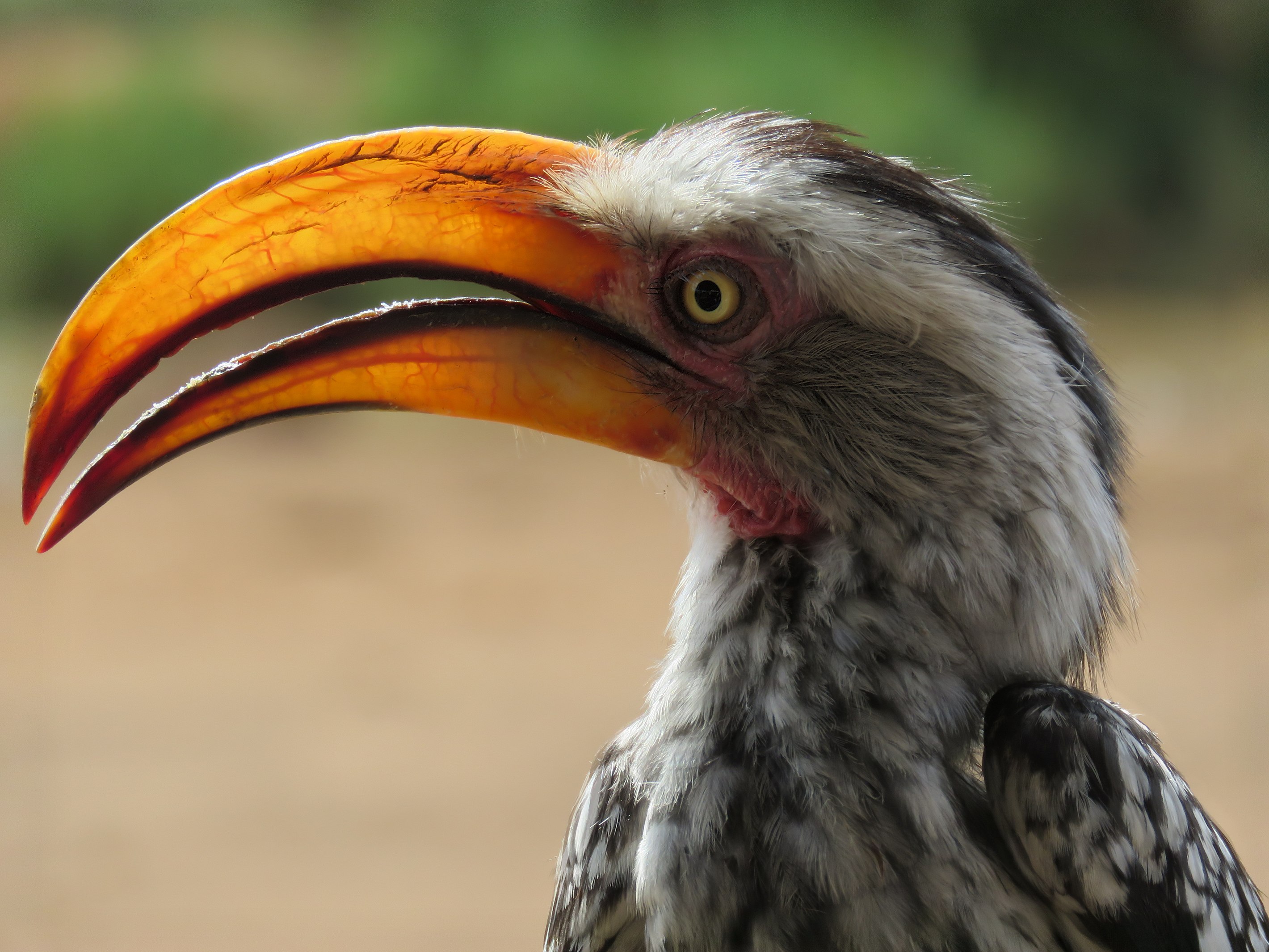
.jpg&action=edit§ion=T-1)
.jpg)
.jpg,_featured)
.jpg,_featured)
-2016-04-30T17:38:00.000Z-File:MUSE_interior.jpg,_not_featured)
.jpg&action=edit§ion=T-1)
.jpg)
.jpg,_featured)
.jpg,_featured)
._Locatie,_Tuinreservaat_Jonkervallei.jpg&action=edit§ion=T-1)
._Locatie,_Tuinreservaat_Jonkervallei.jpg)
.jpg&action=edit§ion=T-1)
.jpg)
.jpg,_not_featured)
.jpg,_not_featured)
.jpg,_not_featured)
.jpg&action=edit§ion=T-1)
.jpg)
.jpg,_not_featured)
.jpg,_not_featured)
![[1]](https://commons.wikimedia.org/wiki/File:Aranda_nature_reserve,_Canberra,_in_moonlight.JPG)
![[2]](https://commons.wikimedia.org/wiki/File:Bushland_on_southern_Mount_Majura.jpg)
.JPG&action=edit§ion=T-1)
.JPG)
.JPG,_not_featured)
.JPG,_not_featured)
.jpg&action=edit§ion=T-1)
.jpg)
.jpg,_featured)
.jpg,_featured)
.jpg,_featured)
.jpg&action=edit§ion=T-1)
.jpg)
.jpg,_featured)
.jpg,_featured)
.jpg&action=edit§ion=T-1)
.jpg)
.jpg,_featured)
.jpg,_featured)
_head.jpg&action=edit§ion=T-1)
_head.jpg)
_head.jpg,_not_featured)
_head.jpg,_not_featured)
,_1896.jpg&action=edit§ion=T-1)
,_1896.jpg)
,_1896.jpg,_featur)
,_1896.jpg,_featur)
.jpg&action=edit§ion=T-1)
.jpg)
.jpg,_featured)
.jpg,_featured)
_-_Interior.jpg&action=edit§ion=T-1)
_-_Interior.jpg)
_-_Interior.jpg,_featured)
_-_Interior.jpg,_featured)
_in_Desenzano_del_Garda.jpg&action=edit§ion=T-1)
_in_Desenzano_del_Garda.jpg)
_in_Desenzano_del_Garda.jpg,_not_featured)
_in_Desenzano_del_Garda.jpg,_not_featured)
.jpg&action=edit§ion=T-1)
.jpg)
.jpg,_featured)
._1113._Palace_museum,_Beijing.jpg)
._1113._Palace_museum,_Beijing.jpg&action=edit§ion=T-1)
._1113._Palace_museum,_Beijing.jpg)
._05.jpg&action=edit§ion=T-1)
._05.jpg)
._05.jpg,_featured)
._05.jpg,_featured)
,_Bahía_Tortuga,_isla_Santa_Cruz,_islas_Galápagos,_Ecuador,_2015-07-26,_DD_32.JPG?fastcci_from=460793&c1=460793&c2=3943817&d1=15&d2=0&s=200)
_-_Interior.jpg&action=edit§ion=T-1)
_-_Interior.jpg)
_-_Interior.jpg,_not_featured)
_-_Interior.jpg,_not_featured)
_-_Interior.jpg,_not_featured)
.JPG&action=edit§ion=T-1)
.JPG)
.JPG,_not_featured)
.JPG,_not_featured)
.JPG,_not_featured)
_-_03.jpg&action=edit§ion=T-1)
_-_03.jpg)
_-_03.jpg,_featured)
_-_03.jpg,_featured)
.jpg&action=edit§ion=T-1)
.jpg)
.jpg,_not_featured)
.jpg,_not_featured)
.JPG&action=edit§ion=T-1)
.JPG)
.JPG,_not_featured)
.JPG,_not_featured)
,_Le_Cour%C3%A9gant,_Brittany,_France_(19651212169).jpg&action=edit§ion=T-1)
,_Le_Courégant,_Brittany,_France_(19651212169).jpg)
.jpg)
,_Frontispiece.jpg&action=edit§ion=T-1)
,_Frontispiece.jpg)
,_Frontispiece.jpg)
,_Frontispiece.jpg,_not_featured)
,_Frontispiece.jpg,_not_featured)
.jpg&action=edit§ion=T-1)
.jpg)
.jpg)
.jpg,_not_featured)
.jpg,_not_featured)


_-_Abside.jpg&action=edit§ion=T-1)
_-_Abside.jpg)
_-_Abside.jpg)
_-_Abside.jpg,_not_featured)
_-_Abside.jpg,_not_featured)
_-_Abside.jpg,_not_featured)
_in_Hanover_Zoo.jpg&action=edit§ion=T-1)
_in_Hanover_Zoo.jpg)
_in_Hanover_Zoo.jpg)
_in_Hanover_Zoo.jpg,_not_featured)
_in_Hanover_Zoo.jpg,_not_featured)
_in_Hanover_Zoo.jpg,_not_featured)


.jpg&action=edit§ion=T-1)
.jpg)
.jpg)
.jpg,_featured)
.jpg,_featured)


